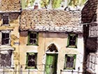
Colouring exterior woodwork
Ptolemy Dean exhorts us to look beneath the layers and celebrate diversity in colour choices in exterior woodwork


Exquisite houses, the beauty of Nature, and how to get the most from your life, straight to your inbox.
You are now subscribed
Your newsletter sign-up was successful
From many layered farmhouses to prim Georgian terraces, one of the least explored aspects of maintaining or repairing traditional buildings is the potential of colour. People seem convinced that windows must be painted brilliant white, and railings and ironwork jet black. So uniform is this livery, and so unquestioning is its application that even to raise the possibility of adding something different raises an eyebrow. I would like to suggest that, when purchasing a house for renovation, it is well worth scratching off the recent layers of these bland modern paints to see what lies beneath. It may surprise some people to learn that brilliant white and jet black are relative newcomers in the history of architectural paintwork. Traditional white lead based paints were unable to achieve anything much brighter than a chalky stone coloured mix, and jet black is a 19th-century creation, the result of progress in paint technology. In London, it is said that jet black was applied to railings during Queen Victoria's extended period of mourning, when rich hues of blue and green were covered with a glossy representation of city soot. Now, perhaps, it is time to look to something more imaginative. In Fitzroy Square, the garden railings have been restored to their original light hue, and now slip into the background, bringing the garden to the street as they were intended to do. It is surely time for the square's houses to follow suit. My wife was given a colour book of early photographs of England, many taken during the Second World War by US army personnel. They took photos of London, Oxford and Cambridge, and of old farmhouses and villages, all in early Ektachrome. The images of old England come alive with the radiating colour of the joinery and ironwork. Sash windows were often painted in two colours. The sash box was given the same rich colour as the front door, and the sashes were painted cream presumably to allow as much light as possible to pass through the glazing bars. These sash boxes framed the windows and emphasised the proportion of the window opening. An example at a house in Malmesbury, Wiltshire, has always caught my eye. The emerald green sash boxes give this house a character of its own, and match the poplar trees behind. But I fear the dreary uniformity of the neighbouring white windows will soon spread to this house, too. Historically, colour distinguished ownership. In the area round Midhurst (Sussex), the houses of the Cowdray Estate are painted a cheerful buttercup yellow. It is splendidly un-'tasteful', but a joy to behold. I wish we could all just relax and enjoy the opportunities of colour once more. Our drab world can only gain from it. l Don't assume ironwork has to be black and windows white. Scrape off paint to see what lies beneathl Look at old photos of the house for clues and inspect the buildings round it to see if any local colour traditions have survivedl Before introducing new colours to windows and doors, check with your local Conservation Officer, so that any necessary consent can be sought.
Exquisite houses, the beauty of Nature, and how to get the most from your life, straight to your inbox.
Country Life is unlike any other magazine: the only glossy weekly on the newsstand and the only magazine that has been guest-edited by His Majesty The King not once, but twice. It is a celebration of modern rural life and all its diverse joys and pleasures — that was first published in Queen Victoria's Diamond Jubilee year. Our eclectic mixture of witty and informative content — from the most up-to-date property news and commentary and a coveted glimpse inside some of the UK's best houses and gardens, to gardening, the arts and interior design, written by experts in their field — still cannot be found in print or online, anywhere else.

