Traditional houses with contemporary interiors
Mary Miers and Jeremy Musson visit four traditional houses with rooms that have been refitted by contemporary designers

It comes as a surprise to learn that this project was done entirely using reclaimed old materials. Maria Speake, who runs the architecture/interior design arm of salvage company Retrouvius, says: ‘I use reclamation in many of my projects but, unusually, in a contemporary way—I’m not into shabby chic.’
The commission, for Mark and Annabel Dearlove, involved collaborating with the architect Nick Helm, who built an extension to the listed terraced house in 2003. Maria used unifying themes to link the more traditional rooms at the front with the new living spaces behind, which are connected visually across a small garden courtyard. ‘In the old part, we preserved but did not fully reinstate surviving fragments of original detail, and used tone and texture to suggest the Georgian spirit of the rooms.’ Light reflects on the broken weaves of muslins and printed raw silks; hand-blocked vintage wallpaper and pieces found in antique fairs combine with a palette of dusty colours and hand-stitched wool carpets to create a relaxed, earthy feel—‘nothing too carefully matched’.
Japanese-style screens, reflecting a time when her clients lived in Japan, mark the transition from old to new. Exposed concrete, partly polished and in other places rough with coarse aggregate, is used functionally and for sculptural effect—a band wrapping round from the window doubles as a sill and a seat. One original detail, inspired by the use of Delft tiles in old Dutch houses, as painted by Vermeer, is the way surfaces are inset at significant places with stitchings of handmade Moroccan tiles, which are also used as skirting boards.
The Glasgow textile designers Timorous Beasties, with whom Retrouvius often works, created Japanese Tree specially for the living room, hand-printing the design on to an almost translucent, paper-like fabric.
The sofas and dining chairs are Italian, but Retrouvius supplied the floors of otto phyllite and reclaimed oak, and other furniture was made by their carpenter using salvaged pews. Maria had the dining chairs covered in leather because it ages well. She also used suede, and the bench rests are upholstered in corduroy: ‘I like using materials associated with masculinity—so often, men look ridiculous in interiors designed by women, and I want to make them feel comfortable. I enjoy seeing corduroy, with its conservative, country associations, used in a modern London interior.’ MM
For more information, visit www.retrouvius.com
Regency Villa
Sign up for the Country Life Newsletter
Exquisite houses, the beauty of Nature, and how to get the most from your life, straight to your inbox.
This redesign of the interior of a Regency villa was masterminded by the Russian architect/interior designer Igor Falkovsky, of London-based Studio Dar. His clients—a couple with two daughters— bought Southview in Buckinghamshire in 2006, attracted by the fact that they could combine a traditional-looking house in a beautiful setting with a completely modern interior. This was because, although listed, the house had been completely gutted, so there were no restrictions on what they did inside. They left all the decisions to Igor and his colleague Antonia Stewart, who supervised the soft furnishings and decoration.
‘The modern aesthetic works very well with the clean lines of the original stucco house,’ says Igor, who completely remodelled the 1970s pastiche Georgian interior. ‘There are no cornices and mouldings; instead, where two materials meet, they’re separated by a shadow gap; the whole effect is very controlled. For the plan, I adopted a systematic approach, changing the flow of space to suit the family needs.’ The southern half of the ground floor is now dominated by one open-plan living/dining room, connected to a large kitchen on one side. Upstairs, there’s a bedroom suite for each of the family, plus one for guests.
‘We used a limited number of timeless natural materials for the principal surfaces,’ says Igor, who worked closely with specialist builders Symm (www.symm.co.uk). ‘Wooden floors are of limed oak—plain and clean with no knots or cracks —and vertical planes, such as doors, are of stained oak; other floors, and the specially designed drum- and oval-shaped bath and basins, and chimneypieces, are of limestone.’
The stair hall creates a dramatic central space, with a staircase that Igor describes as ‘a modern take on a Classical design. It has no winder or newel post, but it turns after four wider stone steps and continues on up in limed oak, supported by a steel structure’. Each step appears to be floating, an effect emphasised by underlighting, and the balustrade is of glass, with no fixings visible. Down the wall, which is finished with a grass fibre cloth, hangs a curtain of light made of fibre-optic threads, which conduct light from a concealed source at staggered speeds, so that it resembles a shimmering cascade.
The dining area of the main living space was created in the original south-facing bay, which is canted and therefore best suited to the recurring oval forms. The dining table has an oval glass centre lit from within, and sits on an oval disk of brown leather, crisply finished with a steel trim. Minotti chairs are upholstered in a blue-grey fabric, a colour echoed by the linen wall hanging and silk curtains. ‘Throughout the house, we’ve used a subtle, understated palette that co-ordinates well with the hard materials in terms of colour and texture to give an overall effect of simple luxury: warm and chic.’ MM
For more information, visit www.studiodar.co.uk
Arts-and-Crafts house
Award-winning designer Simon Bray created this study for a large Voysey-designed family house in London, working with builder George Micallef of Green Amber. Mr Bray says: ‘So many people today want a modern feeling, but don’t want the coldness of the more Minimalist styles. I hope to create a modern English look that draws on our traditions of comfort and warmth, but also gives something new and fresh. Many of my clients are younger families moving into older country houses who want to have their own look.’
Mr Bray believes that you should ‘always respect original architectural detail and existing scale and proportion.’ He also feels that the best modern interior design should be able to use positively the warmth associated with really high-quality materials. ‘We have used walnut—the darker wood—and poplar “cluster”. With veneers, you can use the pattern for decoration with a consistency that you can’t achieve in solid woods.
‘Many of my studies are commissioned by male clients who want to create a kind of retreat, where they can enjoy using new technology. I try to evoke a hint of the colours associated with old country-house libraries or the rooms of a gentleman’s club.’
For more information, visit www.simon-bray.co.uk
Victorian Town house
Nina Campbell designed this living room in a 19th-century town house. ‘Some of the best Minimalist interiors I know are ones with very strong Georgian detailing. Genuinely modern houses often don’t have the same good bones as the architraves and cornices in a Classical house.
‘The big mirror is a 1940s piece bought from Gordon Watson that has a very modern feel. Using slips of mirror or polished steel skirting can create a very modern look.’ Much of the furniture was specially made. ‘The only way to keep everything alive is to have new furniture made. I use Christopher Clarke in Norfolk, and commission contemporary glass sculpture from Adrian Sassoon. I put few pictures on the walls here, but had a large one of a tulip on another wall painted by Sophie Coryndon. It’s important to keep a room feeling as calm as possible.’
Country Life is unlike any other magazine: the only glossy weekly on the newsstand and the only magazine that has been guest-edited by HRH The King not once, but twice. It is a celebration of modern rural life and all its diverse joys and pleasures — that was first published in Queen Victoria's Diamond Jubilee year. Our eclectic mixture of witty and informative content — from the most up-to-date property news and commentary and a coveted glimpse inside some of the UK's best houses and gardens, to gardening, the arts and interior design, written by experts in their field — still cannot be found in print or online, anywhere else.
-
 Five beautiful homes, from a barn conversion to an island treasure, as seen in Country Life
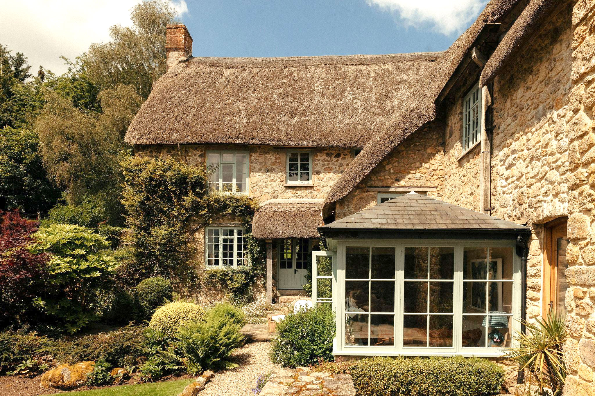
Our pick of the best homes to come to the market via Country Life in recent days include a wonderful thatched home in Devon and a charming red-brick house with gardens that run down to the water's edge.
By Toby Keel Published
-
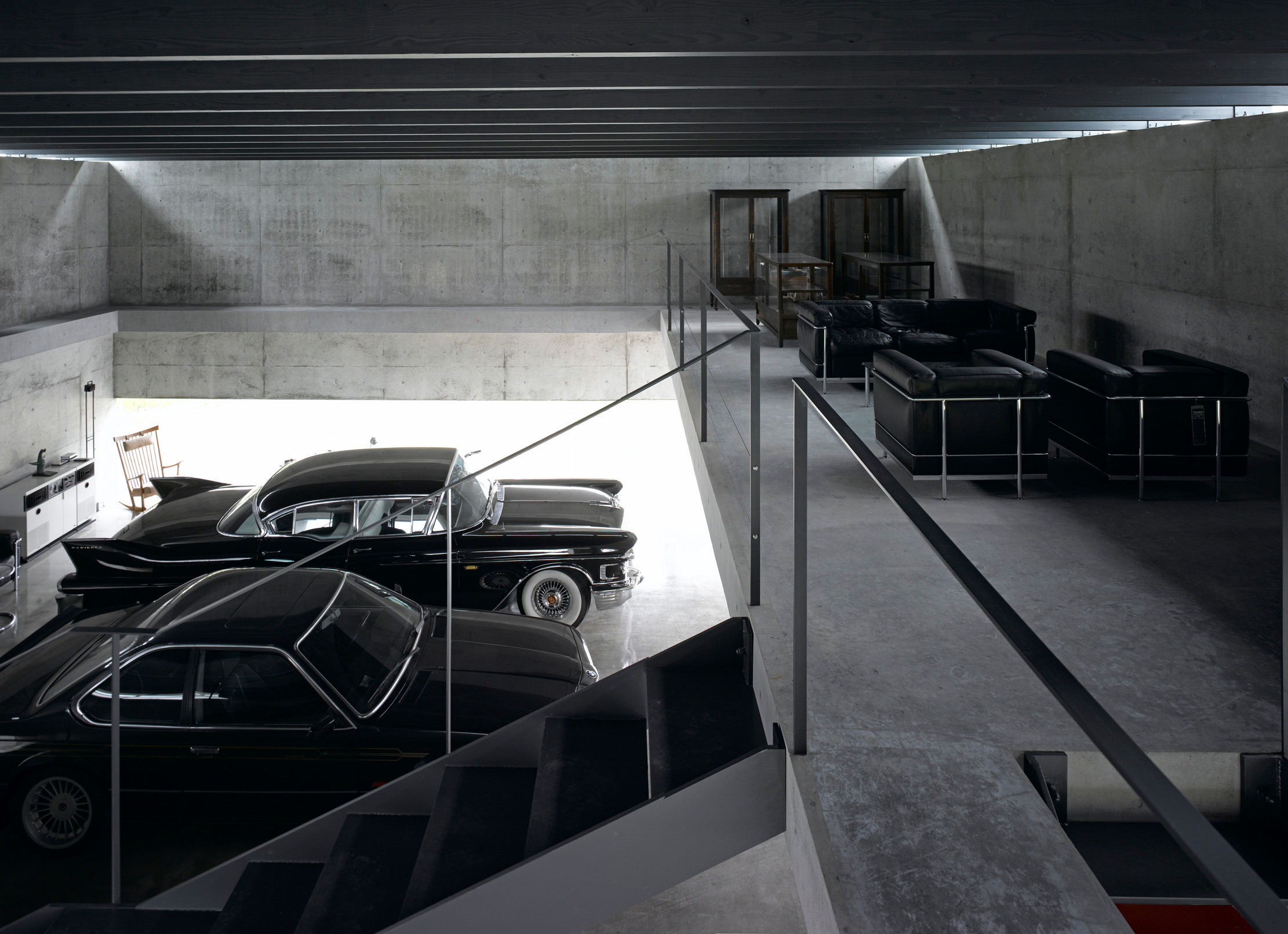
 Shark tanks, crocodile lagoons, laser defences, and a subterranean shooting gallery — nothing is impossible when making the ultimate garage
To collectors, cars are more than just transport — they are works of art. And the buildings used to store them are starting to resemble galleries.
By Adam Hay-Nicholls Published