Dream House week four: A contemporary ligature
James Gorst creates a Modernist extension and link between an old rectory and its outbuildings


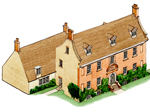
This mellow, red-brick rectory dates from 1701, and presents a handsome ‘doll's house' front of five bays. There are four unusual niches at each end of this principal front, suggesting that it was a high-quality build at the time. On plan, the house consists of two parallel ranges, but, instead of being back to back, as is usually the case, they only partially overlap, like two trains passing one another at a station. This has the advantage that the end room of each range can enjoy double-aspect daylight.
Consequently, the panelled drawing room at the east end of the principal front benefits from windows front and back, as does the dining room at the western end of the back range. The kitchen, as usual, is a small, dreary, north-facing room at the back of the rear range, which is overshadowed to the extent that it must get almost no direct sunlight at all, at least during the winter months.

The present day-to-day approach to this house is no longer by foot up the long garden path to the grand front door on the south side, but instead from the west side, where, on the other side of a tall limestone garden wall, is a modern driveway and car-parking area. This is served by a long run of outbuildings, garages, stables and stores. Like the house, these outbuildings extend east to west, but rather than being constructed of smart Georgian brick, cheaper local rubble limestone was used.
This layout means the first impression of visiting this house is from this side, and through a narrow side door on the flank of the front range. This in turn leads to a small lobby with a ‘back of house' view of the backstairs and kitchen. One must immediately sense one has entered on the wrong side of the ‘green-baize door'.
Upstairs, there are attractive panelled bedrooms in the front range, and more informal ‘eavesy' bedrooms in the lower back range. James Gorst
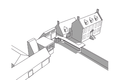
A new two-storey connection piece links the house and stables, allowing free movement between them. Three shifted volumes take their form from the vernacular scale and style of the barn buildings, and give a dramatic quality of light.
A large new entrance, kitchen, studio, bathroom and store are provided on the ground floor, with three new bedrooms and two new bathrooms at first-floor level. The former kitchen is made into a library. External walls are concrete frame and stone in-fill. Pitched roofs are dressed in clay tiles and flat roofs are sedum-planted.
Sign up for the Country Life Newsletter
Exquisite houses, the beauty of Nature, and how to get the most from your life, straight to your inbox.
Ptolemy's verdict
James Gorst's proposals for this house exploit its east-west orientation by connecting the back range of the main house with the long run of its outbuildings. Into this new linking range are located a new kitchen, pantry, studio and downstairs loo, essentially relocating all of the ‘service' functions of the house into this new range to the west of a new entrance. This means that the old back parts of the house can be entirely upgraded for ‘front of house' use.
The old kitchen has become a library, which is an excellent use for a north-facing room as it avoids the fading and damaging effect of direct sunlight on the book spines. There are also obvious welcome practicalities in connecting the garages to the house, a link especially valuable on a wet winter's evening.
But the real ingenuity of this proposal lies in its recognition that, by building an addition on the less formal driveway side of the garden wall, a thoroughly contemporary architectural solution can be found that doesn't visually compete with the supremacy of the Georgian front of the main house.

The new addition is honestly constructed of an exposed concrete frame, but with its panels filled with limestone, contrasting and at the same time complementing the rubblestone of the outbuildings. The roofs are clad in clay tiles to match the house, and also steeply pitched, offering the potential of an interesting cross-section to the upper-floor bedrooms with daylight reflecting off the eaves.
The new kitchen commands a view of the new garden at the back of the house, and, as this faces north, it can be provided with a wall of floor-to-ceiling glazed panels without the risk of excessive heat gain. The inside of this kitchen will offer an entirely different quality of space to that provided in the historic, panelled interiors of the old house.
The users of this building will experience the best of traditional and contemporary design, a combination that is all too rarely satisfactorily achieved.
Country Life is unlike any other magazine: the only glossy weekly on the newsstand and the only magazine that has been guest-edited by HRH The King not once, but twice. It is a celebration of modern rural life and all its diverse joys and pleasures — that was first published in Queen Victoria's Diamond Jubilee year. Our eclectic mixture of witty and informative content — from the most up-to-date property news and commentary and a coveted glimpse inside some of the UK's best houses and gardens, to gardening, the arts and interior design, written by experts in their field — still cannot be found in print or online, anywhere else.
-
 About time: The fastest and slowest moving housing markets revealed
New research by Zoopla has shown where it's easy to sell and where it will take quite a while to find a buyer.
By Annabel Dixon
-
 Betty is the first dog to scale all of Scotland’s hundreds of mountains and hills
Fewer than 100 people have ever completed Betty's ‘full house’ of Scottish summits — and she was fuelled by more than 800 hard boiled eggs.
By Annunciata Elwes