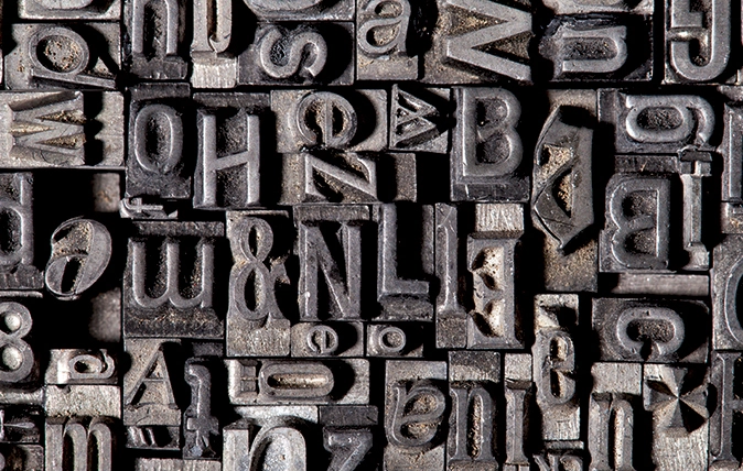

Lettering on Trajan’s Column, AD113 The anonymous serif lettering carved into the base of Trajan’s column in Rome, with its contrasting thick and thin strokes and incised serifs, became the typographic ideal for western civilisation and the most influential template for ‘roman’ serif letter design of the pre-type era. The search for 26 lower-case letters to accompany Trajan’s capitals took another 1,500 years.
Gutenberg’s Black Letter (or Gothic, or Old English), 1440 When Johannes Gutenberg introduced moveable-type printing to the Holy Roman Empire, he deliberately mimicked handwritten Germanic letter forms. William Caxton brought the idea to Britain 30 years later and it still graces the mastheads of the Daily Telegraph, Daily Mail and New York Times.
Italic, 1501 Commissioned as a typeface in its own right by the Venetian printer Aldus Manutius (inventor of the semi-colon), ‘Aldine Italic’ was sloped and condensed to emulate Italian handwriting and save space.
Garamond, 1532 This elegant Renaissance roman serif face named for the French punch-cutter Claude Garamont ended the reign of Black Letter. In 1725, William Caslon adapted the font in England and it was later used to print the American Declaration of Independence.
Typewriter, 1868 The patenting of the typewriter took us even further away from handwriting-like styles towards print. In addition to promoting pangrams for typist training (‘The quick brown fox jumps over the lazy dog’) and later inspiring digital faces such as Courier, where would Hollywood killers have been without that giveaway wonky ‘e’?
Johnston Sans, 1918 ‘Bold simplicity’ was the brief of Frank Pick, of the newly amalgamated Underground Electric Railways Company, to the calligrapher Edward Johnston and his student Eric Gill. Their characterful roundel and sans-serif typeface unified London’s disparate Underground, epitomised Modernism and became a defining lesson in a new concept: branding.
Helvetica, 1957 Post-Second World War British and American advertising and magazine publishing was a mess of jokey and brush-script typefaces until, like a blast of icy Alpine air, Helvetica arrived from Switzerland. It remains both the most (over)used typeface in the world and the only one to star in its own biopic: Gary Hustwit’s Helvetica (2007).
Transport, 1963 In the late 1950s, Jock Kinnear and Margaret Calvert were commissioned to design signs for the first British motorways, and later the entire British road system. They established that words in upper and lower case, because they have shape, are much more recognisable than CAPITALS, which do not, meaning that Britain now has the clearest, most legible road signs in the world.

-
 Designer's Room: A solid oak French kitchen that's been cleverly engineered to last
Kitchen and joinery specialist Artichoke had several clever tricks to deal with the fact that natural wood expands and contracts.
-
 Chocolate eggs, bunnies and the Resurrection: Country Life Quiz of the Day, April 18, 2025
Friday's quiz is an Easter special.

