

Martin Brudnizki on Waking Up in Naples by Howard Hodgkin
I almost chose Édouard Vuillard, but decided on Hodgkin instead. It is no surprise he was inspired by the French interiors painter – his blotches of colour blurring objects and landscapes in similar dreamlike fashion, creating that senseof a scene or a scene full of senses.
It is Hodgkin’s use of colour that has always attracted me. The tones here are slightly muted, but each shade is appealing.
I also admire Hodgkin for his use of frames – he finds an answer to the ultimate of questions, is the frame a part of the artwork? Here he creates one in a most satisfying way, by framing the scene with four bold brush strokes.
Martin Brudnizki is the founder of his eponymous interior architecture and design practice. His projects include Annabel’s, London W1, and the University Arms hotel in Cambridge.
Charlotte Mullins comments on Waking Up in Naples by Howard Hodgkin
Howard Hodgkin was a Colourist who lived and breathed the past. His vivid paintings were recollections of intense experiences. But translating sensations, smells, feelings and moods into strokes of paint was never easy and, sometimes, it would take him years to feel he had captured the moment.
Despite each painting having a specific memory at its core — often suggested by the work’s title — they appear abstract, comprising broad stripes, swirls and splotches of colour.
Waking Up in Naples is filled with heat. The painted orange frame offers a warm contrast to the turquoise brushstrokes that evoke the sea, as red blooms and sensuous curves undulate below. These could suggest a nude reclining on a bed by a window, with balcony railings and flowerpots framing an azure sea. But nothing coheres and, ultimately, this remains an abstract feast for the eye. By translating his highly charged memory into sensual colour, Hodgkin conveys the intensity of his recalled feelings.
Hodgkin was a voracious traveller and spent much time in southern Italy and India, where the light was hot and the colours zinged. He drew on the work of earlier Colourists — Henri Matisse, Édouard Vuillard — but created his own language that hovered between figuration and abstraction.
This painting was completed in 1984, the year he represented Britain in the prestigious Venice Biennale. Many believed he would win the inaugural Turner Prize that year, but he had to wait until 1985 for the accolade.

My favourite painting: Nicholas Coleridge
Nicholas Coleridge chooses Maharana Jagat Singh attending an elephant fight by Syaji and Sukha as his favourite painting

My favourite painting: Lauren Child
Lauren Child chooses her favourite painting for Country Life.

-
 'Monolithic, multi-layered and quite, quite magnificent. This was love at first bite': Tom Parker Bowles on his lifelong love affair with lasagne
An upwardly mobile spaghetti Bolognese, lasagne al forno, with oozing béchamel and layered meaty magnificence, is a bona fide comfort classic, declares Tom Parker Bowles.
-
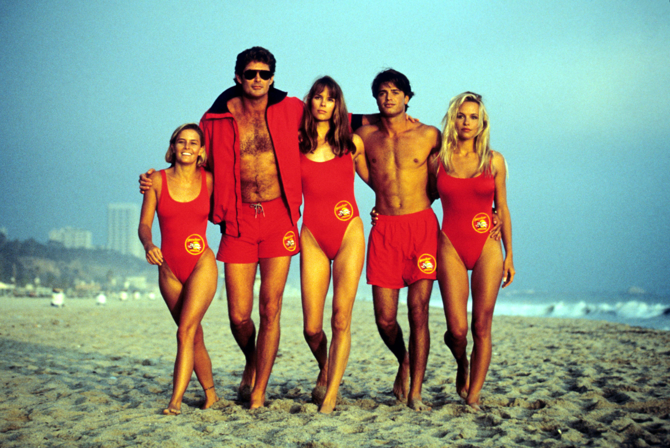 Country houses, cream teas and Baywatch: Country Life Quiz of the Day, April 24, 2025
Thursday's Quiz of the Day asks exactly how popular Baywatch became.


-
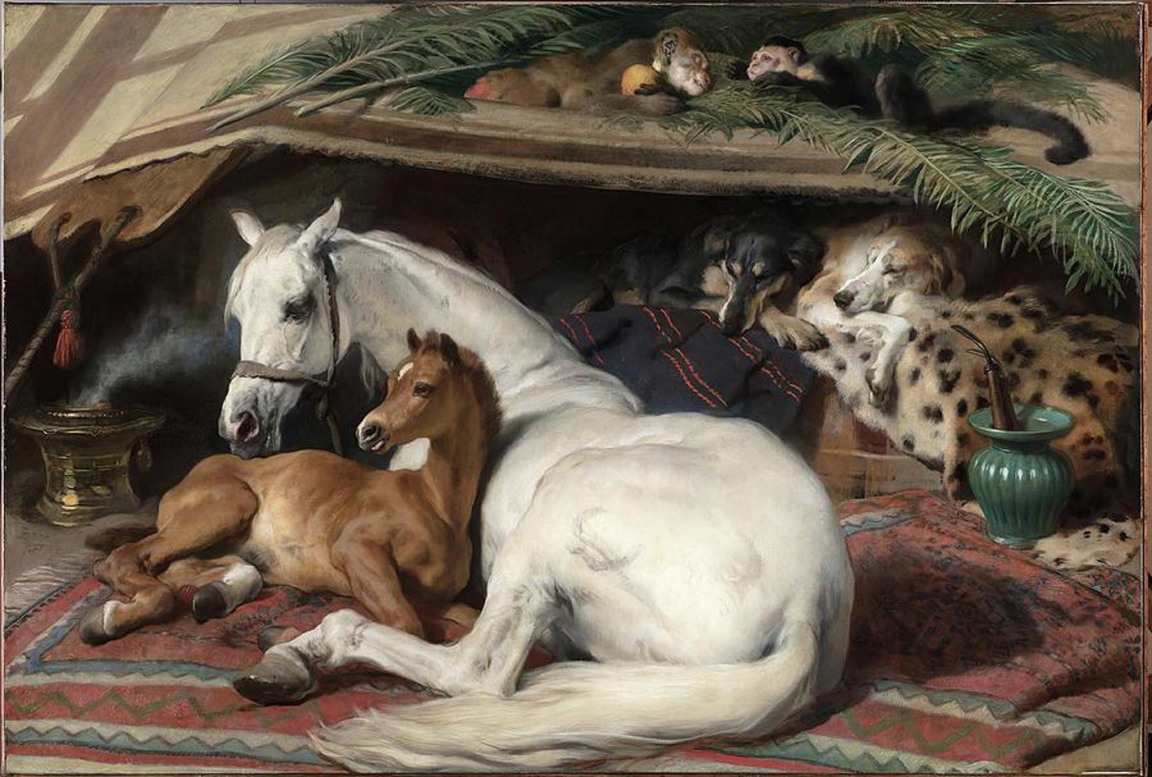 'As a child I wanted to snuggle up with the dogs and be part of it': Alexia Robinson chooses her favourite painting
Alexia Robinson, founder of Love British Food, chooses an Edwin Landseer classic.
-
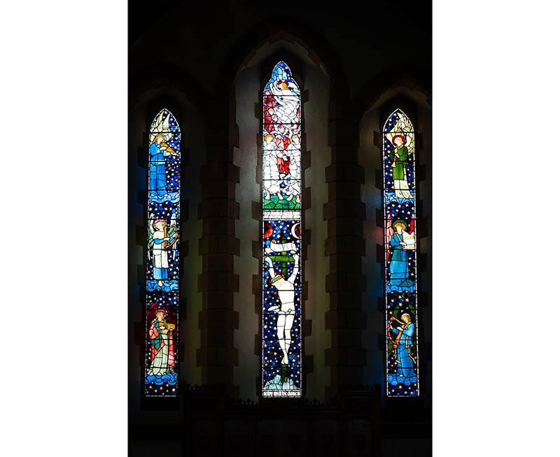 The Pre-Raphaelite painter who swapped 'willowy, nubile women' for stained glass — and created some of the best examples in Britain
The painter Edward Burne-Jones turned from paint to glass for much of his career. James Hughes, director of the Victorian Society, chooses a glass masterpiece by Burne-Jones as his favourite 'painting'.
-
 'I can’t look away. I’m captivated': The painter who takes years over each portrait, with the only guarantee being that it won't look like the subject
For Country Life's My Favourite Painting slot, the writer Emily Howes chooses a work by a daring and challenging artist: Frank Auerbach.
-
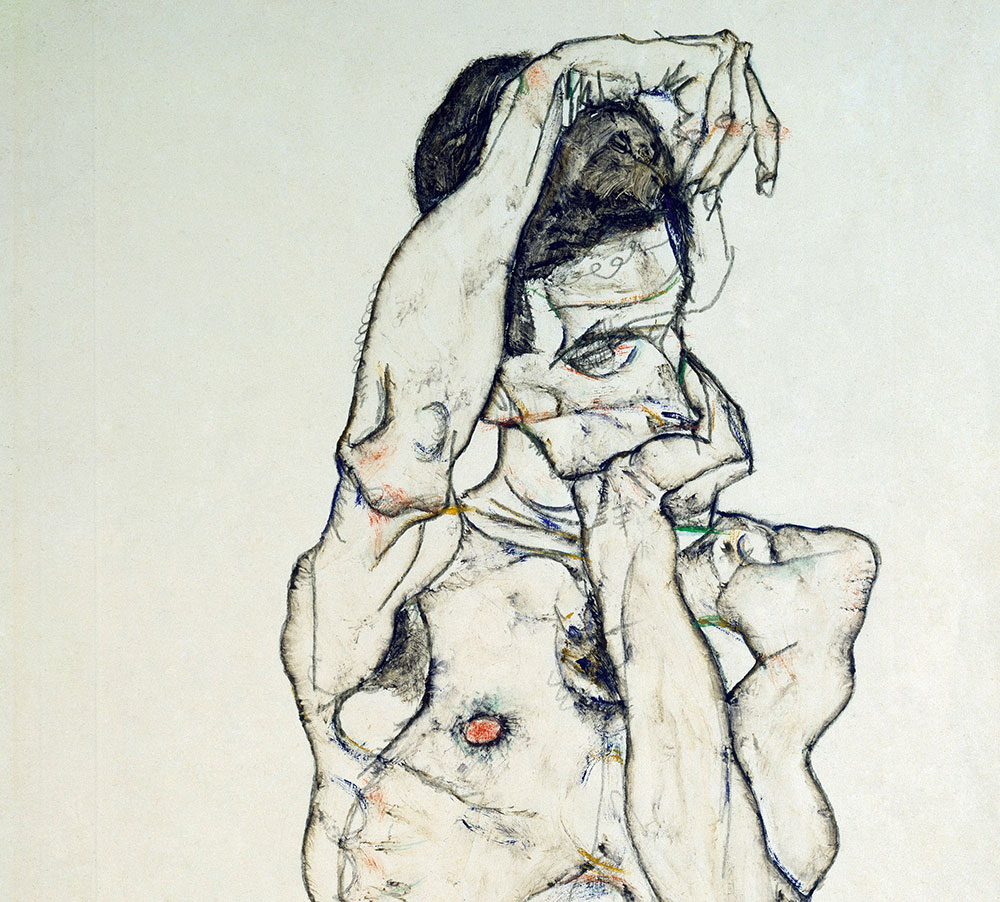 My Favourite Painting: Rob Houchen
The actor Rob Houchen chooses a bold and challenging Egon Schiele work.
-
 My Favourite Painting: Jeremy Clarkson
'That's why this is my favourite painting. Because it invites you to imagine'
-
 The chair of the National Gallery names his favourite from among the 2,300 masterpieces — and it will come as a bit of a shock
As the National Gallery turns 200, the chair of its board of trustees, John Booth, chooses his favourite painting.
-
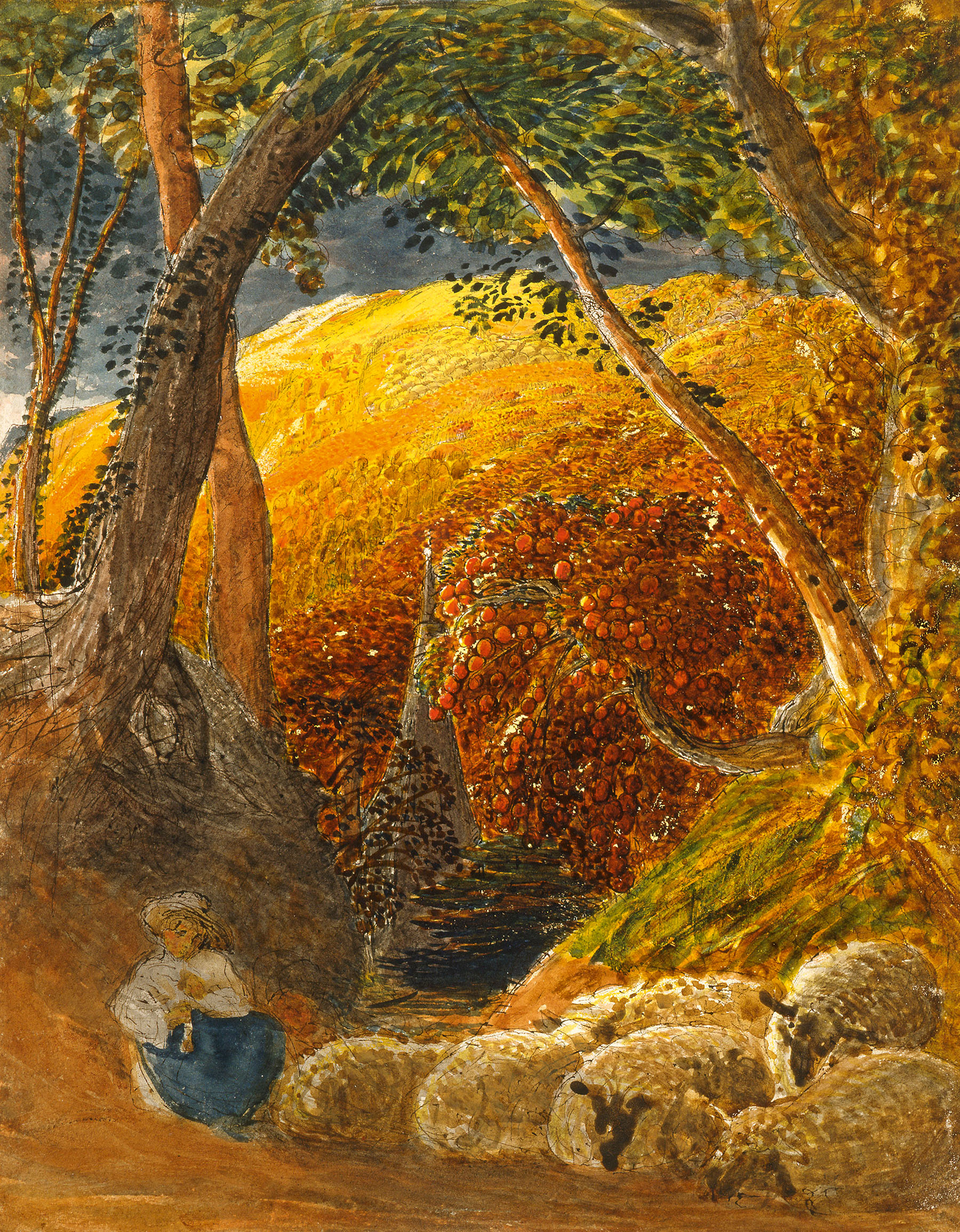 'A wonderful reminder of what the countryside could and should be': The 200-year-old watercolour of a world fast disappearing
Christopher Price of the Rare Breed Survival Trust on the bucolic beauty of The Magic Apple Tree by Samuel Palmer, which he nominates as his favourite painting.
-
 My favourite painting: Andrew Graham-Dixon
'Lesson Number One: it’s the pictures that baffle and tantalise you that stay in the mind forever .'


