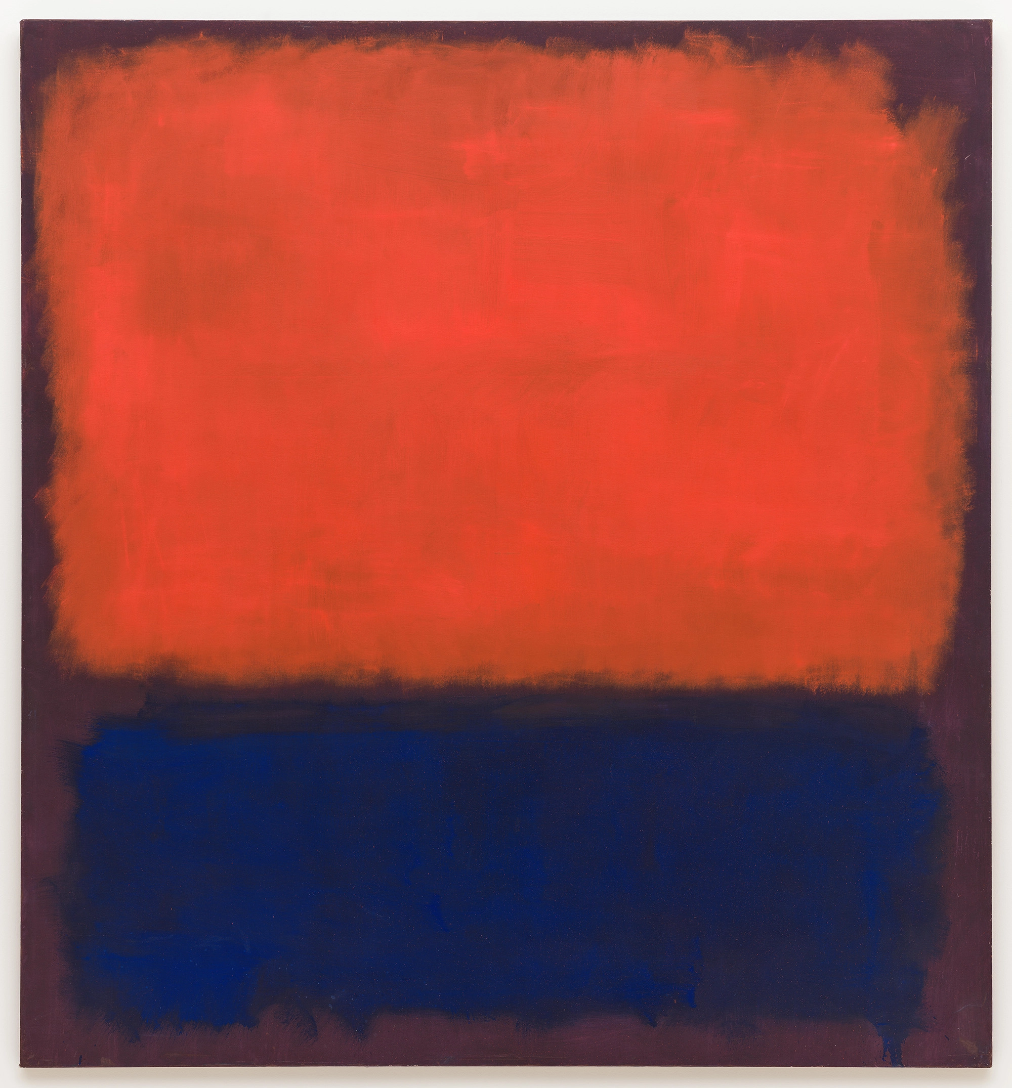
Marie Soliman chooses No 14, 1960 by Mark Rothko
‘Rothko once said that he was interested only in experiencing basic human emotions — ecstasy, tragedy and joy — in the simplest of ways. I happen to believe that less is more, which is perhaps why I always find myself gazing, meditating and reflecting when I look at Rothko’s art.
‘I love the minimalism of this painting. There’s no “movement”, but it somehow feels dynamic. Orange is such a strong colour, strangely not one of my favourites, but used to great effect and elegance alongside the midnight blue.
‘His signature composition, coloured squares filling a large canvas, captures your attention and grounds you. It evokes what he referred to as the “sublime”.’
Marie Soliman is the founder and creative director of Bergman Interiors.
Charlotte Mullins on Rothko and No 14, 1960
There are no words that can adequately describe the sensation of looking at a Mark Rothko painting. It is a transcendental experience that speaks directly to your emotions. It can be meditative, moving and exciting, the soft rectangles of colour that float one above the other coalescing in your eyes to create a pulsating glow that rewards slow looking with a powerful psychological experience.
Rothko, a Russian immigrant, started out as a figurative painter in New York in the 1920s. An awareness of European Surrealism and the writings of Carl Gustav Jung finally gave him the courage to push beyond the figure. In 1947, he wrote: ‘The familiar identity of things has to be pulverised in order to destroy the finite associations with which our society increasingly enshrouds every aspect of our environment.’
By the late 1940s, Rothko was using oil paint as if it were watercolour, cajoling it into numinous clouds of latent colour. The San Francisco Museum of Modern Art (MoMA), which owns this painting, gave him his first solo exhibition in 1946. Gary Garrels, MoMA’s former senior curator of painting, described No 14, 1960 as a glowing orange-red above a twilight blue, both floating over ‘bruised eggplant’ purple. There is an energy to the warm glow, an infinite depth to the blue below it. The colours hover before us, expectant, waiting to interact with the viewer. As Rothko said: ‘A picture lives by companionship, expanding and quickening in the eyes of the sensitive observer.’

The Queen's official portraits: Seven of the most extraordinary paintings from 70 years and over 1,000 sittings
Her Majesty Queen Elizabeth II has been painted literally thousands of times since she came to the throne. Charlotte Mullins


-
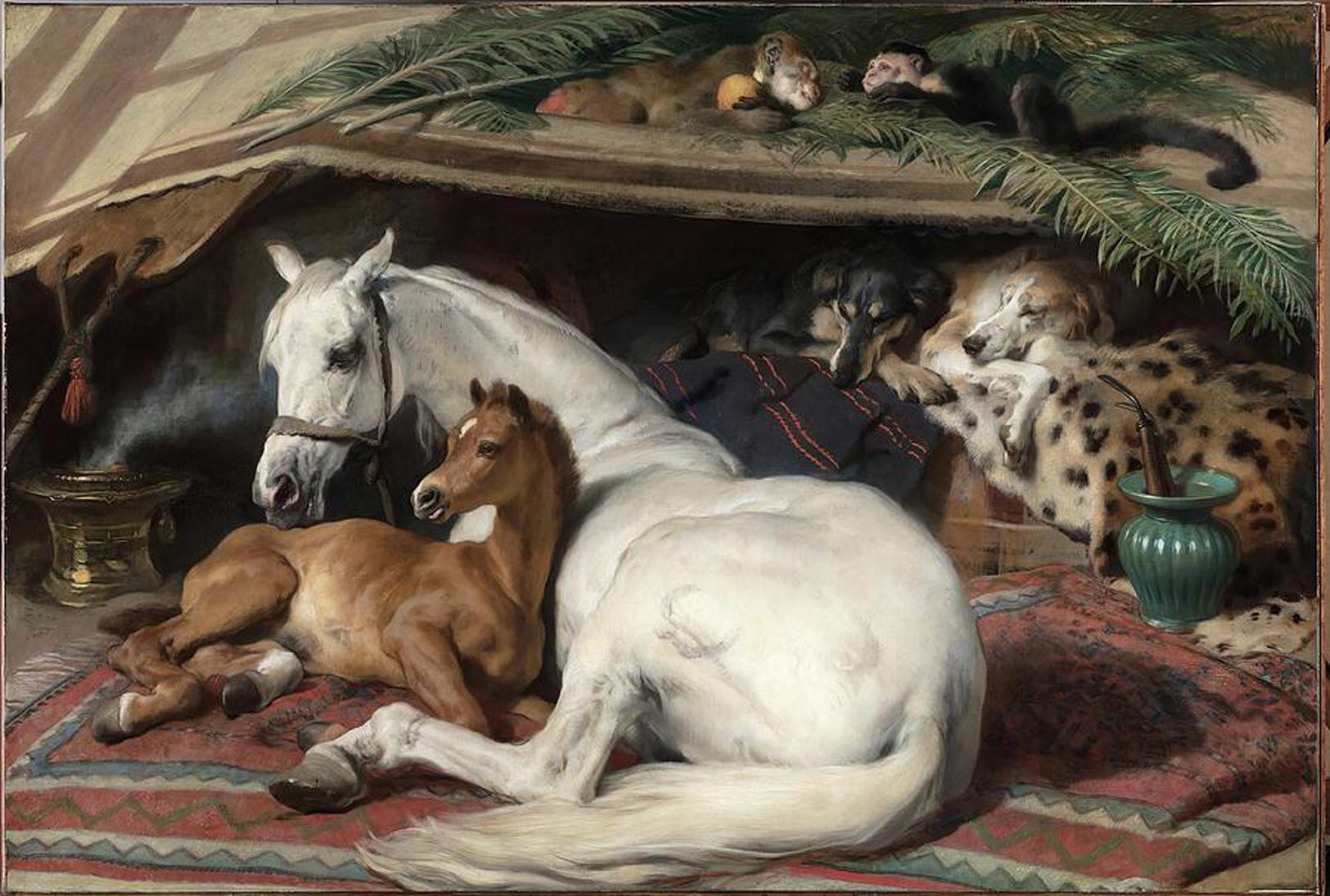 'As a child I wanted to snuggle up with the dogs and be part of it': Alexia Robinson chooses her favourite painting
Alexia Robinson, founder of Love British Food, chooses an Edwin Landseer classic.
-
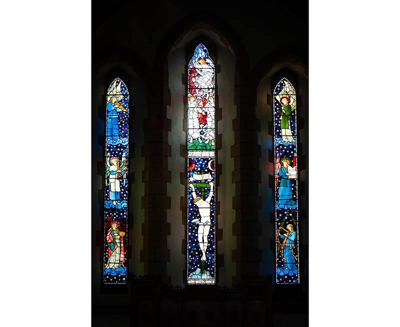 The Pre-Raphaelite painter who swapped 'willowy, nubile women' for stained glass — and created some of the best examples in Britain
The painter Edward Burne-Jones turned from paint to glass for much of his career. James Hughes, director of the Victorian Society, chooses a glass masterpiece by Burne-Jones as his favourite 'painting'.
-
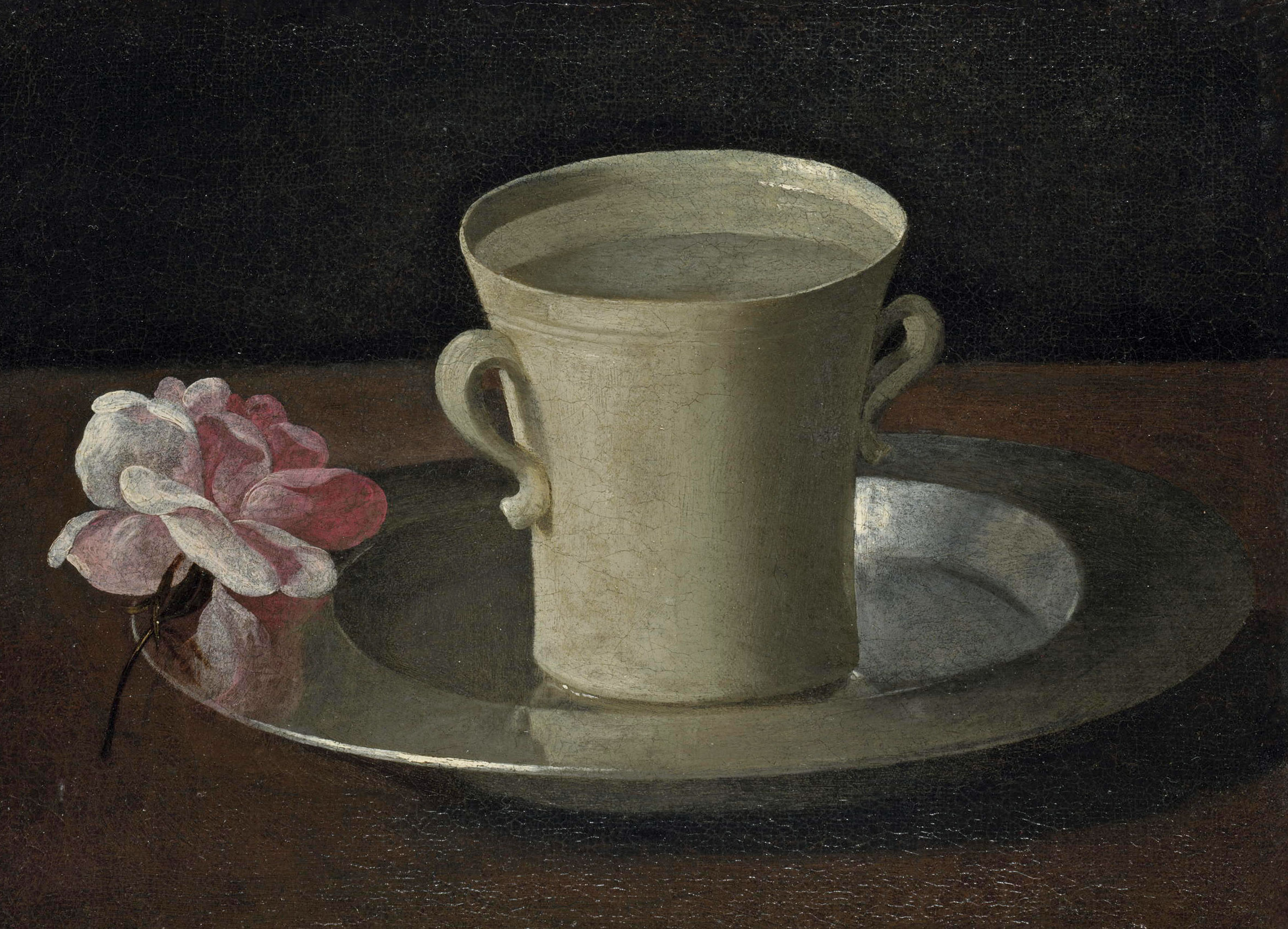
 'I can’t look away. I’m captivated': The painter who takes years over each portrait, with the only guarantee being that it won't look like the subject
For Country Life's My Favourite Painting slot, the writer Emily Howes chooses a work by a daring and challenging artist: Frank Auerbach.
-
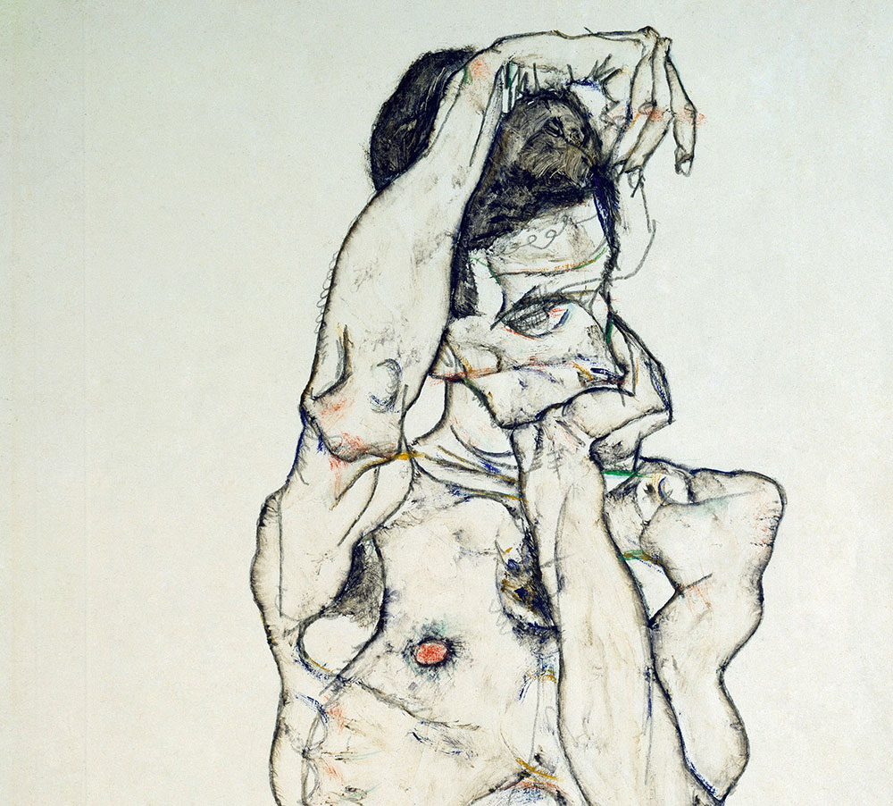 My Favourite Painting: Rob Houchen
The actor Rob Houchen chooses a bold and challenging Egon Schiele work.
-
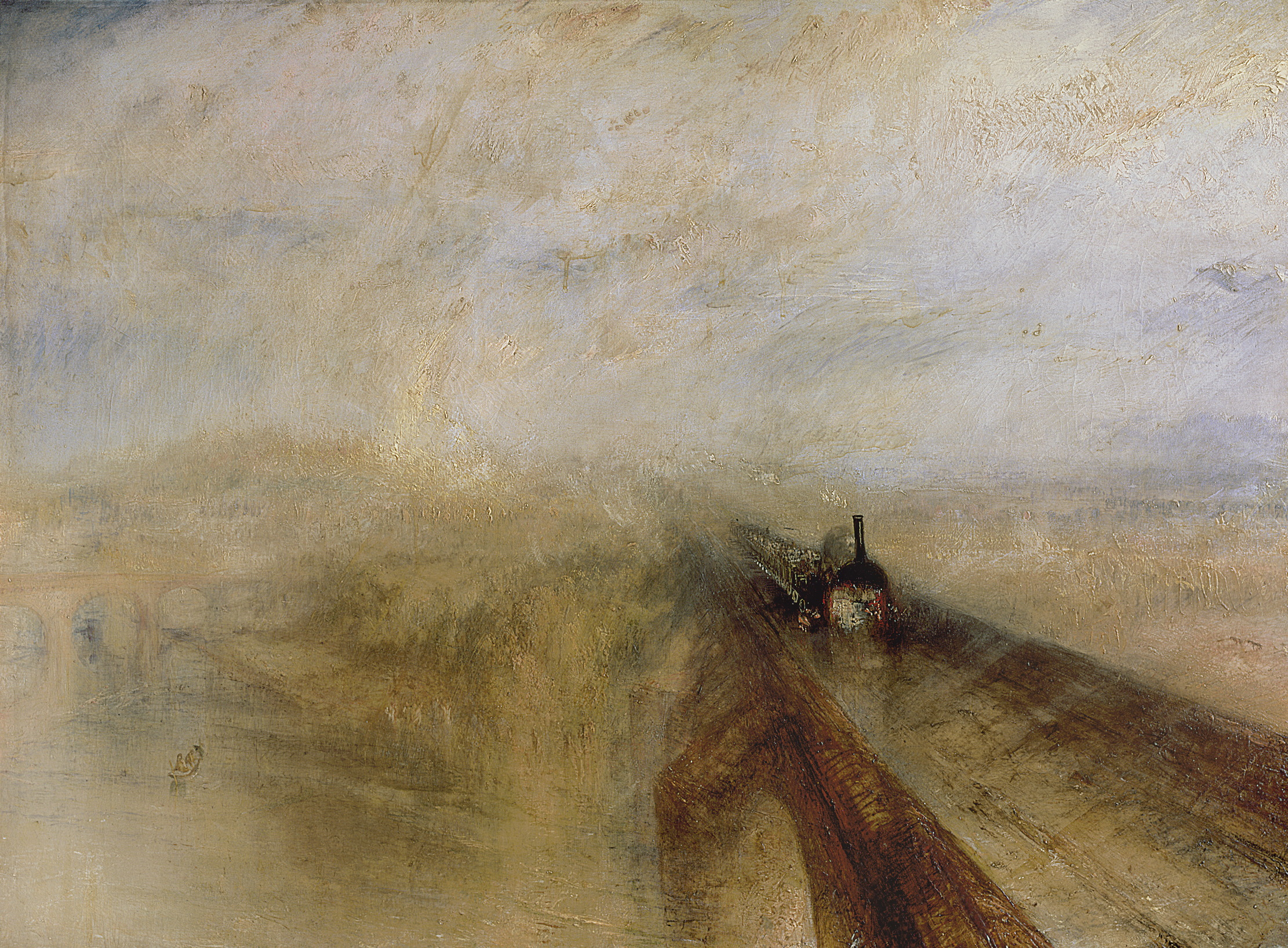 My Favourite Painting: Jeremy Clarkson
'That's why this is my favourite painting. Because it invites you to imagine'
-
 The chair of the National Gallery names his favourite from among the 2,300 masterpieces — and it will come as a bit of a shock
As the National Gallery turns 200, the chair of its board of trustees, John Booth, chooses his favourite painting.
-
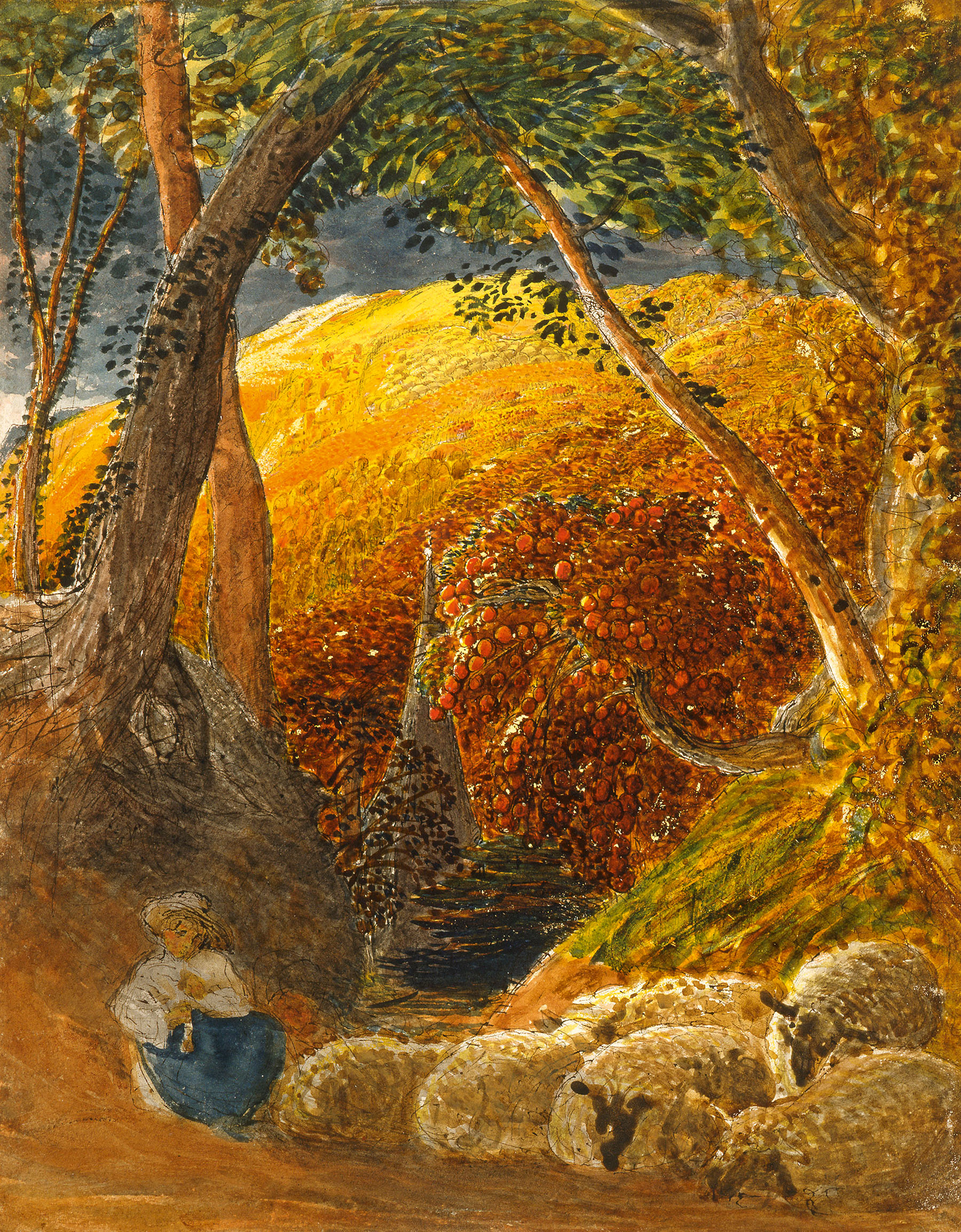 'A wonderful reminder of what the countryside could and should be': The 200-year-old watercolour of a world fast disappearing
Christopher Price of the Rare Breed Survival Trust on the bucolic beauty of The Magic Apple Tree by Samuel Palmer, which he nominates as his favourite painting.
-
 My favourite painting: Andrew Graham-Dixon
'Lesson Number One: it’s the pictures that baffle and tantalise you that stay in the mind forever .'


