
Close your eyes and think of Mondrian, and various words may come to mind ‘grids', say, or ‘rectangles', or ‘geometric abstraction'. Among those that very likely will not are ‘colourist' and ‘colours'-the last unless prefixed by the word ‘primary'. For this, Mondrian has no one to blame but himself.
In 1919, the Dutch artist wrote an essay called Le Néo-Plas-ticisme (neo-Plasticism). Newly arrived in Paris eight years bef-ore, he had discovered the Cubists and decided to take their experi-ment further, celebrating the flatness of the canvas rather than using it to imply painted depth. Now, in neo-Plasticism, he hit on the formula that would shape his work for the rest of his life-the pictures that still come to mind when we hear Mondrian's name, just shy of a century later. Art was to be a strict diet of black horizontals and verticals, the rectangles these made to be left white or grey or painted in the three primary colours: red, yellow and blue.
It's easy enough to follow the formal part of this recipe. Mon-drian had trained as a Dutch Realist painter, turning out windmills and trees like everyone else in Holland. After 1911, these became more and more stylised, graphic and linear until, after a few years as black-and-white pluses and minuses, they turned into grids in 1919. But what of his colours?
This is the more complex question raised by an exhibition at the Turner Contemporary in Margate. One of two shows marking the 70th anniversary of Mondrian's death-the other, in Liverpool, links his work to the studios where it was made-‘Mondrian and Colour' does what the title suggests. Given that neo-Plasticism whittled painting down to just two things-colour and form-it's a question that has been surprisingly little asked.
Another question: how do you get from Farmhouse with Wash on the Line (about 1897) to Composition with Large Red Plane, Yellow, Black, Grey and Blue (1921) in a little over 20 years? How do you move from the green-brown earth tones of the first to the primary colours of the second?
Pretty well every avant-garde painter of the first part of the 20th century took up the Cézanne flat- ness challenge, but none adopted so revolutionary a stance on colour as Mondrian. This didn't happen overnight, or even in 1919. Although Mondrian cultivated the image of the artist-hermit, painting away in grim isolation, he was as open to history as anyone else, or perhaps in his fervent way, more so.
Thus, in Oostzijdse Mill with Extended Blue, Yellow and Purple Sky (1907-8), we find those acid colours often called Fauvist (although Edvard Munch, much imitated by the Fauves, seems a more direct source for them here). By 1911, Mondrian had joined the Theosophical Society, a movement that came with its own set of astral colour rules laid down in Annie Besant's Thought-Forms: yellow for intelligence, blue for devotion, red for anger and so on.

Viewed theosophically, the deeply un-Realist palette of Molen (Mill): The Red Mill (1911) is heavy with symbolism. If you're looking for a eureka-moment in ‘Mondrian and Colour', then this picture, made in the year of his move to Paris, might well be it. And yet, art history, like life, is seldom so neat. The sails of the Red Mill look like the horizontals and verticals that neo-Plasticism would later rule to be painting's only allowable forms. Red and blue are two of the permitted primary colours and the window of the windmill and the boss on its sails look like the rectangles of colour in the 1921 Composition. Squint at Red Mill and you can almost turn it into the abstract, Modernist pictures Mondrian would paint 10 years later.
Oddly, however, it's a much less complex painting than they are. If you restrict yourself to working only in primary colours, you're setting yourself an impossible task. There is no such thing as ‘blue', no single, universal red. What strikes you as you walk around the last room of this exhibition is how varied his late pictures are, how different the Compositions' colours. And also, how much Mondrian enjoys those differences. By setting himself impossible limits, he opens a whole new world of possibility. Mondrian the Colourist? It's not as far-fetched as it sounds.
‘Mondrian and Colour' is at Turner Contemporary, Margate, Kent until September 21 (www.turnercontemporary.org; 01843 233000). ‘Mondrian and his Studios' is at Tate Liverpool, Albert Dock, Liver-pool, until October 5 (0151-702 7400; www.tate.org.uk)

-
 Athena: We need to get serious about saving our museums
The government announced that museums ‘can now apply for £20 million of funding to invest in their future’ last week. But will this be enough?
-
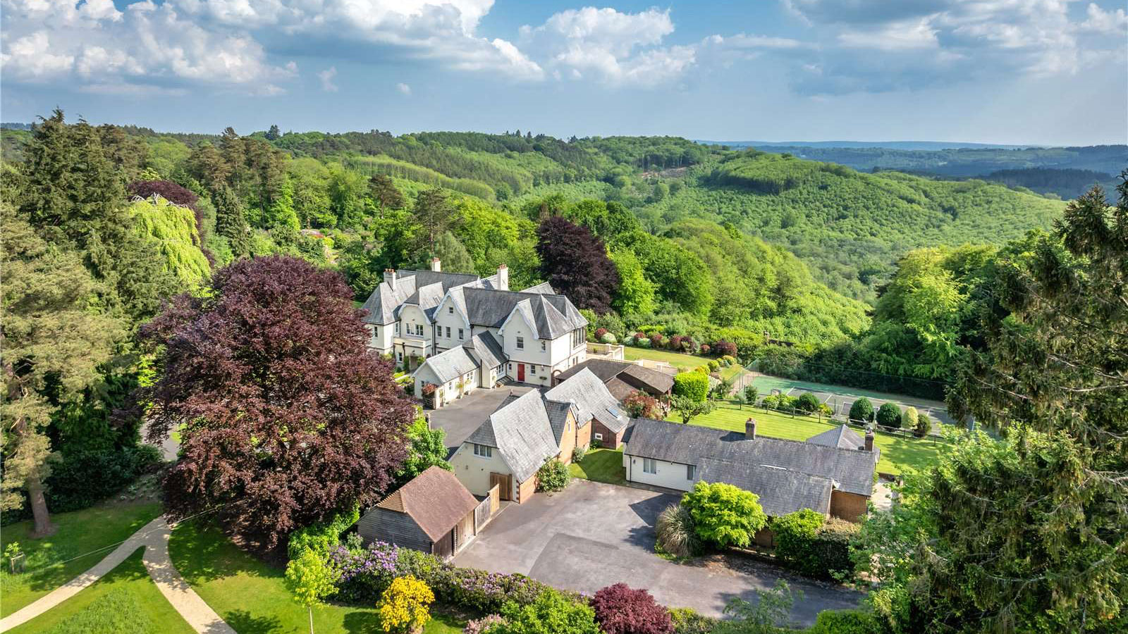 Six rural properties with space, charm and endless views, as seen in Country Life
We take a look at some of the best houses to come to the market via Country Life in the past week.

