How to add character to a new-build house, from paint and furniture to the size of your doors
Carefully chosen furniture, paint, joinery and architectural details will all help to add character to a new house, says Clive Aslet.
Exquisite houses, the beauty of Nature, and how to get the most from your life, straight to your inbox.
You are now subscribed
Your newsletter sign-up was successful
There’s an alchemy to achieving the happily inhabited, slightly tea-stained look, in a new house – and as you would expect of an arcane pursuit, different practitioners have their own formulae for creating the transmutation of a new house into a chic yet slightly battered-seeming home.
Furniture
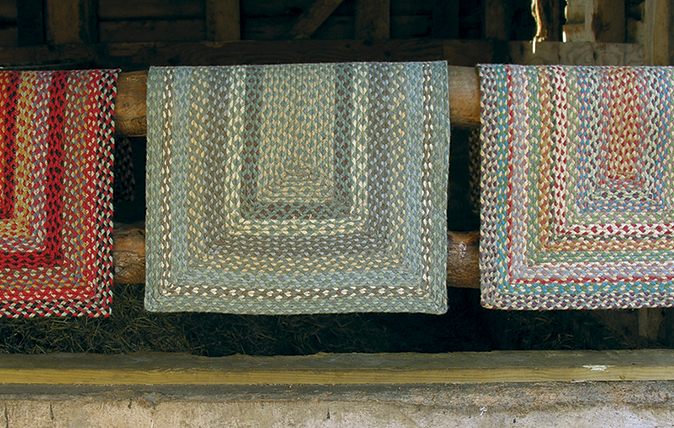
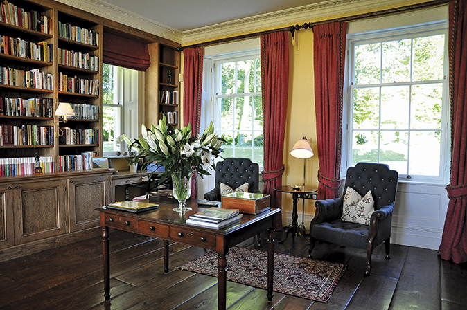
‘There are no ingredients more important than lots of books, lots of rugs, lots of pictures and lots of dogs to make a house feel instantly old,’ says the architect Ben Pentreath, whose shop Pentreath & Hall in Bloomsbury celebrates what might be called the Eric Ravilious aesthetic. ‘If you don’t have these, it will always seem suspiciously clinical and new.’
The dilemma faced by owners who have bought a newly built house, but don’t want it to look ‘out of the box’, is not a problem that faces Piers von Westenholz, the decorator, but he does, however, have a few tips. Fireplaces, club fenders, one very comfortable chair and sit-up, if not-so-comfortable, sofas – these are part of the recipe for an interior that’s welcoming, rather than brash. As are rugs (difficult to find good ones these days), curtains on poles (not swagged), side lighting (never overhead) and old-fashioned holland blinds made from polished cotton, which can, with difficulty, still be found.
Of course, cautions Roger Jones of Sibyl Colefax & John Fowler, clinical and new is exactly what suits Modernist houses, although that isn’t to say they can’t be comfortable. ‘There should be a table beside every chair with a lamp on it and somewhere to put a glass of whisky down,’ decrees Mr Jones.
Even interiors of this type can be enhanced by old furniture—perhaps a single 17th-century piece, set against a white wall as though it were sculpture, because ‘old things add a layer of depth and interest’.
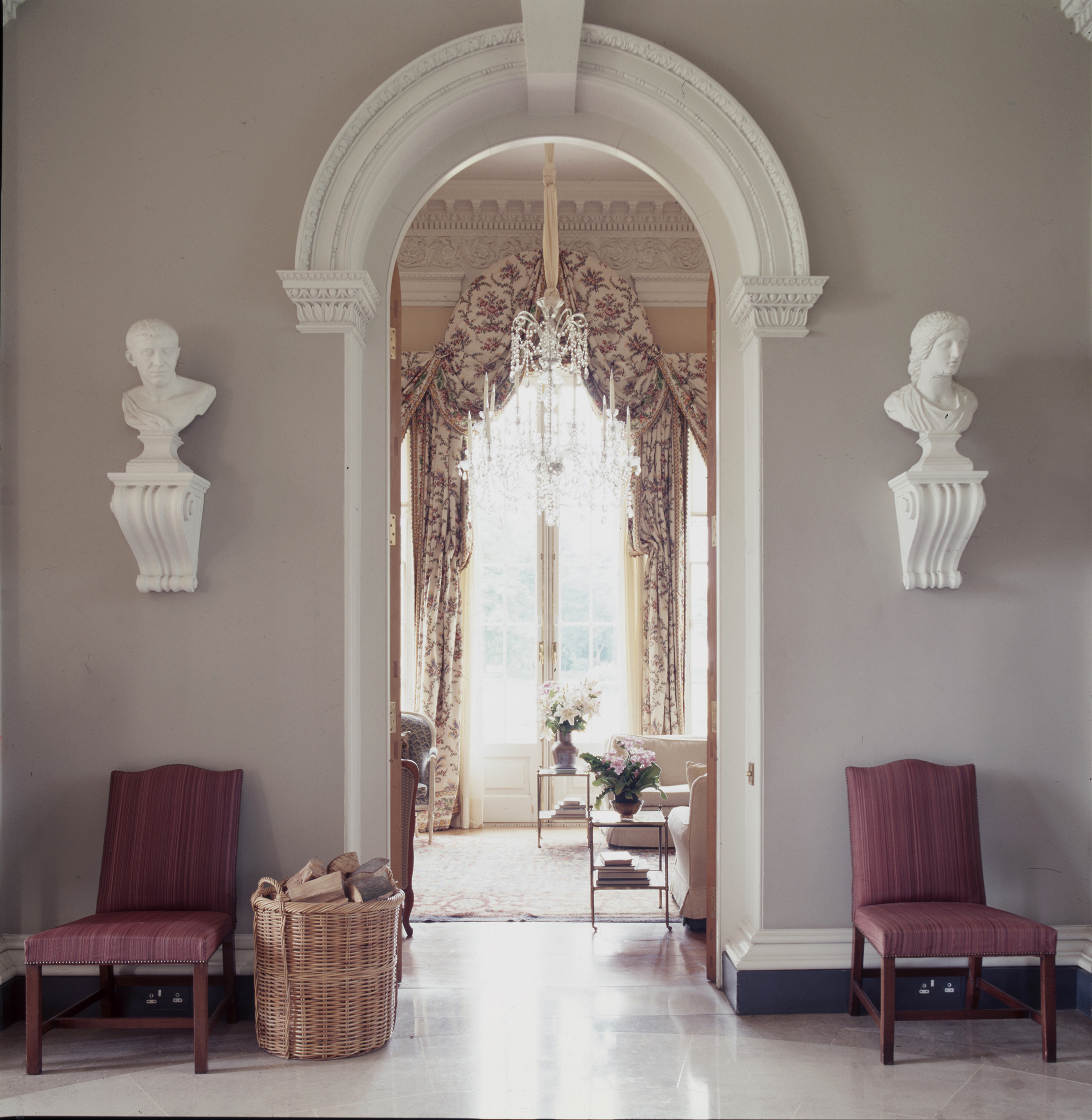
Modern Classical houses need a different approach. ‘I would always, always try to mix periods, so that there are some old and some new things, and one or two surprising things. You want to avoid the soullessness of a modern hotel,’ Mr Jones asserts. Although taste is less fussy and cluttered than a generation ago, a chair covered in chintz can still bring a room to life. Paper-backed linen introduces texture, without having to resort to the paint techniques – stippling, dragging and the rest – of the 1980s.
Paint
Don’t get Patrick Baty started about the importance of paint in adding character to a new interior. He runs Papers and Paints, founded in 1960 by his father, and has recently published a mighty volume on paint, its history, aesthetics and science, called The Anatomy of Colour (Thames & Hudson). If you want depth, you need something other than than mass-market paints.
Exquisite houses, the beauty of Nature, and how to get the most from your life, straight to your inbox.
‘Many proprietary ranges are perfectly good, but the colours are, naturally, compounded in the most economic fashion, by mixing the minimum number of colourants – perhaps two or three. This makes them rather two-dimensional. Mixing four or five colourants gives greater complexity,’ says Mr Baty.
Although closely associated with the historic paint movement that began in the 1980s, he feels that ‘a lot of baloney’ is now talked about it. ‘What people are thinking about when they see a so-called historic paint isn’t the colour, but the connotation.’
It simply wasn’t possible for Georgian decorators, using the pigments available to them, to produce the harsh or shallow effects that result from modern colourants, meanly used. There’s nothing wrong with modern, mass-produced paint – it can always be altered with the addition of colourants by someone who is prepared to experiment.
Joinery
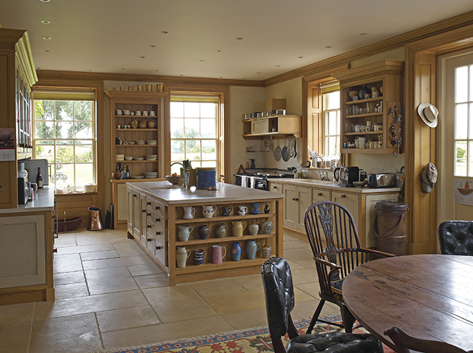
Mystic depths can be found in this subject when you talk to a master, such as Bruce Hodgson, the founder of Artichoke. ‘There are ways to accelerate the ageing of wood, but they double the time that the job takes, the workmen are difficult to find and the result is expensive. So you have to pick your battles carefully,’ he warns. The basis of everything is the use of correct materials: lime for plaster and hardwood or larch for joinery, because the grain grins through the paint surface – avoid MDF.
Doors must be the right depth: not 35mm, as standard these days, but the old 1¾in. Use polished, not lacquered, brass for door furniture and eschew lacquered furniture that ‘looks plastic-wrapped; shellac is a natural material and the application of many more layers gives depth’. These days, laser technology can produce an amazing accuracy of finish, but there’s such a thing as too crisp.
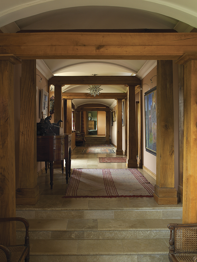
As the Japanese have long known, imperfections have their own beauty and must be produced by the human hand. ‘The paint around doorhandles can be rubbed so that the patina changes and then it won’t feel that the door has just been unwrapped,’ Mr Hodgson advises.
Then there’s a lesson that he learnt from the decorator Nicky Haslam. ‘You can’t design everything,’ he was told, when proposing an imagined improvement to some detail. ‘Quirks and oddities that leave the furnished room feeling slightly unthought-through can add personality.’
Mouldings should be appropriate to the period of the house, perhaps with a sequence of styles to suggest a progression in the supposed building history. Some gradation in quality is also desirable, from the more basic standard of what would have been servants’ rooms to the splendour of the principal reception rooms. ‘You instinctively feel that the house is changing as you walk through it,’ enthuses Mr Hodgson.
Architectural details
‘Rooms don’t all have to be of the same period,’ says architect Ian Adam-Smith. ‘They can look as if they have evolved through changes of level, changes of ceiling height. But this is easier said than done.’ As the architect Mies van der Rohe, who was not a Classicist, put it: ‘God is in the details.’
‘There are small things that can be huge things when you live with them everyday. Doors that open the wrong way feel horrible,’ cautions Mr Adam-Smith. Plaster cornices are not desperately expensive and good ones can be bought off the shelf.
The tragedy is that so many faux pas could be avoided at no extra cost. ‘Doors that are slightly too high and slightly too narrow look mean. In a simple Georgian house, an extra wide door, which is slightly lower than usual, always seems to go well. These proportions could be made standard. Wouldn’t it be wonderful if we could set a new standard of door size!’
This article was first published in Country Life in 2018

10 new builds you need to see right now
New-builds and developments with a fresh outlook.
The best country house builders, craftspeople and specialists in Britain
Whether you're embarking on a new-build or painstakingly restoring a listed building, here are the craftsmen with excellent foundations.