The new look in kitchens isn't chic and sleek — it's decorated and pretty
There’s no reason why a kitchen can’t be pretty; Arabella Youens speaks to designers who've made it their mission to bring charm and comfort to the most-used room in the house.
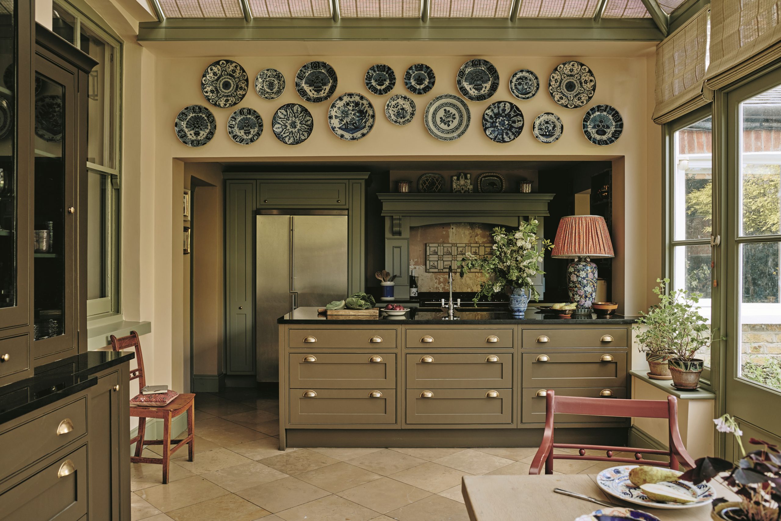

This is the kitchen conservatory of a Victorian former rectory in Wandsworth, south-west London. It was redesigned and refurbished by Tamsin Saunders of interior-design studio Home & Found. With an eye for colour and composition, Mrs Saunders is known for conjuring projects that look far from ‘done’ and avoid the ubiquitous or trendy — this isn’t somewhere to find a scalloped-edge piece. ‘It’s the one-off character that makes homes special and interesting,’ she says.
From the outset of this project, which involved redecorating the entire house, the main task was to bring colour and balance into ‘greige’ interiors. When it came to the kitchen, making use of existing furniture and joinery was also important. The cabinets, dresser and Plain English chairs were repainted in four different, but harmonious earthy tones inspired by Nature.
‘It’s my mantra: in Nature, you never have one solid colour, everything is in different shades,’ explains Mrs Saunders. ‘I regard a room as a three-dimensional canvas with a composition. It sounds too simplistic to say it’s then a question of colouring in; it’s also about adding depth and texture so that it fires up emotions as soon as you walk inside.’
‘It’s important to distract people from functional details — That means proper furniture and attractive lighting’
It is this approach that results in a room that is far removed from a more traditional fitted kitchen, where matching wall-to-wall cabinetry is painted uniformly in one or sometimes two colours. Here, as a result of the layers of greens, the once-prominent shiny black granite worktops and stainless-steel fridge are almost absorbed into the background.
‘The dresser is painted in a brown, which my client didn’t like at first until I pointed out it was the colour of soil,’ says Mrs Saunders. Another element she tries to avoid is having white window frames; here they’ve been painted in a leaf green to connect with the garden. ‘White windows look like over-whitened teeth to me. It’s too strong a colour on woodwork, especially if you want things to be soft and recede.’
Next, it was time to decorate the space as a room, rather than as a purely functional kitchen. Behind the range cooker, tiles that had been used as a splashback were removed and the plasterwork left bare. A collection of Delft plates and chargers hangs on the wall above the kitchen island. ‘I bought these from a dealer who was retiring and was inspired by having recently been to see a Vermeer exhibition,’ she says. ‘I love the softness of the Dutch Masters, as well as the colours of blue and sage together.’ Mrs Saunders also added a selection of copper lustreware arranged on a set of old French shelves, which are hung on the wall by the island.
Emma Burns, joint managing director of Sibyl Colefax & John Fowler, took a similar approach to her kitchen/dining room in her Oxfordshire home, a former dovecote.
Sign up for the Country Life Newsletter
Exquisite houses, the beauty of Nature, and how to get the most from your life, straight to your inbox.
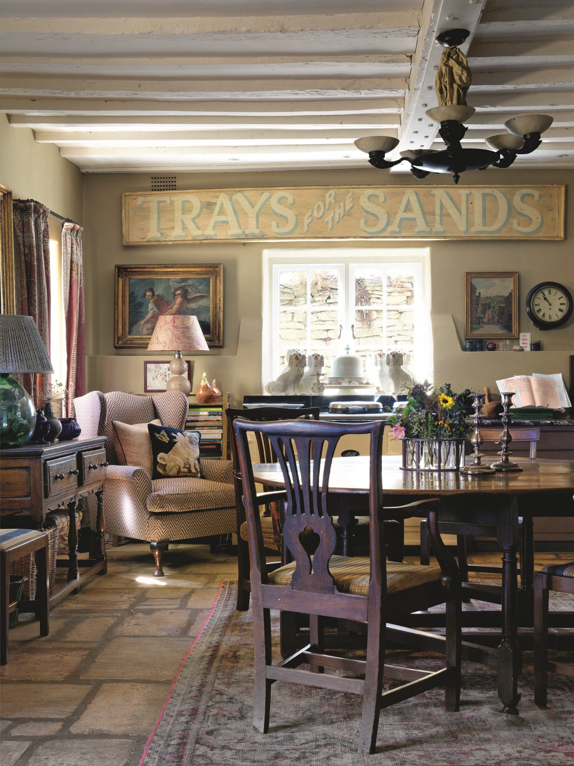
‘My initial issue is that I’ve only got two downstairs rooms: a kitchen and a drawing room with a hall in between,’ explains Miss Burns. ‘In order to create a more multi-purpose space, I decided against wall-hung cabinets and, apart from a few purpose-built cupboards, used a chest of drawers with a marble top and a dresser as storage and work surfaces.’ A deep butler’s sink is useful for stashing plates during a dinner party, as is a larder to the left of the sink that can house the next course out of sight.
‘It’s important to have theatre to distract people from more functional details,’ she continues. ‘That means having proper furniture and attractive lighting.’ A sign, which was a prop left over from a television advert for Mr Kipling cakes, straddles the wall above a window. ‘Then there are various paintings of old rellies to look at, too.’
The modest amount of preparation area fortunately doesn’t faze her, having learned to cook on a 24in surface using only a two-ring burner at Cordon Bleu. ‘I get nervous if there’s too much space and only make more of a mess,’ she adds. An upholstered armchair is another detail that helps to blur the boundaries between function and form. It stands to the side of the Aga.
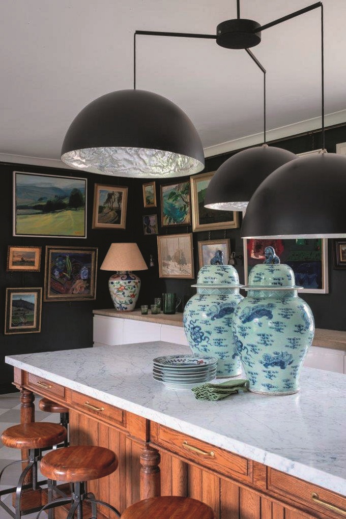
Henriette von Stockhausen, creative director of VSP Interiors, recommends viewing these kitchen living spaces as a further living room. ‘Treat it as you would a drawing room or master bedroom,’ she says.
‘I incorporate antique furniture, such as dressers and chefs’ tables, alongside art that has a high impact. A tapestry can create a brilliant focal point behind a dining area or work surface — and is also good for absorbing sound.’ Another route to adding a strong decorative element to a kitchen is to eschew painted walls in favour of wallpaper. ‘I would always recommend it,’ she says.
Good lighting makes a substantial difference in the way a kitchen looks throughout the day and night, as well as forging the gap between a kitchen and living room. ‘Always have three levels of lighting,’ recommends Miss von Stockhausen, who, as does Mrs Saunders, favours adding built-in table lamps to islands and countertops (ideally, for wiring reasons, these need to be planned in early during the design stage). ‘I’d also always choose directional wall lights over work surfaces, rather than those hidden under cabinets,’ adds Miss von Stockhausen.
A vintage lamp on the island of the kitchen designed by Mrs Saunders adds a focal point and softens some of the harder surrounding surfaces. It’s a detail such as this that results in a home that is both original and unique. ‘You don’t have to buy things that fit in perfectly to a scheme,’ she says ‘I really encourage people to include something that’s a bit random or a bit “off” in the mix — that’s what makes rooms more attractive.’
Credit: Christopher Horwood via Sims-Hilditch
Creating a 'statement island' that defines a kitchen without overwhelming it
Elegant proportions and soft hues offset the dramatic scale of this kitchen in the Cotswolds. Amelia Thorpe takes a look.
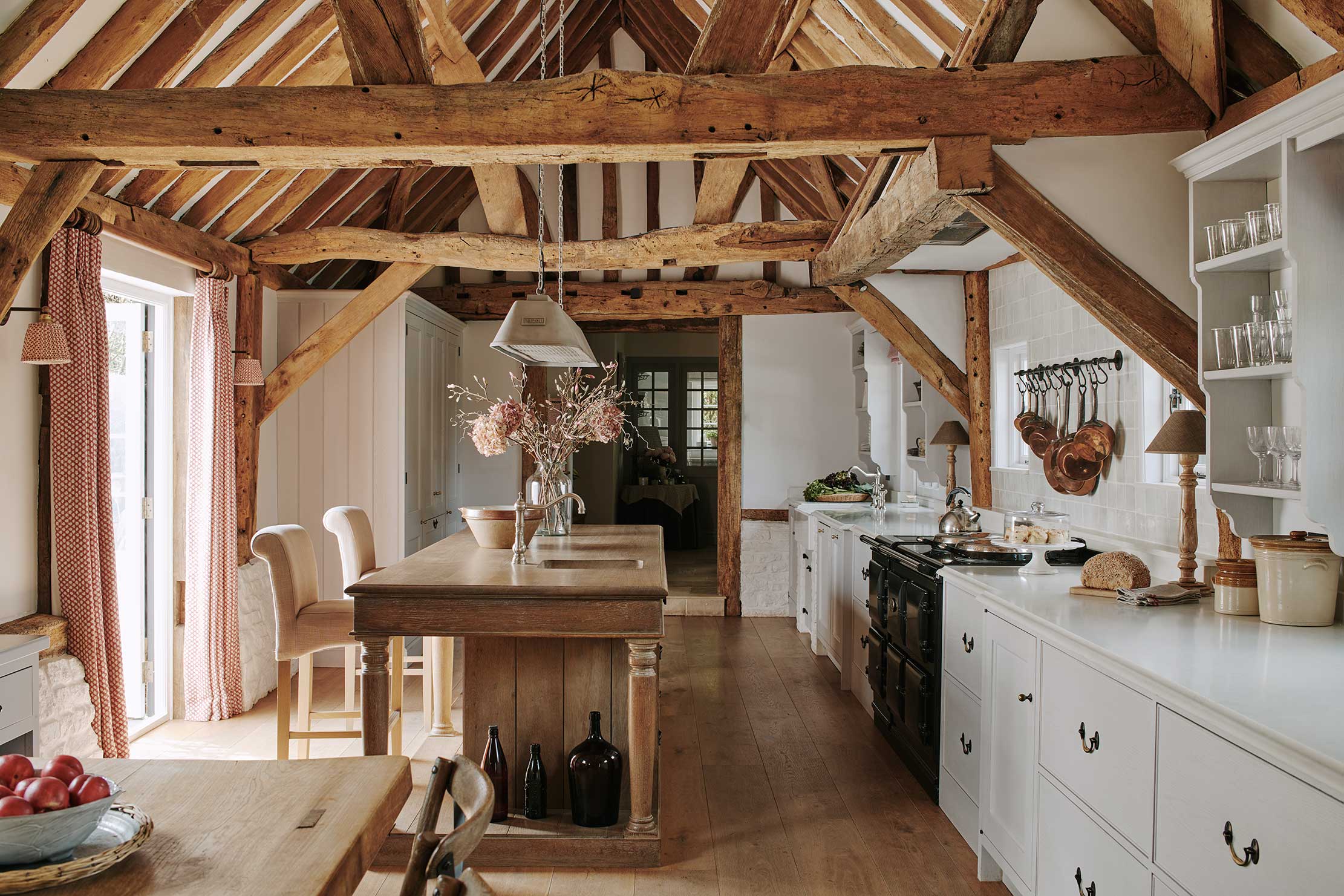
A modern kitchen perfectly framed by the exquisite ancient beams
Artichoke designed a discreet and timeless kitchen to complement a converted granary. Amelia Thorpe takes a look.

Credit: Tom Howley
Yes, you can put a new kitchen in a Grade I-listed house — and this beautiful example shows how
Traditional cabinetry was a key ingredient in the sympathetic restoration of a Grade I-listed Tudor house in Shropshire.
-
 Diamonds are everyone's best friend: The enduring appeal of one of Nature's sparkliest treasures
Every diamond has a story to tell and each of us deserves to fall in love with one.
By Jonathan Self
-
 RHS Chelsea Flower Show: Everything you need to know, plus our top tips and tricks
Country Life editors and contributor share their tips and tricks for making the most of Chelsea.
By Amie Elizabeth White