The key to a great bathroom? Make it feel more like your sitting room — even to the point of having an armchair next to the bath
Flora Soames is on a mission to encourage more and more of us to embrace the concept of the decorated bathroom.
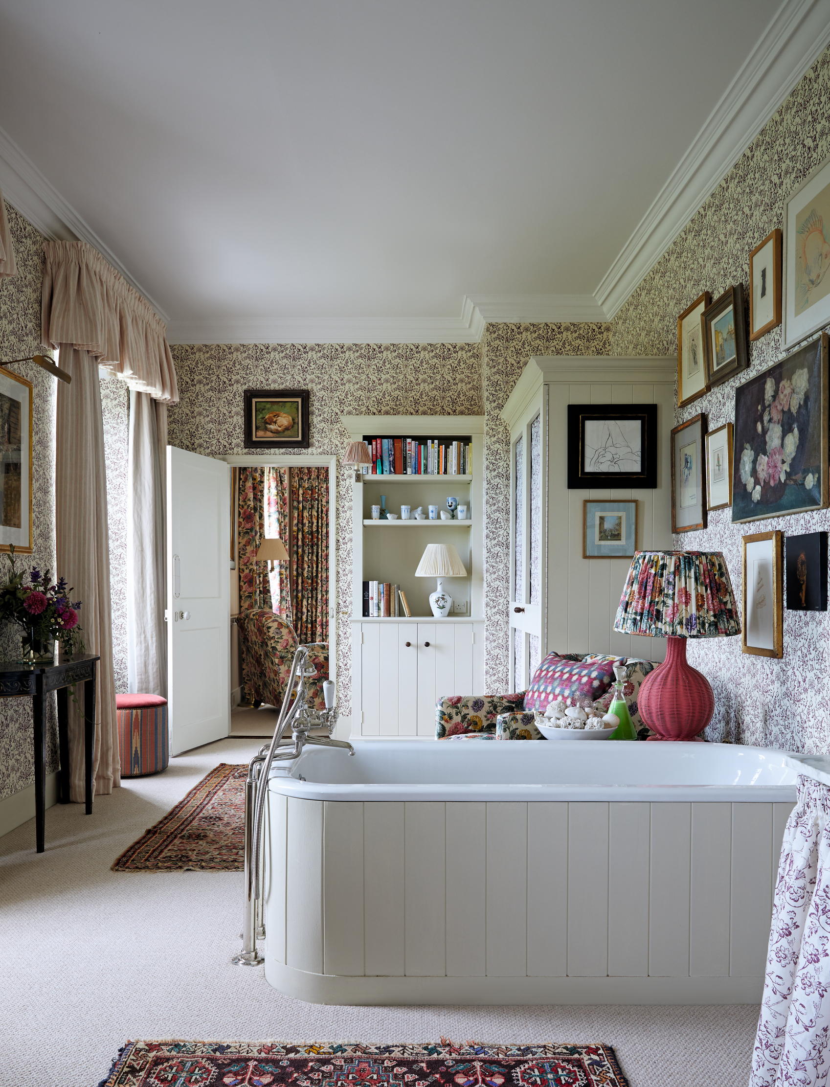

I spend a lot of time in my bathroom — specifically, in the bath. Not being a shower person, I find that a bath is ideal for winding down after a long day. It’s where I do some of my best thinking. When it comes to decorating bathrooms, I’m drawn to childhood memories. As a young child, bath-rooms are where you tend to spend time with your parents, have scraps with your brothers and sisters and hold important conversations about the day that has passed. The memories are (almost all) magical. My childhood bathroom in Norfolk was filled with characterful details: a series of illustrations decorated the wall above the bath, mounted on orange towelling. The bath itself was turquoise enamel.
Subconsciously, these memories have informed the approach I take to designing bathrooms in adulthood. First and foremost, despite being a functional room, it doesn’t have to be decorated in a perfunctory way. It should be wonderfully spoiling and can be decadent. The American decorator Nancy Lancaster is credited with spearheading this approach in English interiors. Before she arrived and tore up the decorating rulebook, guests in country houses had to set off, sponge bag in hand, to find a lino-floored room located somewhere down a corridor and heated by a single-bar radiator. Following her insistence for comfort first, bathrooms started to adjoin their accompanying bedrooms and were decorated like small sitting rooms, with pattern at the heart of them, artwork, blowsy fabrics at the windows and somewhere comfortable to sit.
Cecil Beaton believed it was important to live surrounded by what you like, so why should bathrooms be any different? Decoratively, I like to take a ‘more is more’ approach. The first bathroom shown here was designed for a busy family of six in a house designed by Quinlan Terry in the 1970s. It has the best out-look of all the rooms, overlooking the park beyond, with the bath positioned to take advantage of these views.
It’s the picture hang that underlines the bathroom-as-family-room approach, as well as the assorted bookshelves, cupboards and wallpaper. Many people worry about books and wallpaper in a bathroom, but it simply needs plenty of ventilation. We also put a protective varnish on our hand-blocked wallpaper designs, which helps. I also love having an armchair next to the bath, which makes it a place for everyone to come together.
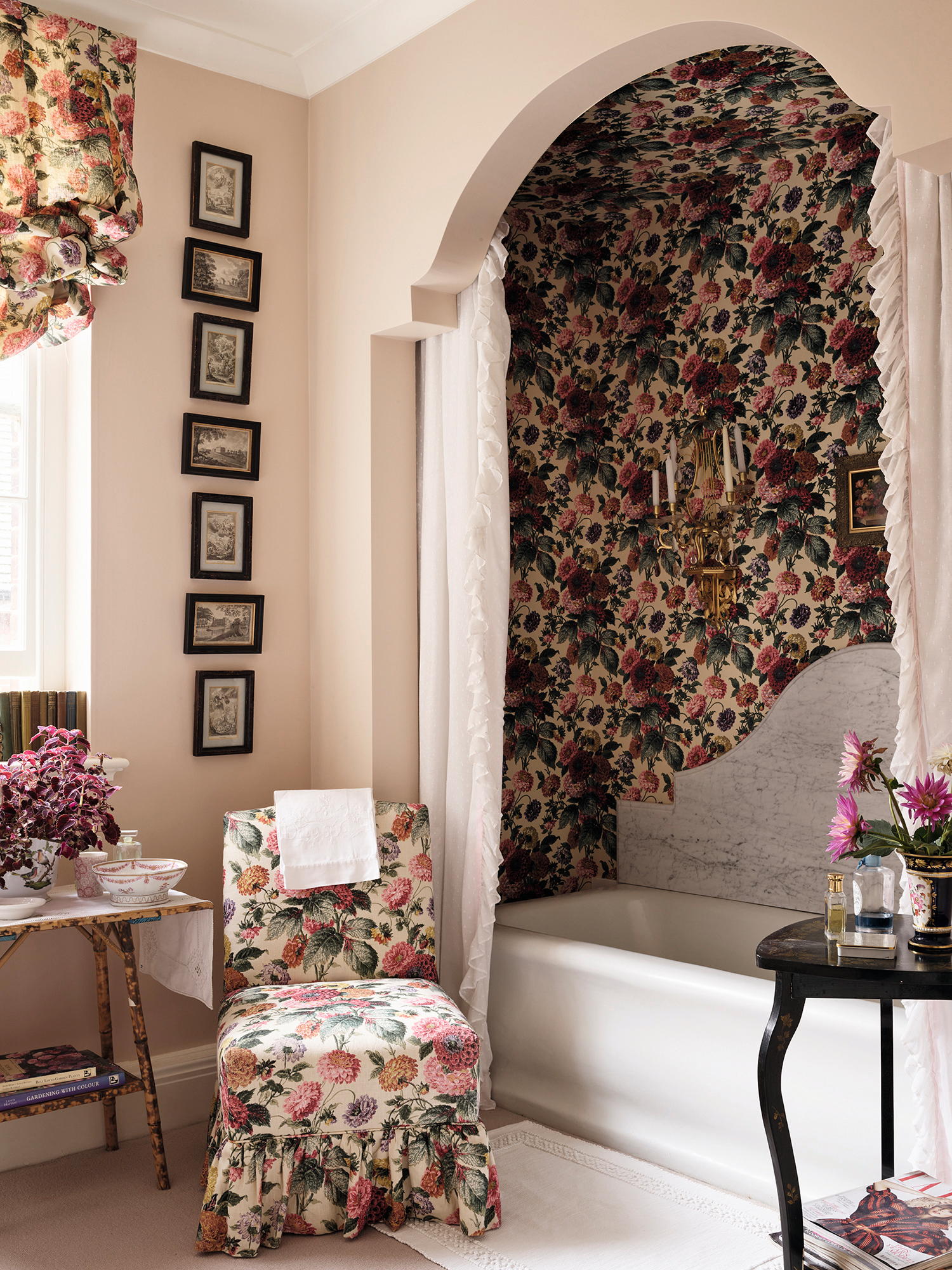
The bath alcove in the second scheme has a sense of theatricality that I like to introduce to bathrooms; somewhere slightly decadent that encourages one to luxuriate a little longer. Out of sight is another alcove for a shower that, despite not being visible here, is a firm fixture in my designs and as chic to decorate in its own right. The marble splashback plays to the shape of the opening, as well as the original Edwardian bath fittings.
My instinct was to keep adding layers to this room. The blind, slipper chair and alcove are in my Dahlias design, whereas the auction-sourced wall sconces were originally intended for the drawing room, until they found a home here. The spotted voile curtains were spontaneously rescued from an old tester bed. I often include a little stool or a fabric skirt around the sink to add softness in contrast to the hard surfaces. Do consider the lighting, too: wall lights at face height are much more flattering than those fitted overhead.
Flora Soames — 01747 445650; www.florasoames.com
Sign up for the Country Life Newsletter
Exquisite houses, the beauty of Nature, and how to get the most from your life, straight to your inbox.
Country Life is unlike any other magazine: the only glossy weekly on the newsstand and the only magazine that has been guest-edited by HRH The King not once, but twice. It is a celebration of modern rural life and all its diverse joys and pleasures — that was first published in Queen Victoria's Diamond Jubilee year. Our eclectic mixture of witty and informative content — from the most up-to-date property news and commentary and a coveted glimpse inside some of the UK's best houses and gardens, to gardening, the arts and interior design, written by experts in their field — still cannot be found in print or online, anywhere else.
-
 A villa from paradise on Koh Samui where the pool might be bigger than the house
Situated on the Samujana Estate, a filming location for the White Lotus, Villa 24 has got it all
-
 ‘Greece — it’s eternal and makes me feel ancient and youthful at the same time’: Isabel Ettedgui’s Consuming Passions
The owner of Connolly reveals what she would take to a desert island and why she once waited four years to get a supper reservation.
-
 The £27,600 wooden bathtub and other modern day marvels to create an unforgettable bathroom
When is a bath not a bath? When it's a work of art.
-
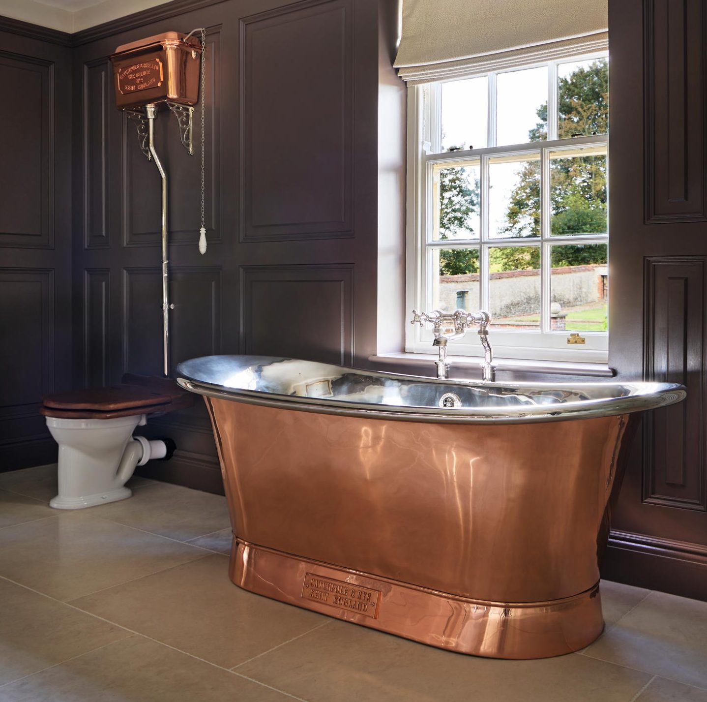 Soaking it up: Five brilliant bathubs
Make a bath an event, with these extraordinary bathrooms and bathtubs selected by Amelia Thorpe.
-
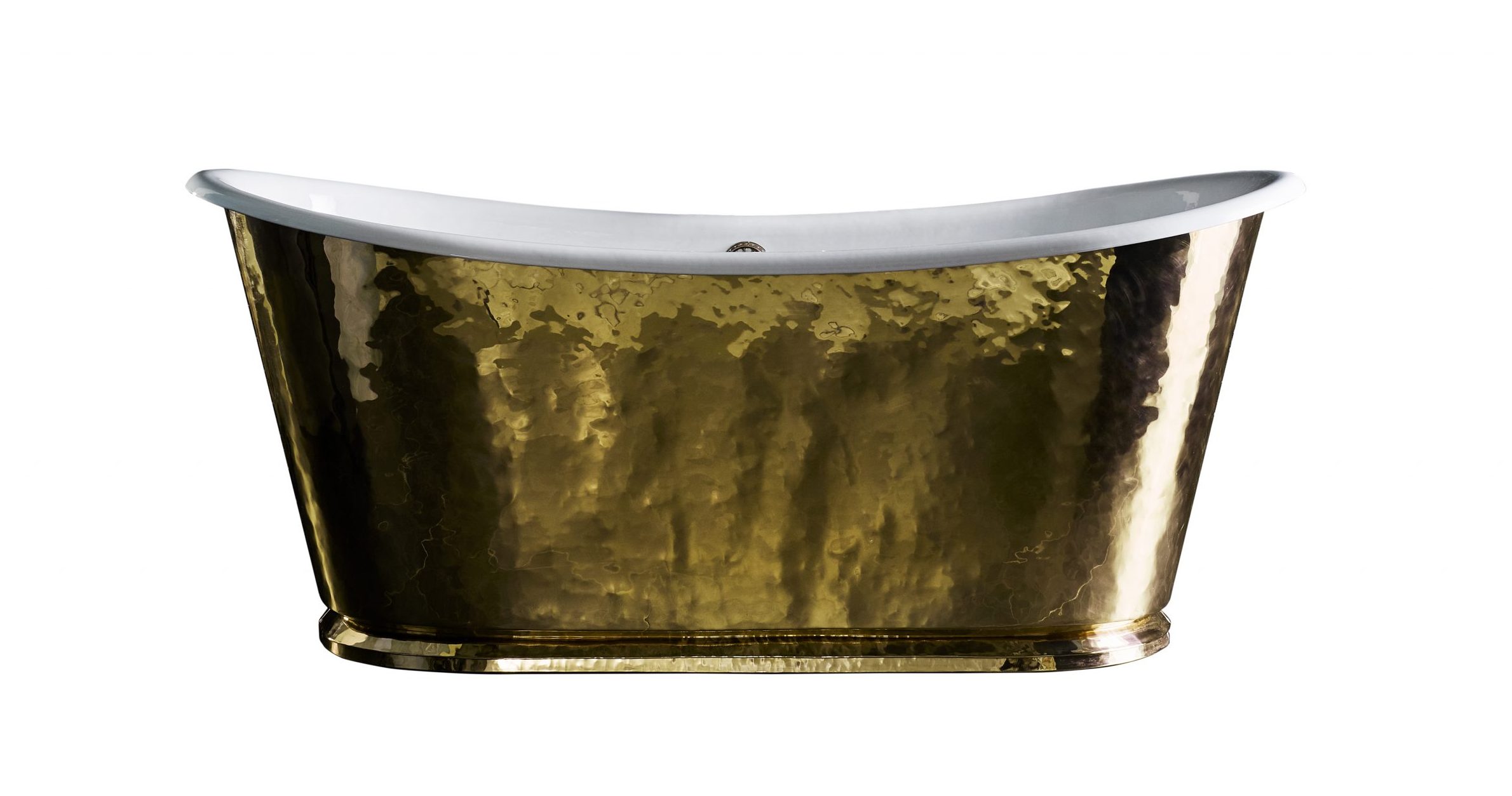 Best free-standing baths from £4,000 to £14,000 — for people who really want to splash out
Free-standing baths for making a statement — not to mention causing havoc with your bank statement.
-
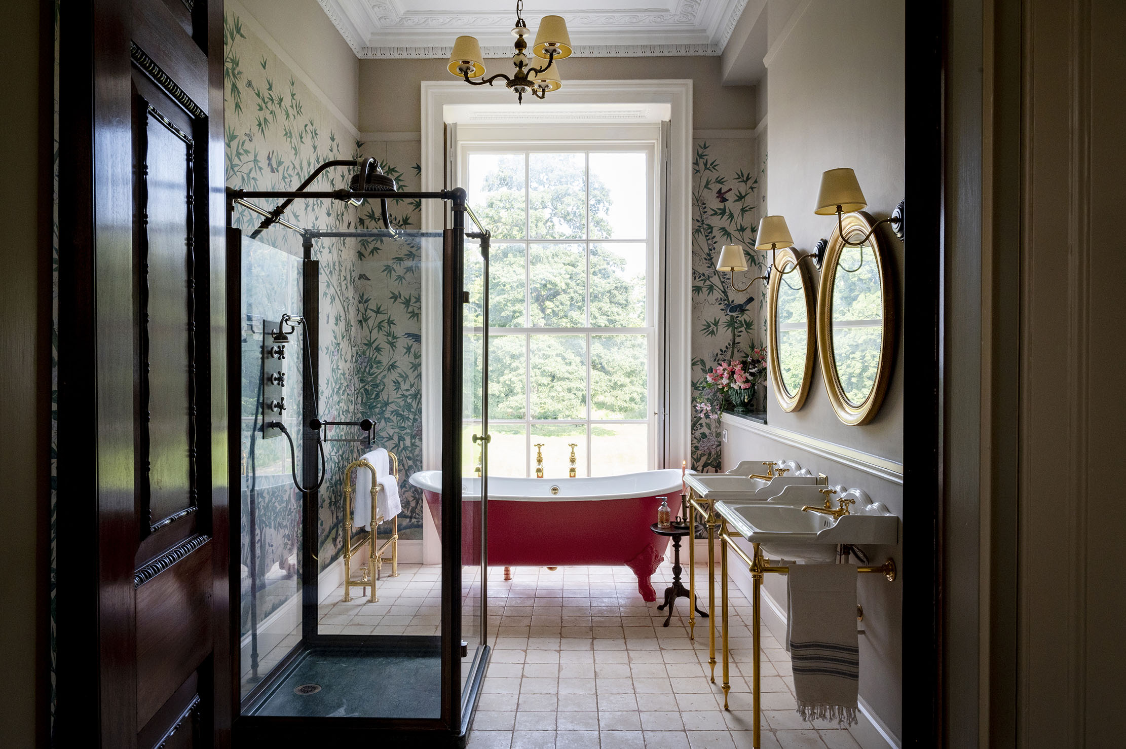 How a chance discovery of a wallpaper fragment inspired the look of this country house bathroom
A fragment of hand-painted chinoiserie set the scene for the decoration of this bathroom at Keythorpe Hall, Leicestershire.
-
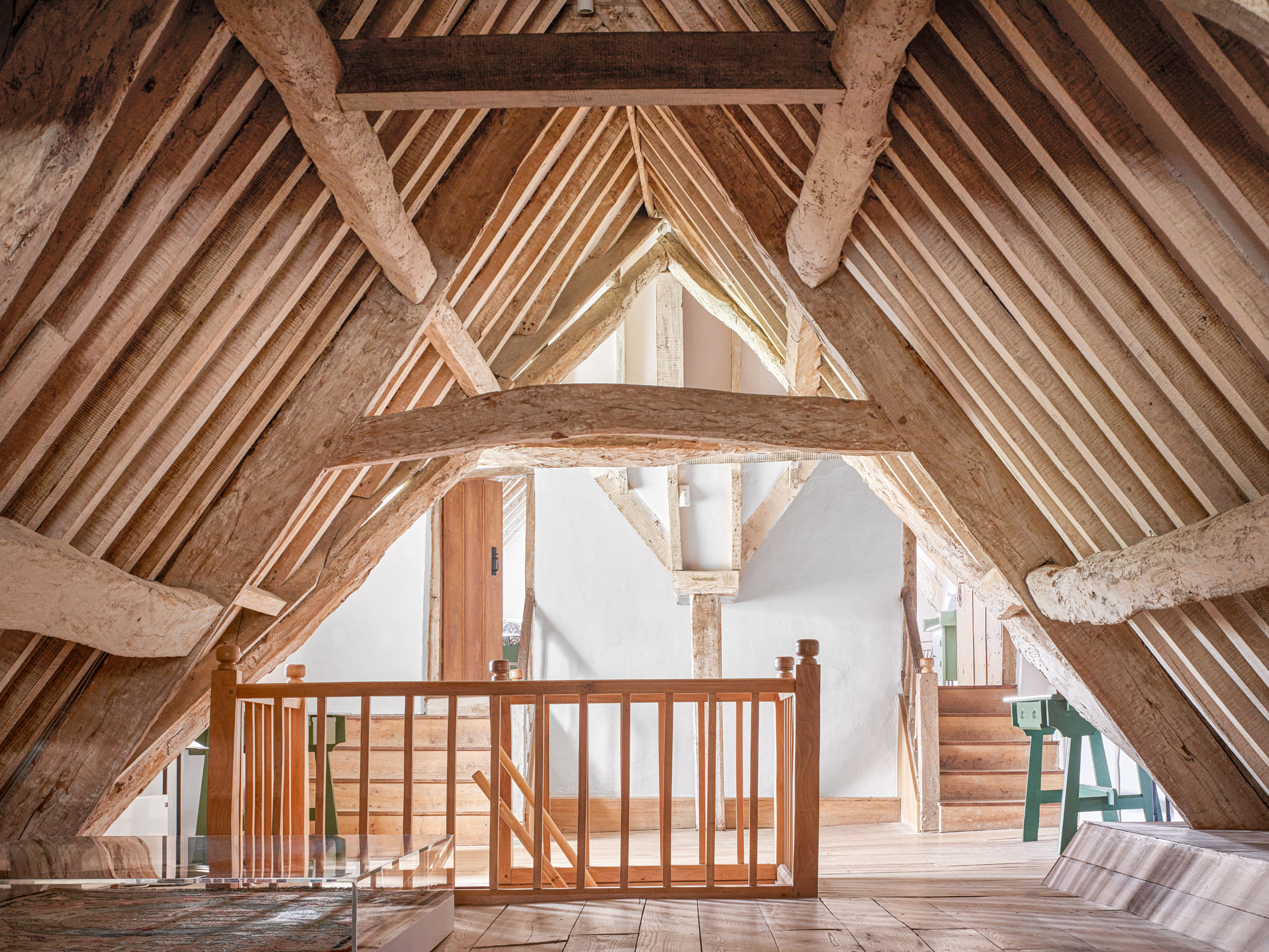 10 things I wish I'd known about doing up old houses before I started, by Country Life's interiors guru Giles Kime
Country Life’s executive editor and resident interiors expert Giles Kime shares the lessons he’s learnt from the experience of dragging a succession of houses into the 21st-century.
-
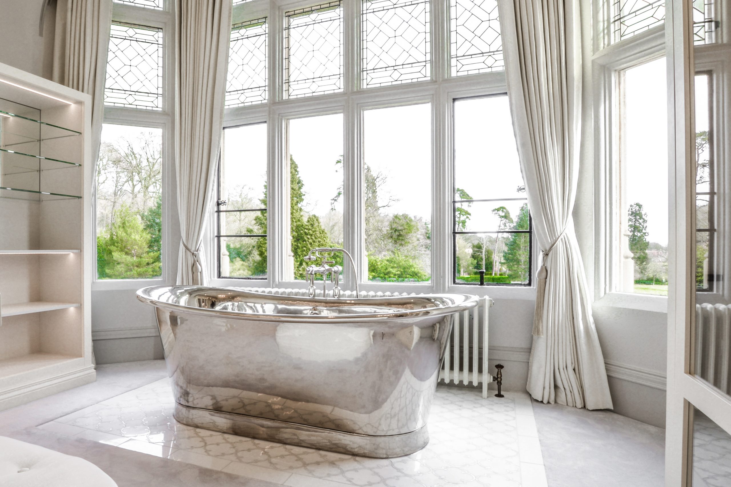 Breathtaking new looks for bathrooms, from linen and lights to a truly spectacular nickel bathtub
Elegant baths, vanities and accessories to add a touch of luxury to your bathroom, selected by Amelia Thorpe.
-
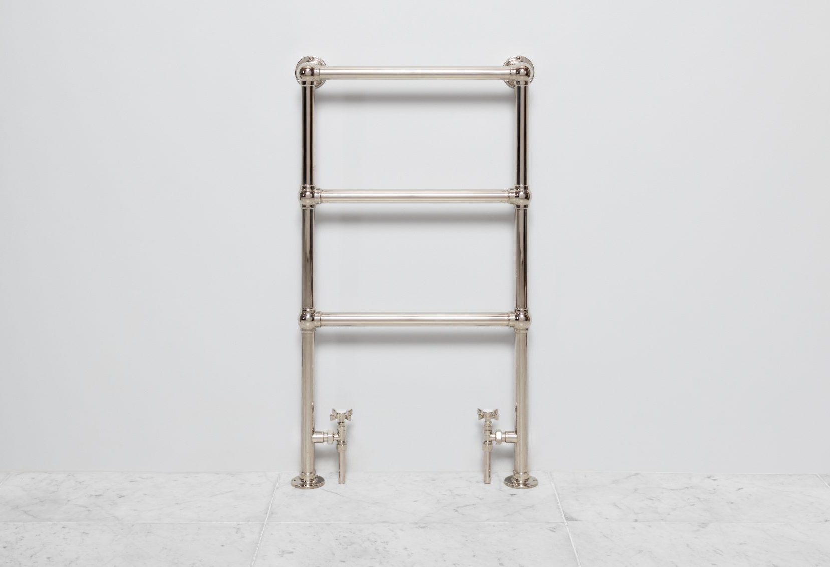 Everything you need to transform your bathroom into a stylish oasis, from patterned walls to elegant marble washstands
Ideas and inspiration as selected by Amelia Thorpe.
-
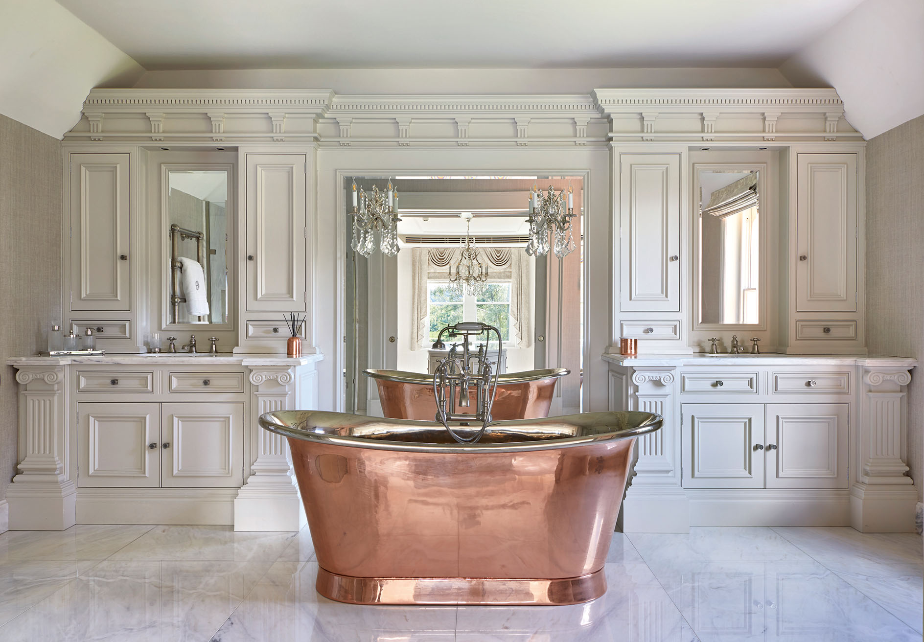 A magnificent copper bath at the centre of a wonderful Buckinghamshire bathroom
A striking copper bath and classically inspired joinery have brought this bathroom to life. Arabella Youens takes a closer look.