The future’s bright: New colour palettes bring life to period properties
Period houses are being treated to a jauntier palette of colours, says Giles Kime, as he explores bold beautiful hues for your home.

In the 1960s, Carlo Scarpa’s protracted restoration of Verona’s Castelvecchio eloquently expressed an eternal truth: you can restore a building sympathetically without riding roughshod over its past.
Fifty years on, not everyone has got the hint. Architects tend to get the blame for obliterating the character of a house, yet often it’s ham-fisted, over-enthusiastic decorators who are at fault, the sort who see their calling as a form of self expression and the word ‘fun’ as valid aesthetic terminology.
Needless to say, the results can be calamitous: witty wallpaper here, some token Modernism there, plus ‘statement upholstery’ that was the result of a ‘moment’ that should really have been allowed to pass.
It doesn’t have to be this way; although it’s only natural that every owner of a house should wish to make their mark, that’s all it needs to be, rather than being an exercise in unhinged eclecticism.
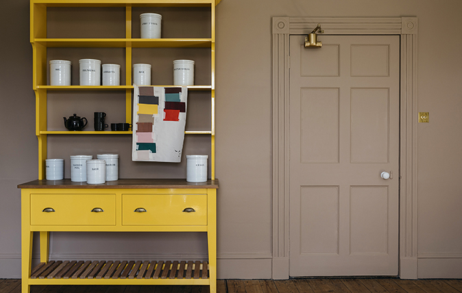
There are, however, signs that a new generation of designers is discovering that the secret to making a mark that’s sympathetic to old building lies in colour. Not grey, beige or even greige (a mix of grey and beige) but a bold, beautiful hues that bring a period interior to life.
One of the first was Farrow & Ball’s St Giles Blue, inspired by a fragment found at St Giles House in Wimborne St Giles, the 17th-century Dorset home of the Earl of Shaftesbury.
There’s a rainbow of others: Edward Bulmer’s Invisible Green and Little Greene’s Atomic Red, for example, and, now, a small but perfectly formed collection of a dozen colours that Plain English is offering to anyone who commissions its cabinetry. They’re a tasty bunch, ranging from the vivid-red Jam and sugary-pink Blancmange to the verdant Sprouts and the very yokey Boiled Egg. More fun than fun.
Sign up for the Country Life Newsletter
Exquisite houses, the beauty of Nature, and how to get the most from your life, straight to your inbox.
In the pink
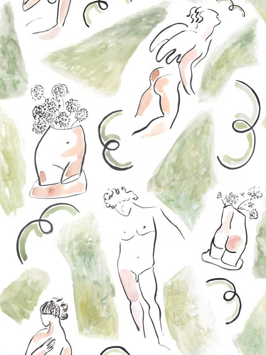
The above is not to say that fun and good taste are mutually exclusive. Common Room, a new wallpaper brand that’s a regular feature of Country Life’s interiors pages, specialises in paper that combines the two. One is the Bloomsbury-inspired Dressing and Undressing, which costs £130 a roll (07900 006309; www.commonroom.co)
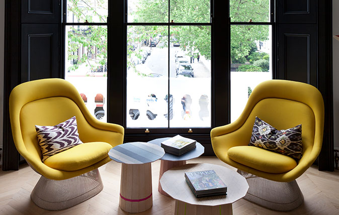
Credit: Black walls - design by Suzy Hoodless
How, and why, to decorate your house with black paint
Interior designer Suzy Hoodless reveals the secret to using black paint.
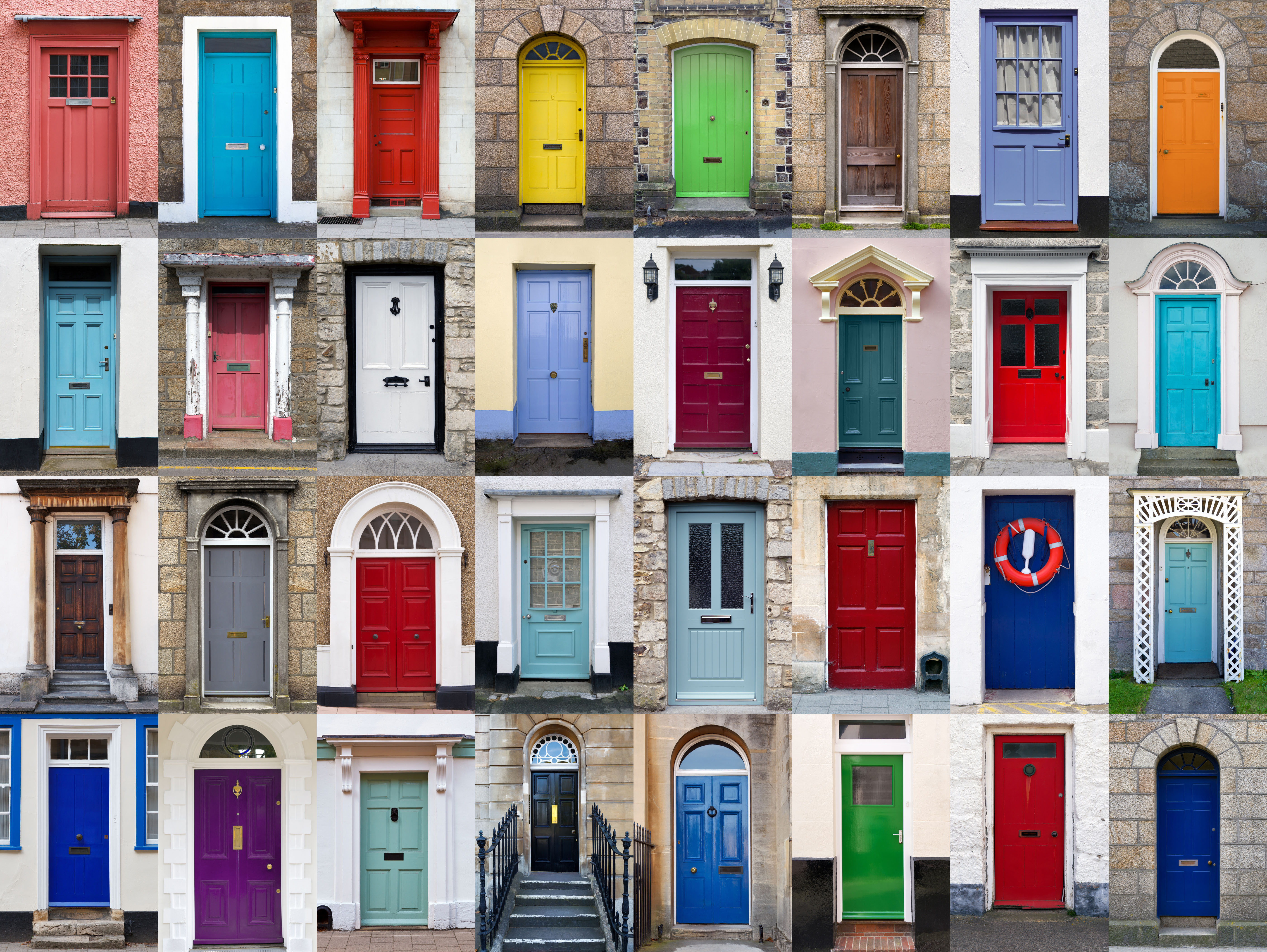
What's the best colour front door for selling a house?
If you're re-painting your front door, you'll end up going round in circles — especially if you're thinking of selling soon.
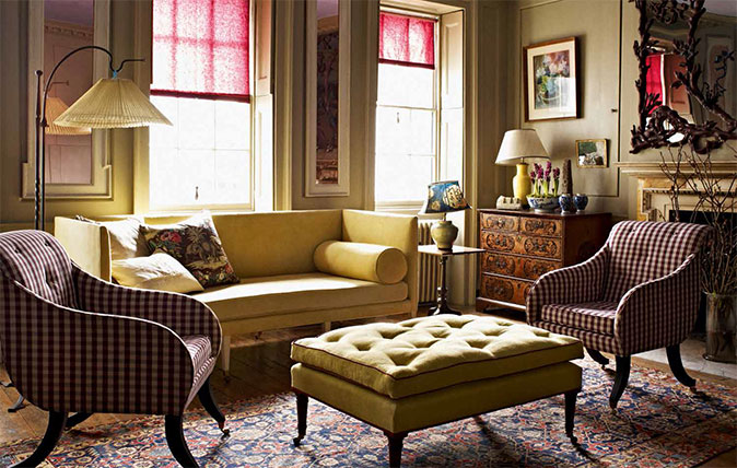
Blending antiques, colours and design to create a beautiful room
Giles Kime takes a look at the work of Max Rollitt, focusing on this beautiful room in an 18th century
-
 About time: The fastest and slowest moving housing markets revealed
New research by Zoopla has shown where it's easy to sell and where it will take quite a while to find a buyer.
By Annabel Dixon
-
 Betty is the first dog to scale all of Scotland’s hundreds of mountains and hills
Fewer than 100 people have ever completed Betty's ‘full house’ of Scottish summits — and she was fuelled by more than 800 hard boiled eggs.
By Annunciata Elwes