Open plan or keep things separate? There is another way, as this farmhouse kitchen shows
Opening up space either side of a chimney breast transformed this kitchen and dining room, designed by Susie Atkinson
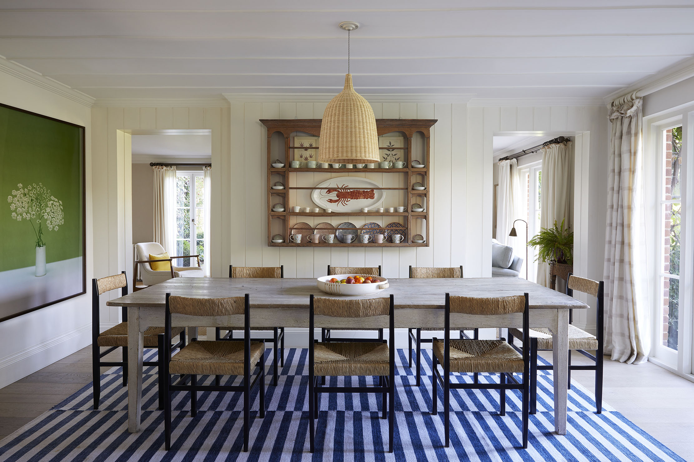

When Susie Atkinson and her husband, Justin, bought a home in Hampshire in the late 1990s, they added an extension to the main building to create a new family-sized kitchen and living room.
Originally, these two rooms were separate spaces, but, ‘as time went on, I realised that a lot of light came from the sitting room, so we decided to knock through to allow more to come into the kitchen — after all, it was where everyone gathered,’ explains Mrs Atkinson.
At the same time, she decided to add tongue-and-groove panelling to the walls and beading on the ceiling. ‘It seems like a strange thing to do as the ceiling heights aren’t high in this room, but it worked, because the detailing added some interest and stopped the ceiling from feeling low and blank.’
When it came to decorating, her approach was to let the art and ‘random pieces of china’ on the plate rack take the lead and to pull back on introducing lots of other colour and pattern.
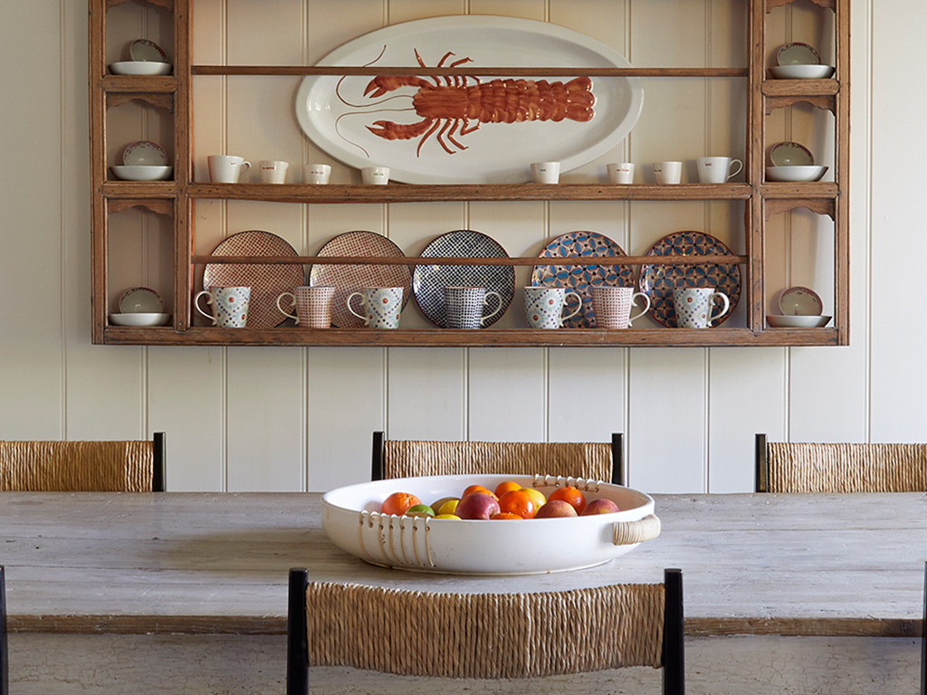
The farmhouse table was picked up at an antiques shop on Pimlico Road and the rush chairs are her own Craftmaker’s design, part of the Studio Atkinson Collection.
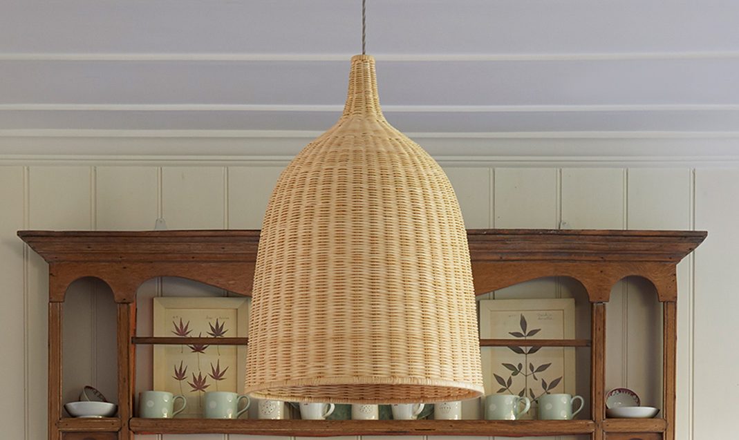
The lamp shade is ‘vintage Ikea,’ she adds. ‘I simply swapped the plastic finial for a china one.’
The framed photograph is by Kate Friend and was bought from the Lyndsey Ingram gallery in Mayfair, London W1. ‘It’s almost like a Dutch abstract and I love the way it ties in with the views of the garden.’
Sign up for the Country Life Newsletter
Exquisite houses, the beauty of Nature, and how to get the most from your life, straight to your inbox.
See more at Studio Atkinson — www.studio-atkinson.com
Credit: Susie Atkinson
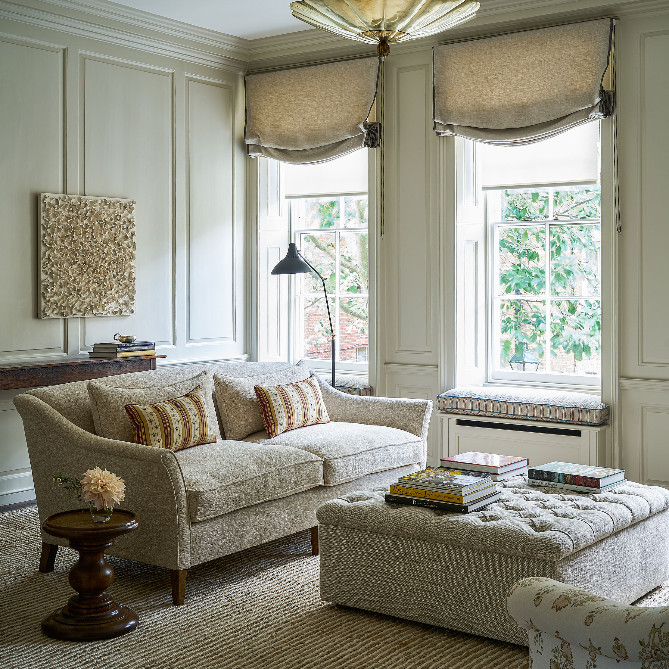
The transformation of a sitting room with just the right touch needed in a grand, Grade II*-listed townhouse
Susie Atkinson has taken a sympathetic approach to the interior of a Queen Anne townhouse in London. Arabella Youens explains
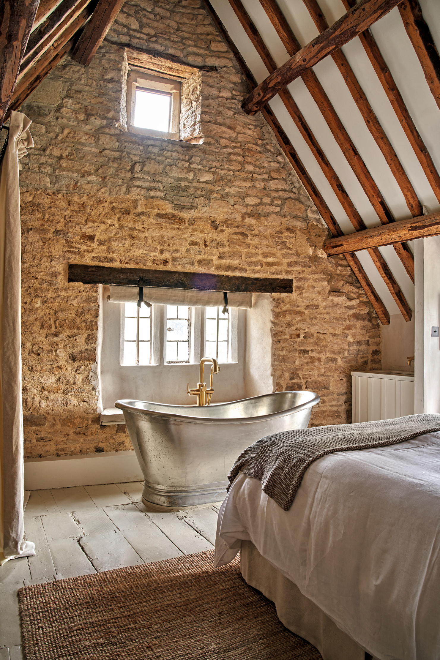
The best interior designers in Britain
Of all the decorating trends that have been in vogue over the last 50 years – be it Scandi, Minimalism
Credit: Designer Susie Atkinson
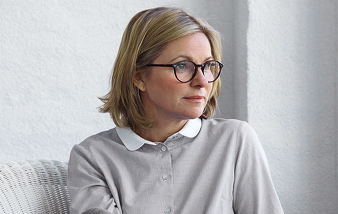
Designer secrets: Susie Atkinson on the keys to perfect lighting
Susie Atkinson, a designer whose projects include Soho House, shared her best lighting tips with Country Life.

Credit: Getty
Britain's best interior designers on the paint colours you just can't go wrong with
People across the country are using their time to decorate, and with the big companies still running delivery services you're likely
-
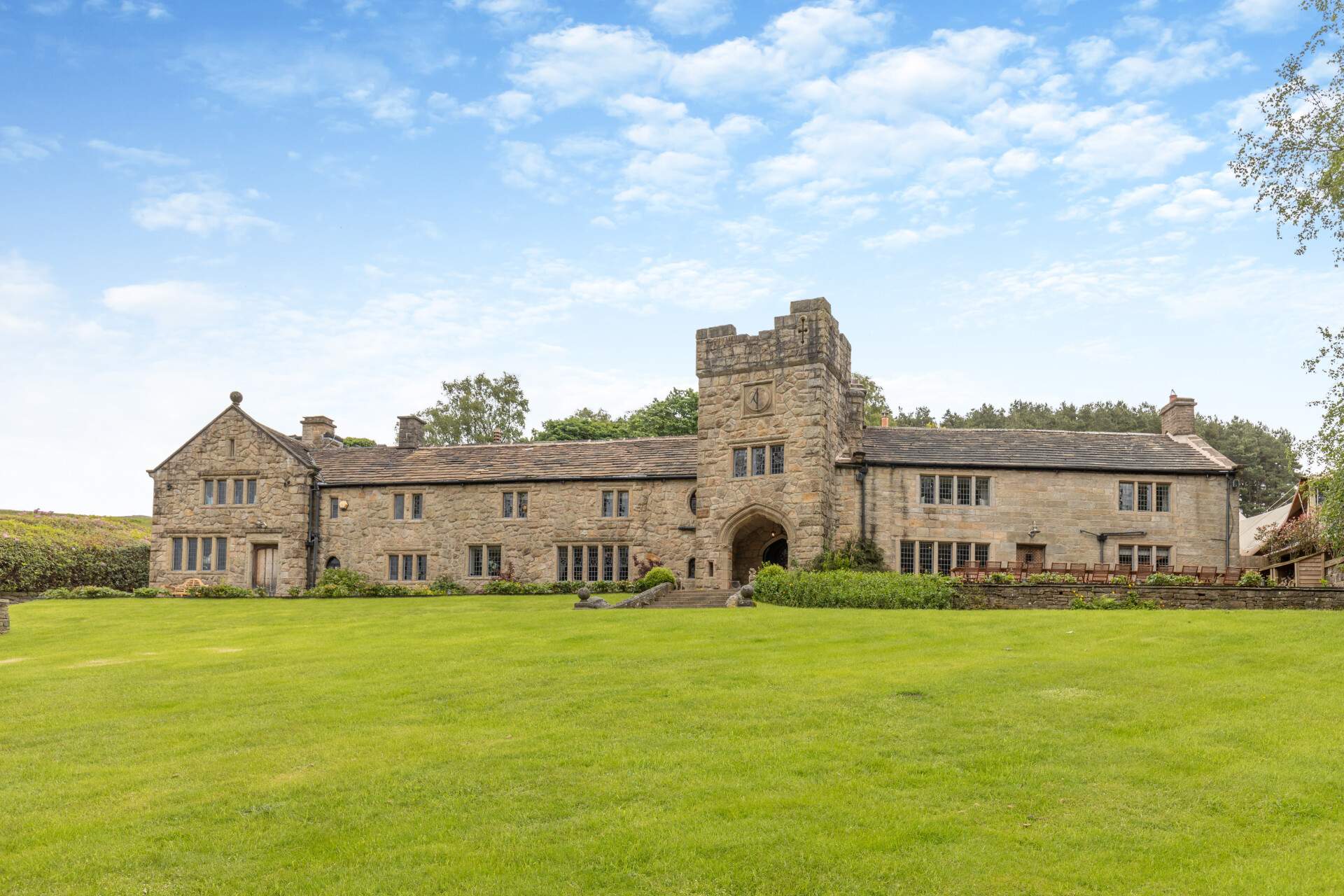 Some of the finest landscapes in the North of England with a 12-bedroom home attached
Upper House in Derbyshire shows why the Kinder landscape was worth fighting for.
By James Fisher
-
 The Great Gatsby, pugs and the Mitford sisters: Country Life Quiz of the Day, April 16, 2025
Wednesday's quiz tests your knowledge on literature, National Parks and weird body parts.
By Rosie Paterson