The man they call 'the paint detective' shares his 10 tips for choosing the right colours for your house
Patrick Baty can reveal a room’s colourful past using only the most scant evidence. He spoke to Amelia Thorpe about his life, his work – and his 10 tips for choosing the right colours for your house.
An obsession with colour has, at times, dominated Patrick Baty’s family life. ‘After reading a 17th-century reference to the fact that Shotover Common near Oxford was a source of the finest yellow ochre, I dragged my wife and young children there,’ he says.
‘When I noticed the spoils of yellow earth beside some rabbit holes, I emptied my youngest child’s baby-food jar, which I filled with earth and took home, where I washed, sieved and ground the earth with oil to make a beautiful paint.’
Today, he’s more likely to be found advising on paint in some of the country’s most remarkable historic buildings, from Hampton Court to Tower Bridge.

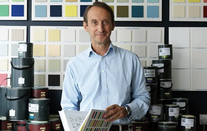
On resigning his commission as a cavalry officer, he joined his father, Robert Baty, who had founded Papers and Paints (www.papersandpaints.co.uk ) in 1960 on Park Walk in Chelsea – where it remains to this day.
This intimate knowledge of his field has given Mr Baty unique views on choosing paint, notably that the challenges it presents have changed little over the centuries. Many 21st-century hues are remarkably similar to their 18th-century antecedents, except with different names. Here are his tips.
Patrick Baty’s 10 tips on choosing the right shade of paint for your house
Start with the element of the room that you can’t, or won’t change
To choose a paint colour for a room, start with a given, be it granny’s curtains that you don’t want to throw out, upholstery or a rug. A paint colour can then be custom mixed to fit in with your scheme, which is easier than the other way round.
Don’t get overwhelmed by the choices – colours are essentially the same as they’ve always been
Today, we can have just about any colour we want, but too much choice can be overwhelming. During my research, I discovered that the ‘everyday’ house of the 1930s was typically decorated in much the same colours as one in the 1730s. Things don’t change that much. Cool Stone Colour or Warm Stone Colour might be called Gardenia or Magnolia now, but today’s favourite colours are essentially the same as they always were.
Don’t be afraid of being too conventional
Don’t think that following the decorative conventions of the past is a fuddy-duddy approach. The reason they are conventions is because they work. If you’re lucky enough to have an 18th-century house with skirting, lower flat-wall area, chair rail, upper wall and cornice, then following the decorative conventions of the period means you can’t go wrong.
The woodwork, which creates the framework of the room, would almost invariably have been painted in an off-white or Pale Stone Colour. Then, there are a number of conventions for the upper and lower wall: a darker colour above the chair rail and off-white, usually the same as the woodwork, below. If the ceiling is high and that creates a top-heavy appearance, a darker colour below and lighter above will create a more balanced look. Or you could choose the same colour top and bottom.
Keep it simple
I’ve analysed umpteen panelled doors and there was never a convention of picking out features using different colours, whatever some 20th-century decorators might have suggested.
Get inspired by the past
A good way to keep things simple is to use an appropriate palette of the past. In my book The Anatomy of Colour, I show how palettes were limited and developed over the years with the availability of new colours. For example, a set of colour cards produced in 1807 shows a palette that’s soft and comfortable, nothing brash or of the kind that would set your teeth on edge.
Think of your hallway as an external space
In the past entrance halls were typically treated as if they were external spaces, so they were usually painted in a stone colour, which was also cost-effective when covering larger areas.
Two-tone rooms can work brilliantly – and great country houses can show you the way
Some historic buildings can offer combinations of complementary colours that provide great inspiration: for example, the pale-pink ceiling and dark-green walls of the 1740s picture gallery at Temple Newsam in Leeds, or the dull green and Light Peach Blossom colours combined in the saloon at Uppark, West Sussex.
If you see an old colour you like, don't be afraid to go for it
Some colours from the past are delicious and worthy of revival, such as Burnt Oxford Ochre or Bronze Green, which is magnificent.
Don’t mix and match brands of paint
Buy paints from the same manufacturer – this will ensure a consistent level of sheen.
If you create your own paint, use plenty of different colourants
The expensive element of a tin of paint is the colourant. I discovered years ago, when my father taught me colour-matching, that you can make many colours by using only two colourants, but the resulting paints tend to be flat and lifeless. By making colours with up to five colourants, they will be much more complex and fully developed: under some lights, Lead Colour, for example, can have a slight blueness, and under others it can have a hint of warmth.
- -
The paint detective’s tricks: How Patrick Baty can tell the colours a room has been painted through the ages
‘When customers asked for a good “Adam Green” or a “Soane Yellow”, I was intrigued and started to research pigments,’ he says of his early days working with his father. He spent hours in the RIBA library studying paint manuals, some of which dated back to the 17th century, before employing his father’s colour-mixing skills to recreate the recipes.
Eventually, Baty pere et fils were able to reproduce all 136 colours from a volume first published in 1934 titled A Tint Book of Historical Colours – they are still for sale.
He compares analysing paint to ‘piecing together a jigsaw’. It involves collecting information from archives and examining samples the size of a fingernail, which he scrutinises under a microscope, looking at previous layers of paint and the underlying substrate.
Detective work reveals a lot: ‘Zinc oxide wasn’t used in paint until the 1850s; you won’t really see titanium dioxide until 1960; you can tell the years of the Second World War, because of lack of maintenance; and recognise October 1954 when painting was allowed again,’ he notes.
‘You can also tell the year 1956 on London exteriors, because of the remarkable effect of the Clean Air Act.’
