
One of the many joys of classic English and American decoration is the clarity of its four fundamental tenets: timeless good looks, comfort, a bit of creativity and nothing that will scare the horses. Stray into more modish genres and you find prevailing tastes being pushed and pulled between maximalism and minimalism in a relentless cycle of revolution and counter-revolution.
Colour plays a big part in the ebb and flow; in turning their backs on the rich palettes favoured by decorators in the 1990s, designers keen to create a pared-back style relied on countless shades of white that were applied not only to walls and furniture, but often to floors as well. In the following decade, colour was back and this time often applied to every element in a room, a practice known as ‘colour drenching’ — an easy way to achieve a brilliant quick fix for small, dark rooms where a cosseting atmosphere tends to be the best option. In the hands of fashionable designers, few family sitting rooms (estate-agent speak for what we used to call a television room) or gastro pubs escaped a good drenching in black, blue or deep burgundy.
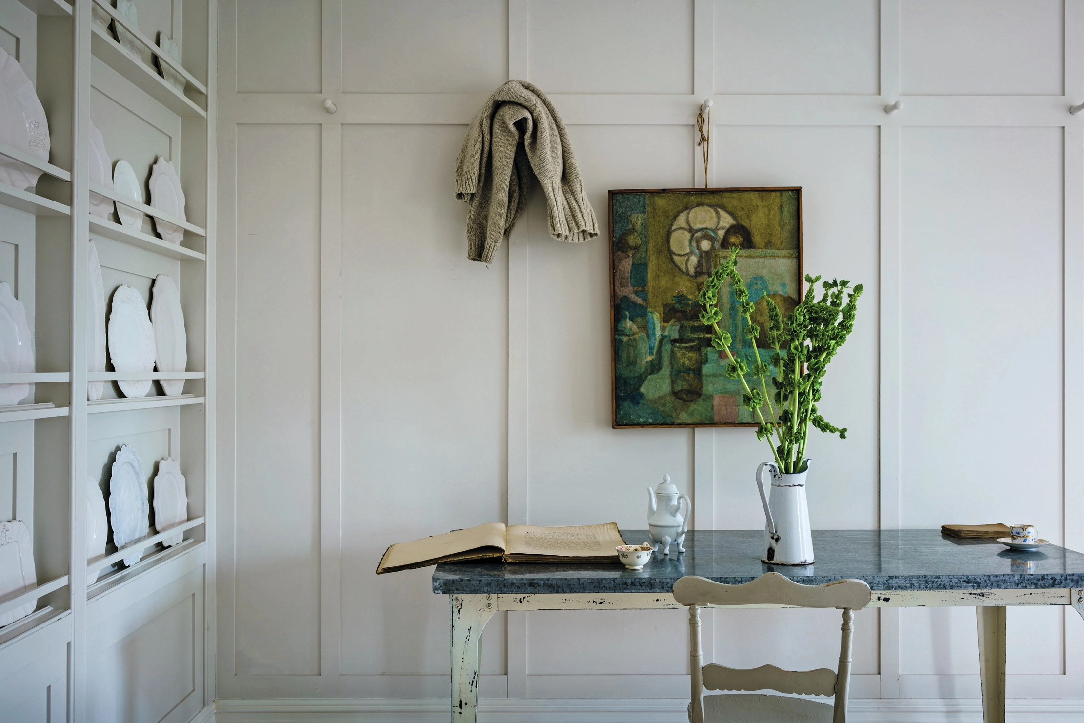
'Most whites have an almost imperceptible hint of some other hue–grey, green, red, yellow’'
Although they are far too polite to say so, decorators of the old school take a dim view of colour drenching (‘colour what?’ asked one, disingenuously, when I called to canvas her opinion), only occasionally employing it to give a coherent look to panelled rooms, usually in softer colours. Many are also wary of too much white, including Roger Banks-Pye (the late, great totem of 1980s decoration): ‘Although there are moments when white walls might seem a relief, those moments are rare and should be discouraged.’
But that was way back when; Banks-Pye died almost 30 years ago. Since then, a vast breadth of paler hues has proliferated. Most people with a couple of projects under their belt have their pet whites, but to the less experienced, negotiating this nuanced area can be intimidating (Farrow & Ball alone has more than 20 whites and neutrals and proudly proclaim that white is ‘never just white’).
Yet, when you get your eye in, you realise that there are horses for courses; most have an almost imperceptible hint of some other hue — grey, green, red, yellow — that lends them to different settings and colours. Dulux Brilliant White these are most definitely not. Getting it right is transformative.
As with any highly subjective area, there are rarely any straight answers; complex white schemes, colour drenching or a mix of the two are usually required to create a house that fulfils a variety of different purposes. It’s also vital to consider other elements; for the American decorator Elsie de Wolfe, colour was merely an integral part of the whole. ‘I believe in plenty of optimism and white paint, comfortable chairs with lights beside them, open fires on the hearth and flowers.’

WOW!house 2024: Six of the brightest ideas you'll see at the interiors event
Prepare to be dazzled: six designers currently dreaming up rooms for this year’s WOW!house share their plans with Amelia Thorpe.

'Not cheap... but cheaper than a divorce lawyer'
Driven to distraction by paint charts? A colour consultant could be the answer for anyone befuddled by choosing the right

Upon reflection: How to buy an antique mirror
Amelia Thorpe speaks to the experts from the world of antique mirrors to provide the best advice on brightening up

The ancient decorative painting technique enjoying a revival 2,000 years after being the talk of Pompeii
The infinite possibilities of decorative painting brought life to villas in Pompeii, Florentine palaces and Charleston in East Sussex. Today,


