How large-scale wallpaper can transform a space beyond recognition
Fortune favours the bold – in actions and interiors. Giles Kime explains how big and bold can make a small room look larger and what to avoid if your floor space is limited.
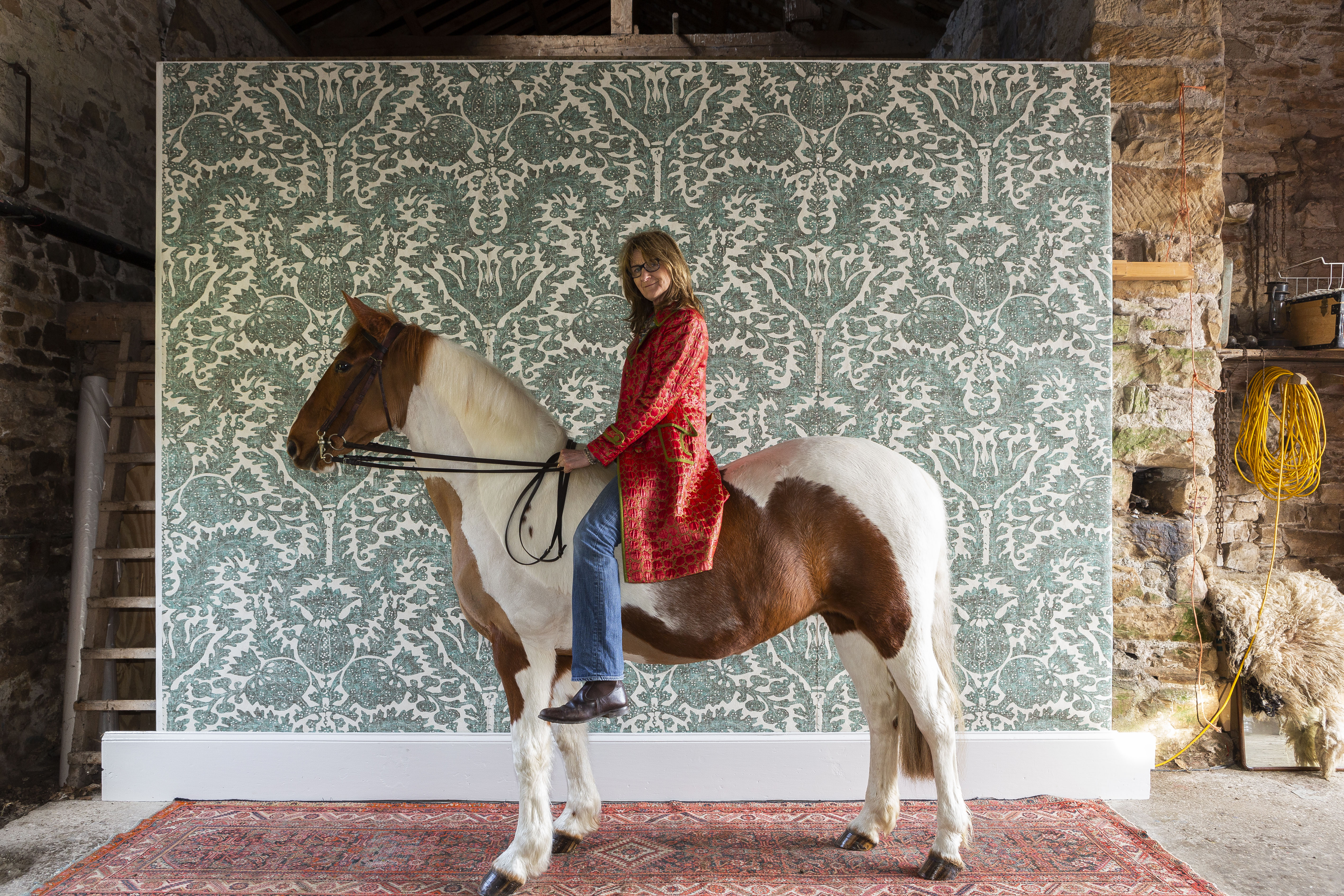

If there’s one thing you’ll learn from Design Thread, Kit Kemp’s third book on interior design, it’s that aesthetic bravery is as essential in the creation of a beautiful room as a paintbrush, a ladder and a bolt of fabric.
Mrs Kemp, creative force behind some of London’s most stylish hotels, not only employs a heroic use of colour, but also refuses to be bound by conventional wisdom, which dictates that furniture, lighting and artwork should politely respect the proportions of rooms they occupy. Her larger-than-life pieces dominate the spaces she brings to life in a way that is exuberant, without being remotely overbearing.
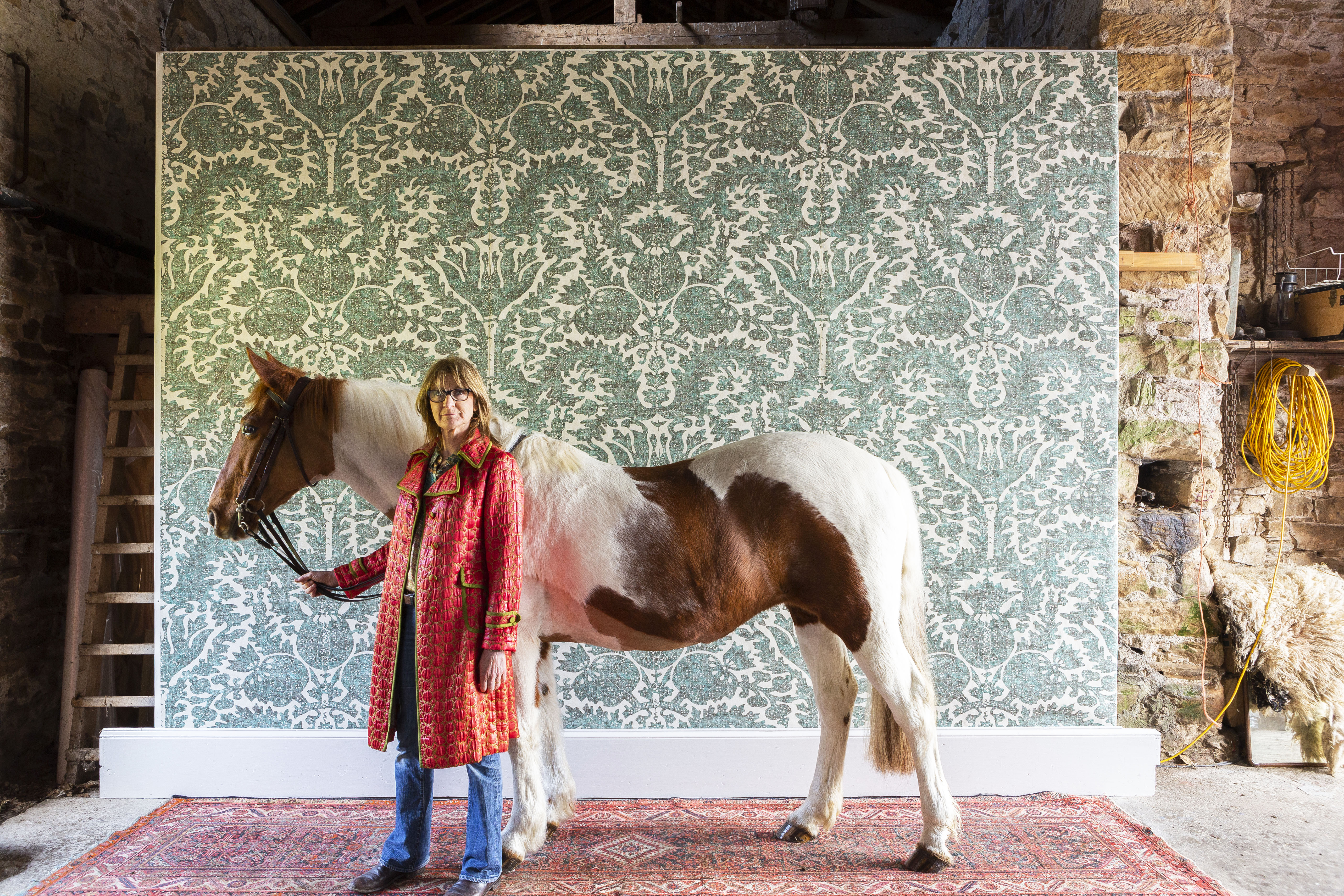
Another aspect of scale that conventional wisdom gets horribly wrong is the idea that, when decorating a small space, one should fill it with correspondingly small furniture. However, nothing makes a small bedroom look bigger than a four-poster and a giant armoire. The same is true of pattern; small, spriggy Victorian-style florals simply emphasise diminutive proportions, but large-scale pattern distracts the occupant from the fact that any cat they might choose to swing would get a very sore head.
A designer with aesthetic bravery in spades is Totty Lowther, a stylist who, in a past life, created everything from sets for feature films to windows for Laura Ashley and now juggles running an interiors boutique in a shipping container in Penrith with the demands of life on a Cumbrian hill farm.
'Like so many successful designs, it’s rooted in the past, but feels fresh and distinctive'
Pomegranate, her new design for Lewis & Wood, is based on an Indian take on damask, a style of textile popular in the 17th and 18th centuries. By hugely magnifying the proportions of the pattern, she’s created a design that doesn’t just have a transformative effect on furniture, but also on the space it occupies. Like so many successful designs, it’s rooted in the past, but feels fresh and distinctive.
Pomegranate is the latest collaboration between Lewis & Wood and a long list of artists and designers, including Adam Calkin, Melissa White and Andrew Davidson, that harnesses the creativity of those beyond the world of textiles and interior design.
For more pattern on a gloriously grand scale, visit the company’s showrooms at 105–106, Design Centre East, Chelsea Harbour, London SW10 0XF, or visit www.lewisandwood.co.uk.
Sign up for the Country Life Newsletter
Exquisite houses, the beauty of Nature, and how to get the most from your life, straight to your inbox.
Credit: Joanna Wood
Beautiful bathrooms: How to design your lighting, draw the eye and make the most of your space
Bathrooms are typically the smallest room in the house - interior designer Joanna Wood shares her top tips and tricks
Six indispensable lighting tips: What to do and what not to do to get it right
Interior designer Henriette von Stockhausen of VSP Interiors shares her secrets for getting the right lighting.
Credit: Lighting top 10
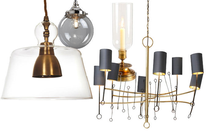
Country Life Top 10: Lighting – The best lamps, chandeliers and lights you can buy
Our interiors expert Giles Kime guides you towards the most beautiful lighting on the market today.
-
 The King's favourite tea, conclave and spring flowers: Country Life Quiz of the Day, April 22, 2025
Tuesday's Quiz of the Day blows smoke, tells the time and more.
By Toby Keel
-
 London is the place for me* (*the discerning property buyer)
With more buyers looking at London than anywhere else, is the 'race for space' finally over?
By Annabel Dixon
-
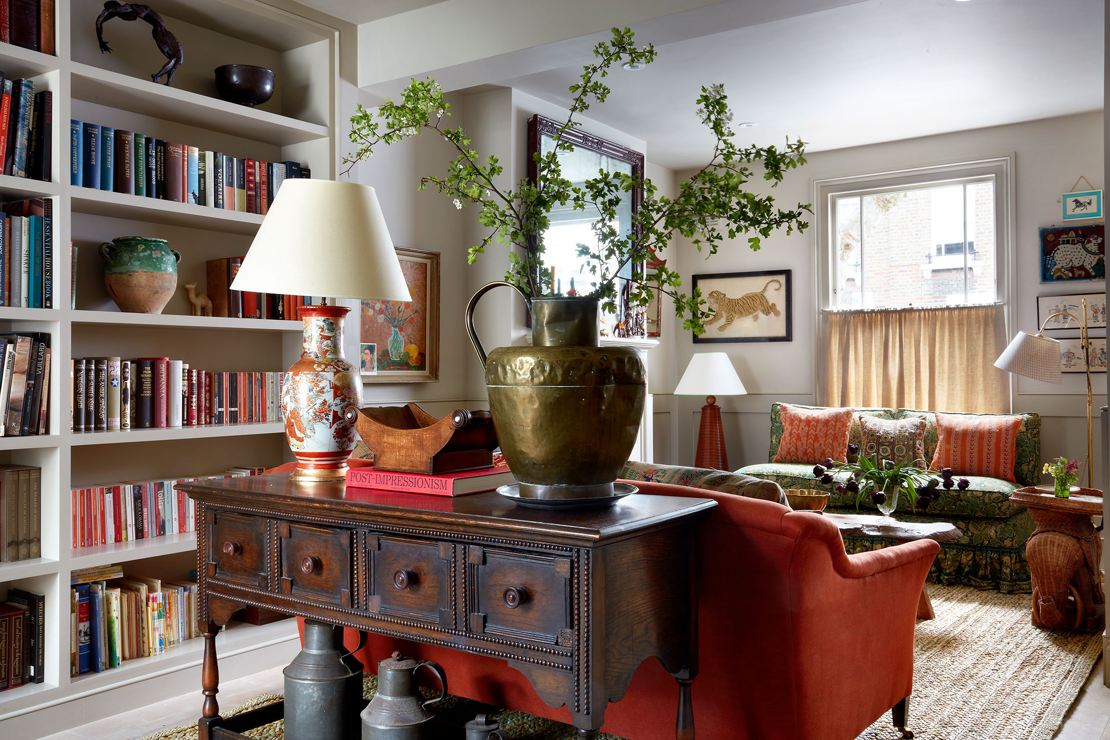 Injecting colour, pattern and character into a once-plain sitting room
Books, art and textiles transformed a once-characterless space into a warm, inviting sitting room.
By Arabella Youens
-
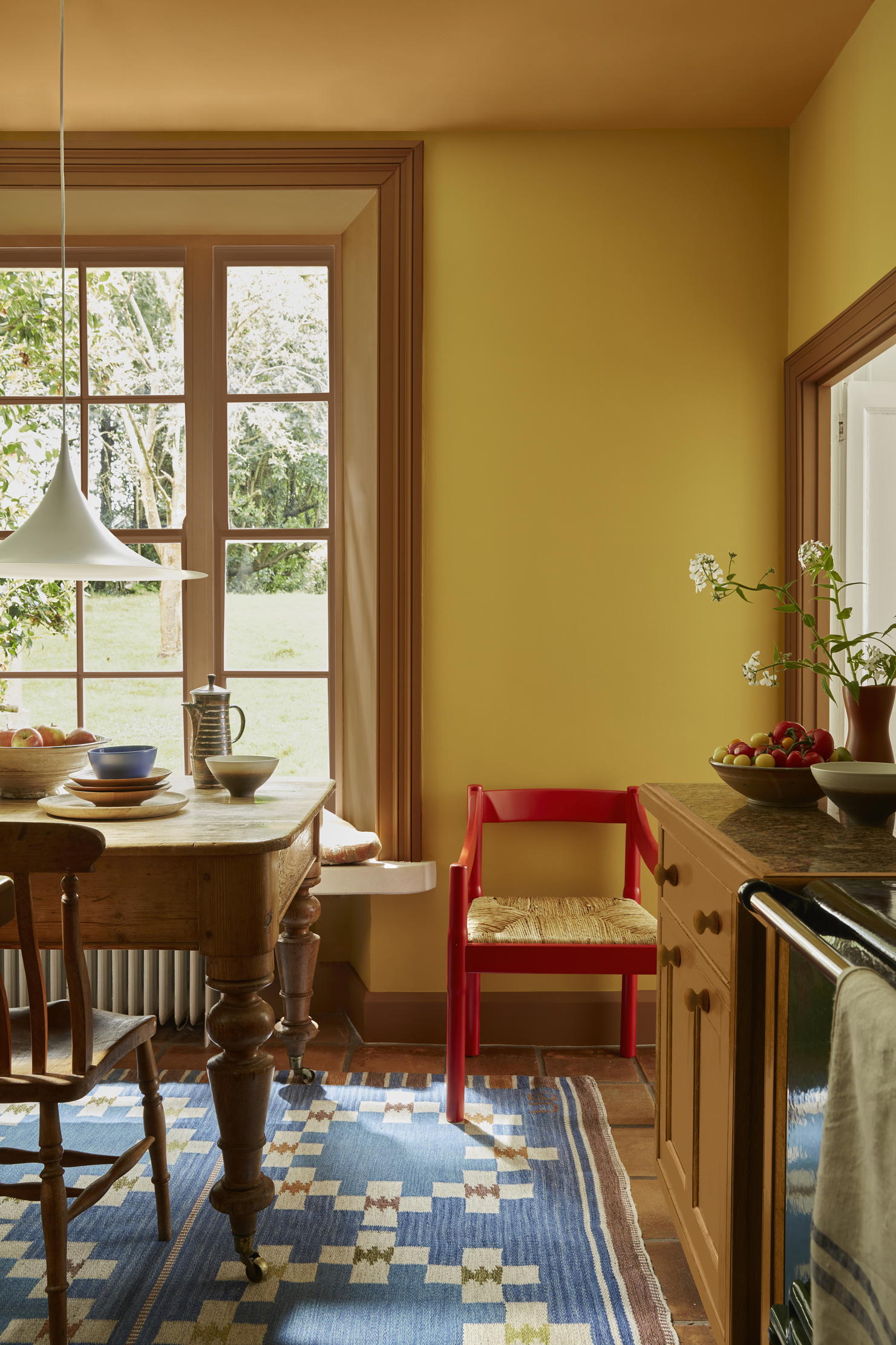 Say no to boring walls: Six choices of paint and paper which will get people talking
Amelia Thorpe picks out some glorious alternatives to just painting everything white.
By Amelia Thorpe
-
 'Not cheap... but cheaper than a divorce lawyer': Why it pays to hire a consultant to choose the perfect paint colour
Driven to distraction by paint charts? A colour consultant could be the answer for anyone befuddled by choosing the right hue, says Giles Kime.
By Giles Kime
-
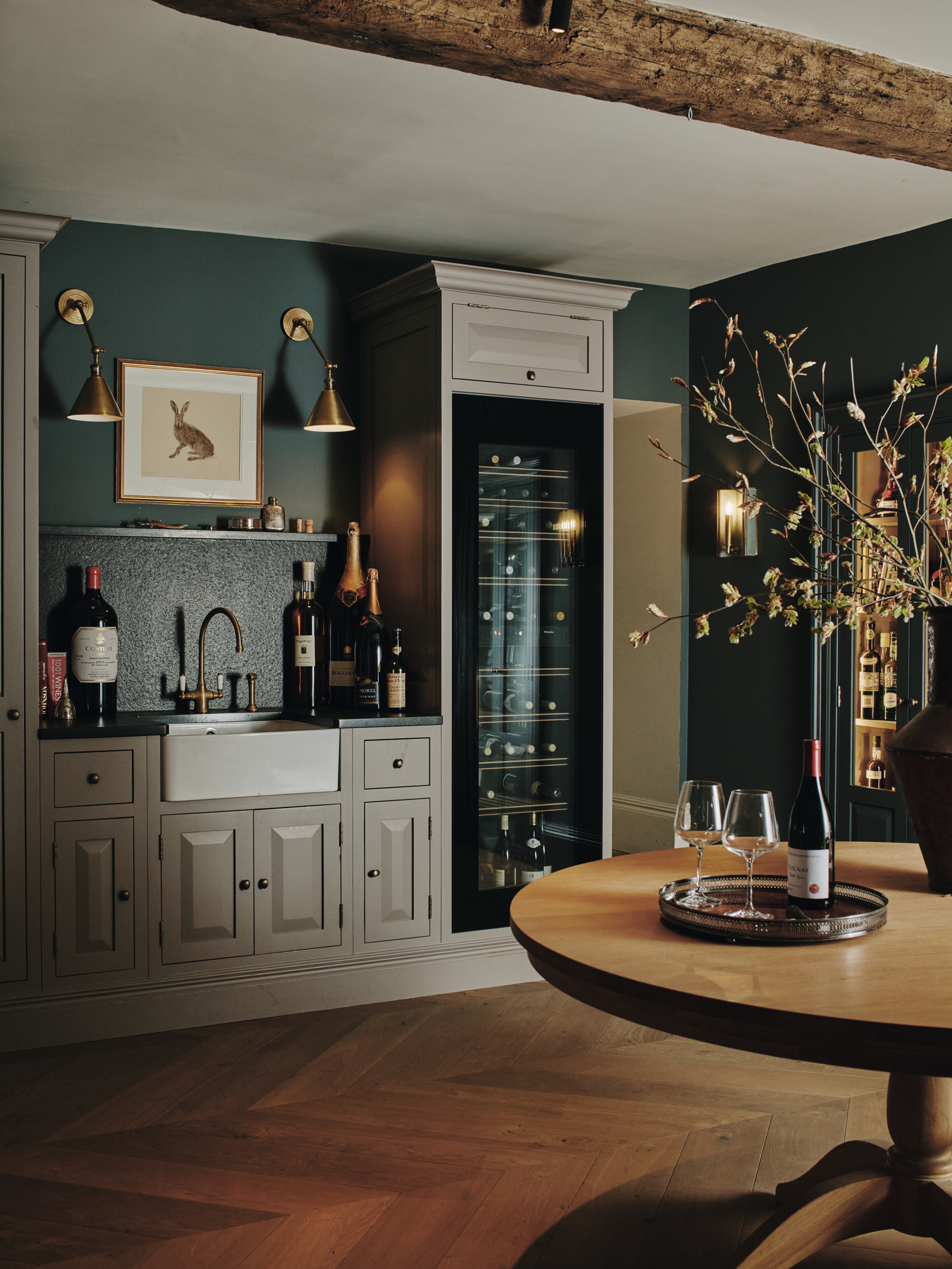 Room with a cru — how an 'enduring legacy of lockdown' is the latest must have in interior design
Long gone are the dusty cellars of the past. Now is the time to make the place you store your wine as pleasurable as drinking it.
By Amelia Thorpe
-
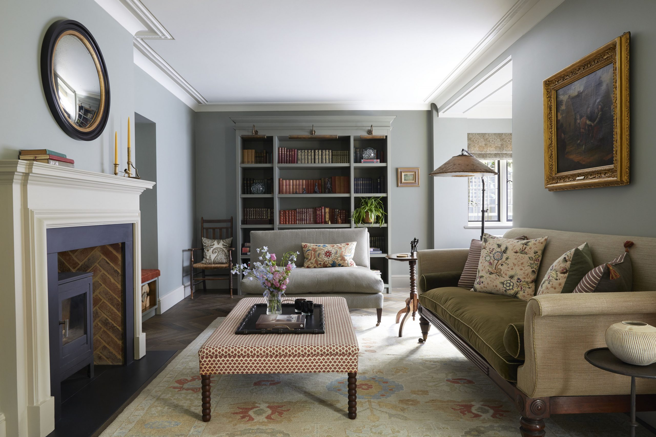 The secret to transforming an awkwardly shaped room
Cave Interiors turned the awkwardly shaped sitting room of an Edwardian house into a warm and welcoming space.
By Arabella Youens
-
 A gloomy kitchen entirely re-created as a cosy living space
When Nicole Salvesen and Mary Graham were asked to redecorate a country house in Berkshire, the first task was to turn a dark space into a colourful sitting room.
By Arabella Youens
-
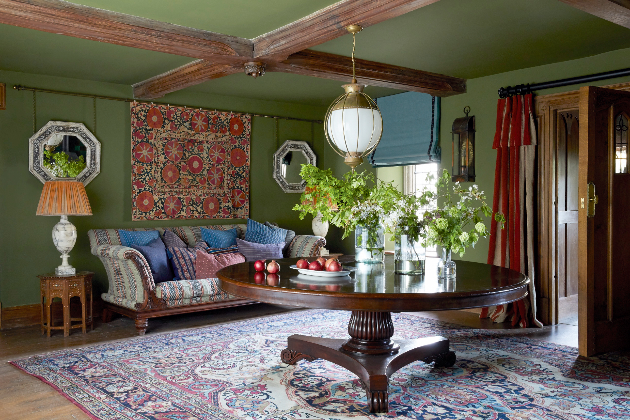 A living room that's a lesson in how to restore lost character in a historic space
Nicola Harding used rich colours and textures to enhance the historic character of a Jacobean house in Berkshire.
By Arabella Youens
-
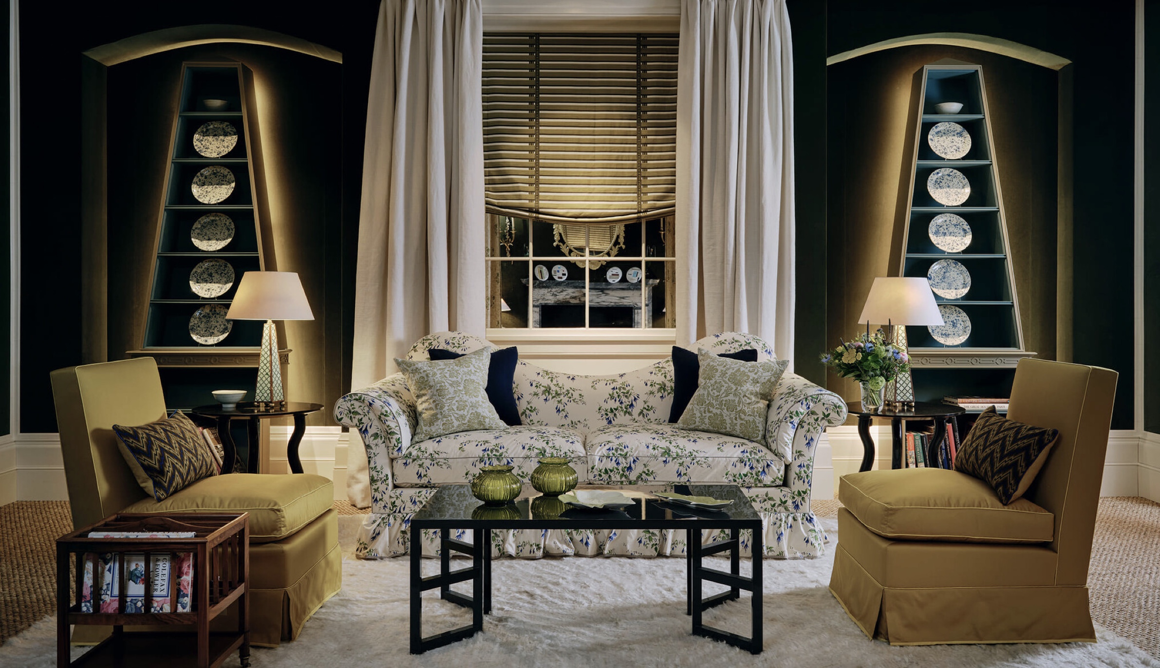 The slipper chair: How one of America's great designers produced a classic of armless fun
The slipper chair might have its roots in the 18th century, but it owes its compact, convivial appeal to Billy Baldwin, a giant of 20th-century American interior design.
By Giles Kime