How to make a Super Cottage, by designer Bee Osborn
There’s no reason why a small house shouldn’t feel like a big one, says interior designer Bee Osborn.
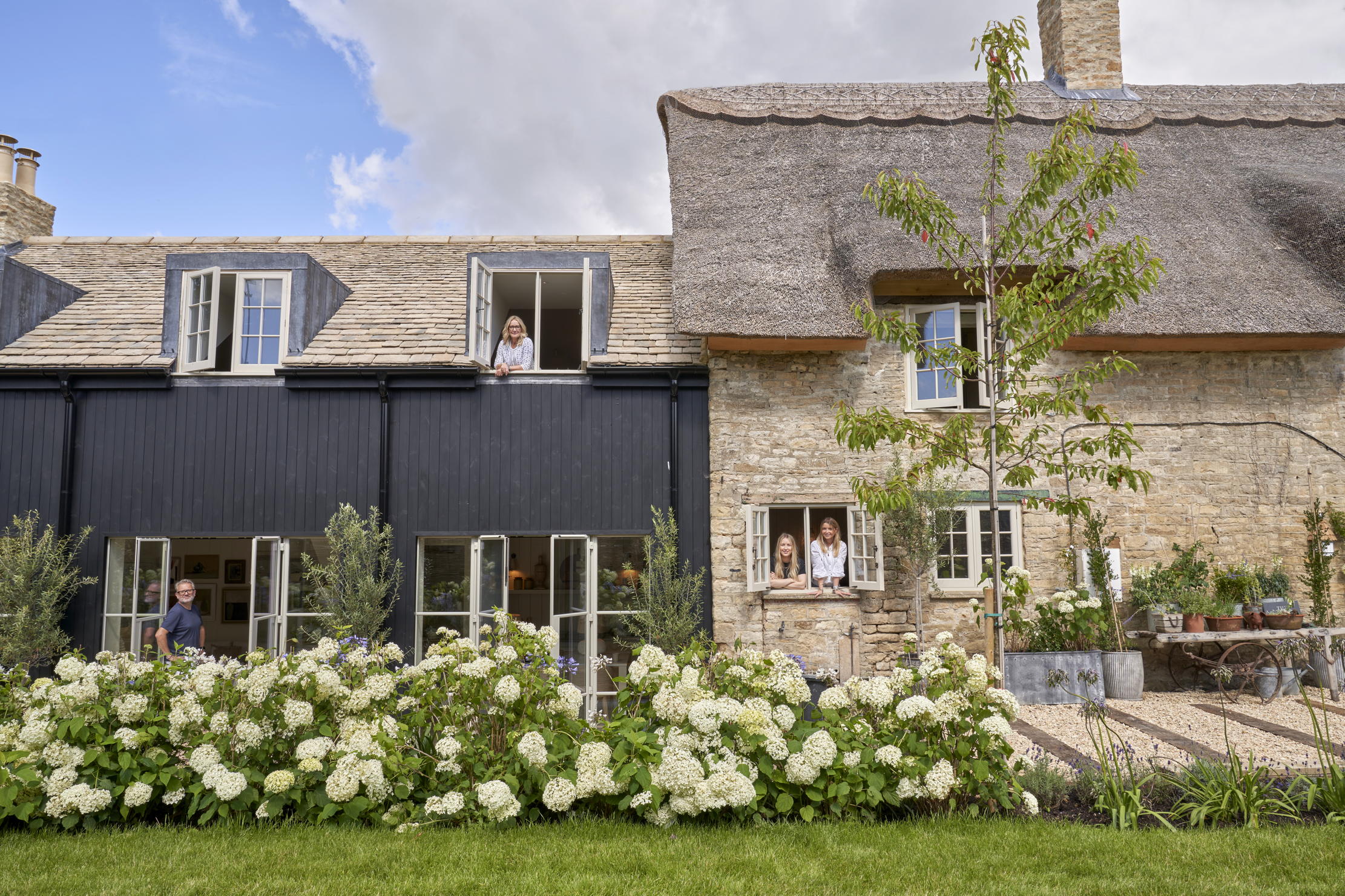

Several years ago, I went in search of a home in the Cotswolds to be closer to my daughter’s school. Having stopped to buy a sandwich at a local shop, I spotted a For Sale sign next to a dilapidated two-up-two-down shrouded in undergrowth.
My reaction was impulsive; within 10 minutes, I’d made an offer and set about creating my first super cottage, which comprised a small, but carefully considered series of spaces that can grow and stretch when needed. It’s a house that doesn’t cost a fortune to run, but still is filled with quality things, so that it feels luxurious and cosy. After it gained significant publicity thanks to its resemblance to the house that features in the film The Holiday, I sold it and set about finding my next project — my ninth — and my second ‘super cottage’.
This house was completely derelict and the project involved spending 15 months living in a shepherd’s hut in the garden (cooking on a barbecue in rain and sometimes snow), as the builders set to work with the renovations. I was very clear that I wanted enough room to have eight friends for dinner — something I couldn’t do in my previous home — and for my three daughters to come and stay with their respective husbands or boyfriends.
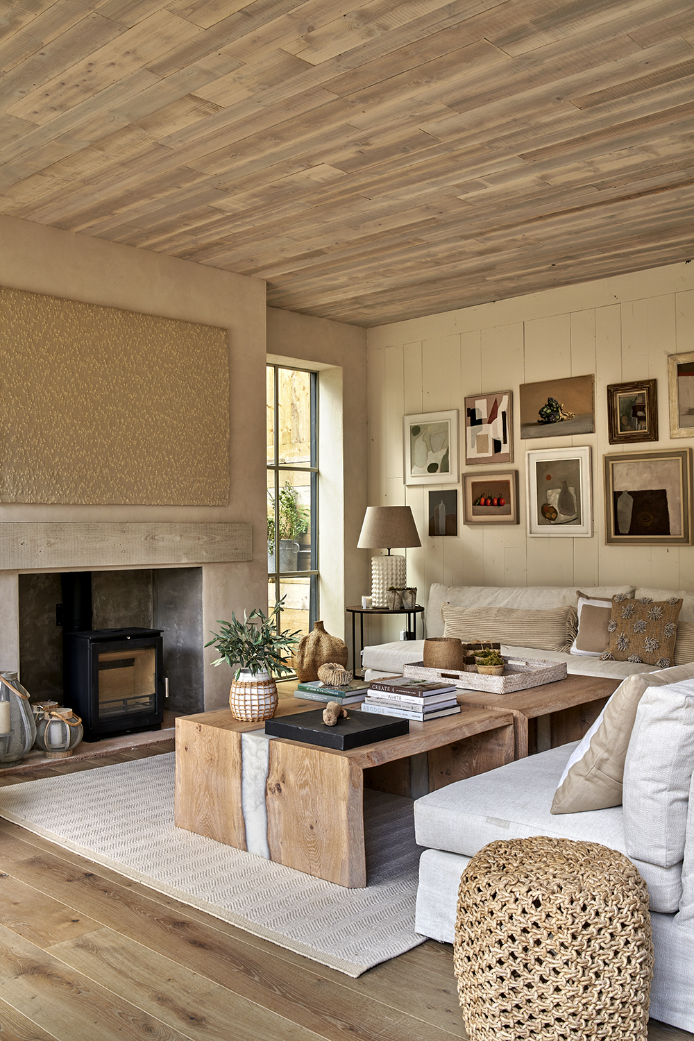
Ideally, a super cottage should be like a pyramid, with more space downstairs than upstairs, but, of course, that’s not always possible. In that case, it’s a question of looking with fresh eyes at what is available and making the most of it. Here, in every room, I’ve fought for each square inch — searching in voids, removing plasterboard ceilings and lowering floors where necessary.
The benefits of redesigning a very old cottage, even one that requires battling with planning permission and listed-building consent, is that you have an opportunity to be in an attractive village location that would be almost impossible to replicate with a new-build site. Once you’ve stripped it back to the stone walls, it’s possible to create a thermally efficient home with the best lighting, good plumbing and sockets where you want them.
Of course, as the square footage isn’t huge, the project won’t be as expensive to do and the house will be more efficient to run in the long term. Therefore, I’ve found myself being able to spend a little more on details that really matter to me.
A hotel-style spec
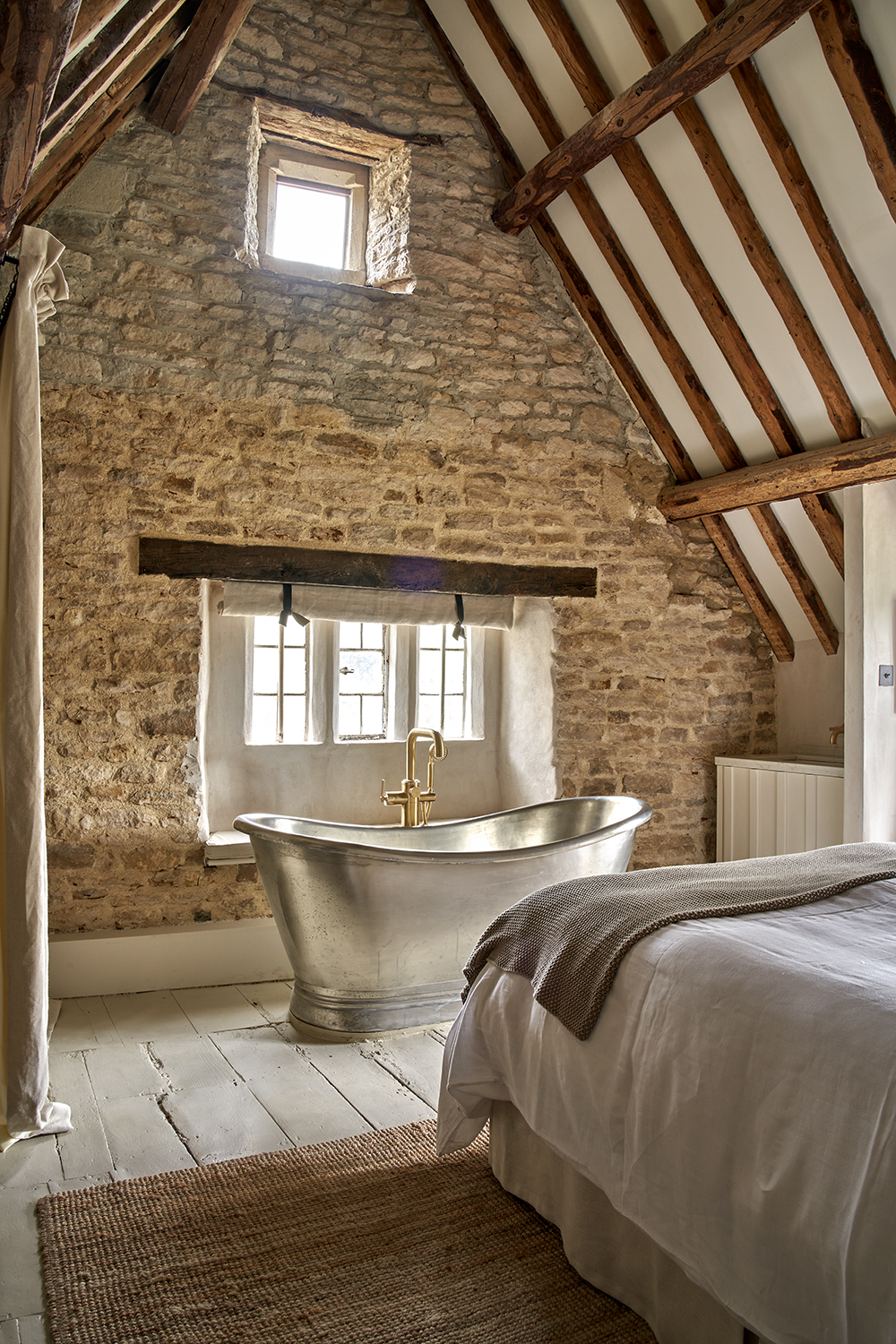
There are some areas where I will spend and others where I pull back. Lighting is crucial. I use very little overhead lighting, except for directional spots for artwork, and like to create pockets of light for atmosphere. We use floor lights and lamps and put everything on dimmers for flexibility. The fact that each bedroom should have its own bathroom was another non-negotiable. I don’t think anyone is comfortable plodding down a corridor in the middle of the night in search of a loo. My bedroom has a roll-top bath at the end of the bed, which adds a bit of glamour to the space.
Sign up for the Country Life Newsletter
Exquisite houses, the beauty of Nature, and how to get the most from your life, straight to your inbox.
I like to use ‘thunder box’ loos — those that are built in with storage space left and right and come with a lid so that one person can sit down and chat to the other person in the bath. My youngest daughter’s bedroom features what could be called a ‘micro shower’ — it’s squeezed into a wardrobe space.
Although I’ll use inexpensive cladding from the timber yard, I will opt for a few wow factors, such as taps.
Creating space
I like places to flow easily and feel immensely calm, inviting and comfortable, so I use a lot of natural materials, such as reclaimed wood, rattan, cotton and linen. It’s not that I don’t like pattern, but I think, when rooms are small, it’s easier on the eye to work with plain fabrics.
In any family home, storage is important, so I’ve included built-in sofas with space to put things at the bottom. I’ve also carved out cupboards in cavity walls throughout the house, which are fitted with push doors. In bathrooms, even 15mm of wall space will give enough room to house essential products.
Achieving height
As in many cottages, the ceiling height in parts of the original building was limited. My son-in-law is 6ft 3in, so I knew that this needed addressing. We dug down to lower the floor to create extra room and continued with the same level for the new, barn-like extension that houses the kitchen. This was one of the biggest expenses of the whole project. Once the floor had been lowered, we carved out the wall beneath the original windows to create window seats, which helps to overcome the feeling that the windows are higher than they should be.
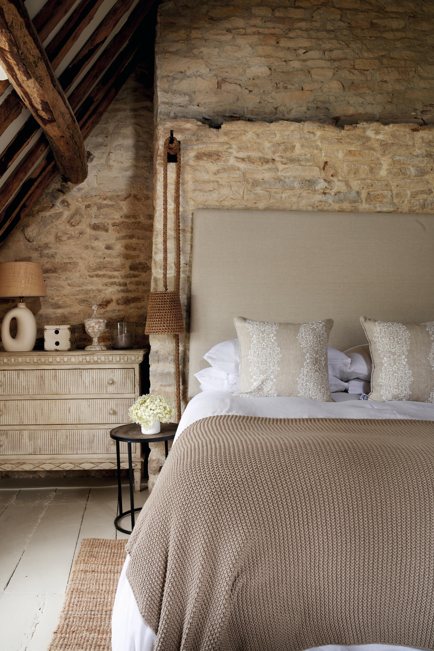
One of the first things I tend to do when redesigning a cottage is to take the ceilings up to the apex. It means you lose the loft — if one exists — but, to me, lofts are merely full of things that no one uses, so are worth sacrificing. Doing this introduces a far greater feeling of space. In my bedroom, we removed the false ceiling, exposing the beams and stone walls. We also replaced a Velux roof light with a dormer with a window seat, which required planning permission.
Privacy
The downside to being in the middle of a village is the possibility of being overlooked. One way of overcoming this problem is to use hazel hurdles as a screen and then plant pleached hornbeam trees, which don’t lose their leaves in winter, up against them. The hurdles will last about 10 years before breaking down, by which time the trees will be established. In the meantime, what’s rather lovely is that the light filters through the gaps in the hazel branches as the sun begins to set.
Secondary accommodation
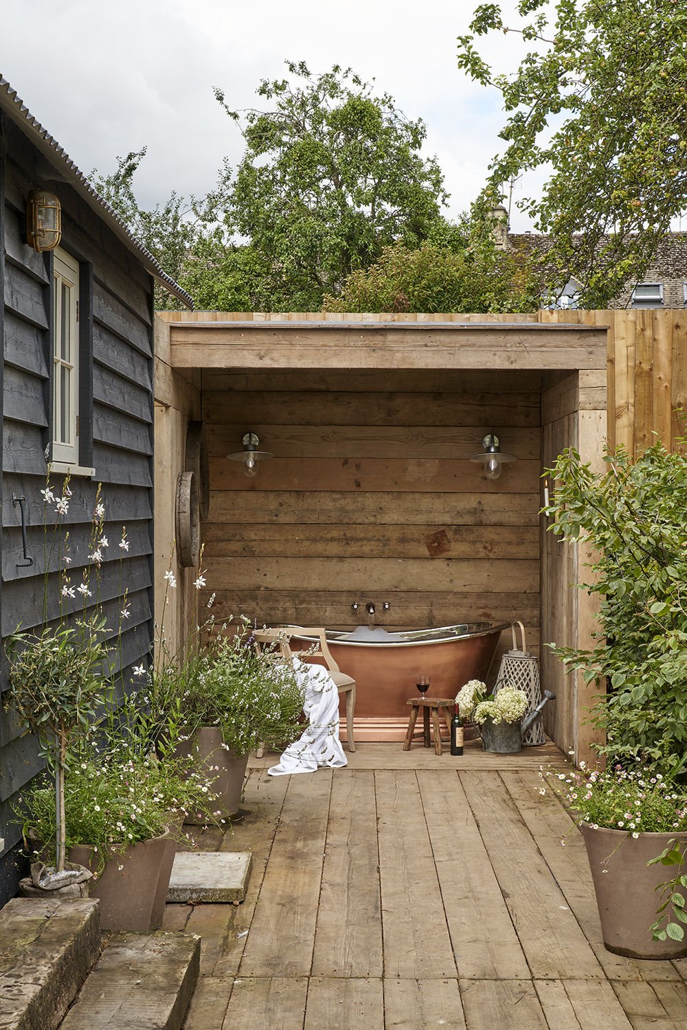
Despite having lots of experience in space planning, there was no way I was going to manage to create room for a fourth bedroom inside the cottage. Many will opt to convert an outbuilding into a guest house, but that wasn’t possible here. Instead, the shepherd’s hut I lived in while doing up the house has become a fourth spare room. It comes with a shower room and loo, but, to make it extra special, I’ve designed an outdoor bath alongside. Inspired by a hotel I stayed in years ago, the bath stands in a hut that is open on one side. It’s made from reclaimed scaffolding boards and is completely private.
The sympathetic extension
It was obvious from the start that I would need to rebuild the structure on the side of the cottage that had fallen into complete disrepair. In doing so, I’ve more than doubled the footprint of the original 1,000sq ft cottage.
In this case, the planners were keen that the new part didn’t mimic the original building. Using contrasting materials in a modern design meant that the new part could be clearly read as different to the old house: it’s clad in timber, which is painted black. There are large Crittal-style doors along the terrace, which are taken up to the maximum height of 2.5m (8ft) giving the room a great feeling of space and natural light.
Outside space
The considered use of space extends into the garden, too. I have created a 10m by 2.5m (32ft by 8ft) terrace with a concrete floor that lies at the same level as the extension, so sunk down, which makes it feel very private.
The original plan was to build in a seating area for 12 people, but it’s south-facing and that would mean sacrificing any space for sitting in the sun when not entertaining.
Instead, I designed a more multifunctional space, which could be used for dining or sunbathing. There are two low tables, which are wide and deep, so work as tables or sunbathing spaces, depending on the need.
Studio Osborn & Osborn Interiors — 020–8673 6483 osborninteriors.com
Credit: Nicholas Yarsley via Frampton Court
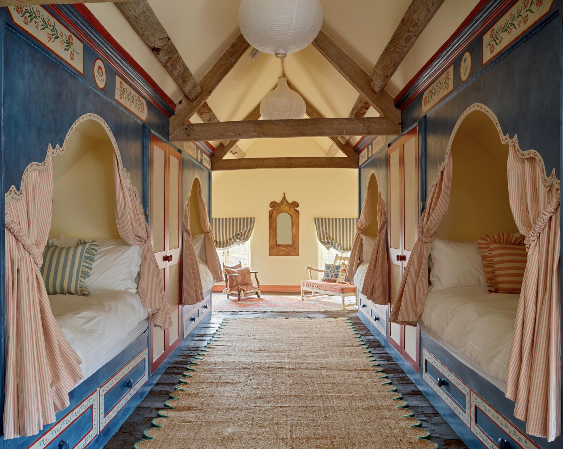
A Cotswolds attic that's been turned into a fairytale fantasy bedroom
A space once used for storage has been transformed into a dreamy place for children to sleep by designer Tess
Colour counsel: The latest paints and wallpapers, from £27 per pot to £1,240 per roll
Amelia Thorpe picks out the latest colours, textures and shades from the wonderful world of wallpaper.
Credit: Nkuku
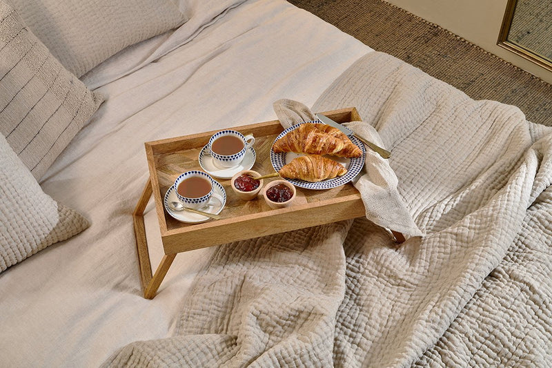
The best breakfast-in-bed trays, from £2 (yes, really) up to £245
Breakfast in bed has never looked so good to Lydia Stangroom as she picks out the best breakfast-in-bed trays.
Country Life is unlike any other magazine: the only glossy weekly on the newsstand and the only magazine that has been guest-edited by HRH The King not once, but twice. It is a celebration of modern rural life and all its diverse joys and pleasures — that was first published in Queen Victoria's Diamond Jubilee year. Our eclectic mixture of witty and informative content — from the most up-to-date property news and commentary and a coveted glimpse inside some of the UK's best houses and gardens, to gardening, the arts and interior design, written by experts in their field — still cannot be found in print or online, anywhere else.
-
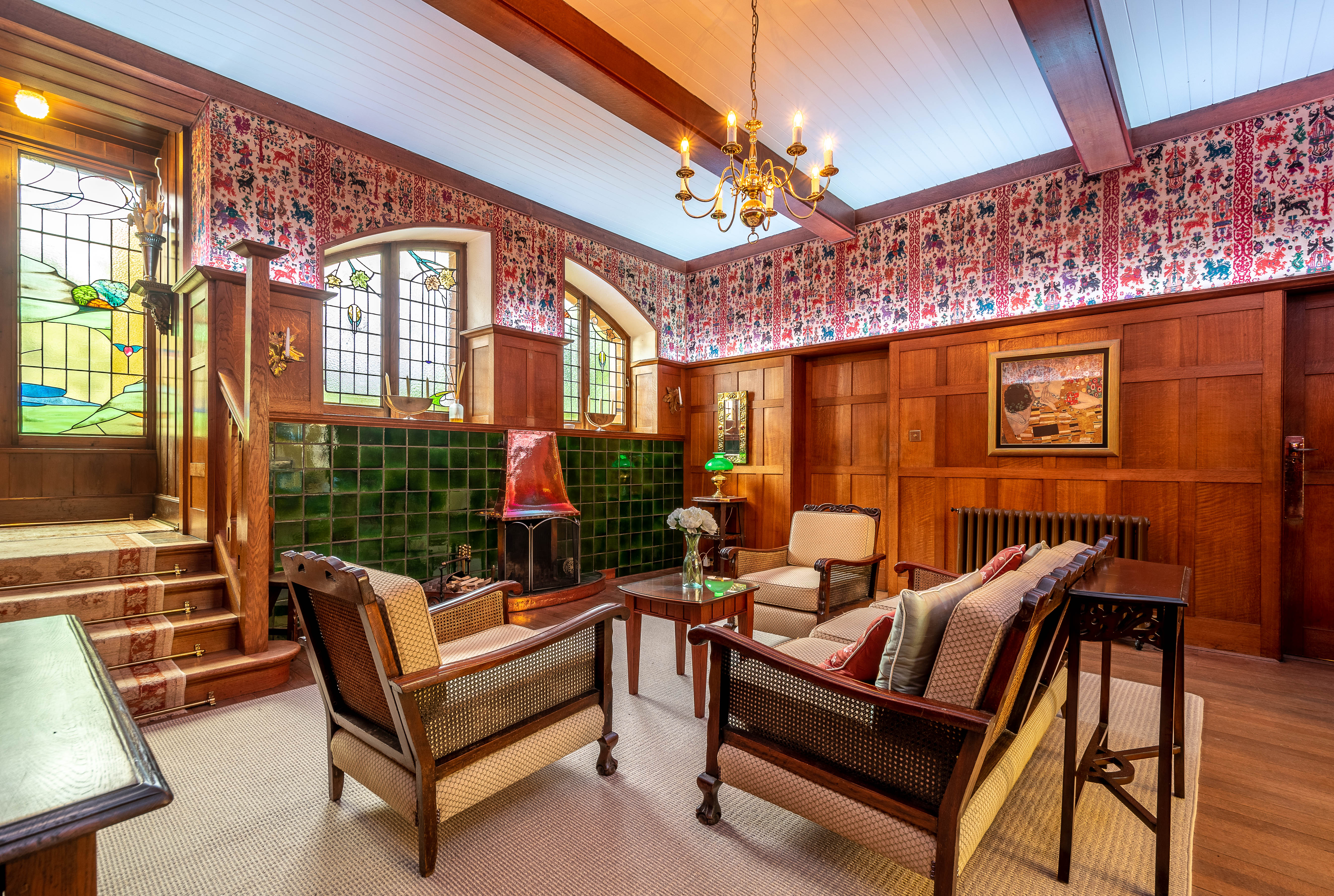 Seven of the UK’s best Arts and Crafts buildings — and you can stay in all of them
The Arts and Crafts movement was an international design trend with roots in the UK — and lots of buildings built and decorated in the style have since been turned into hotels.
By Ben West
-
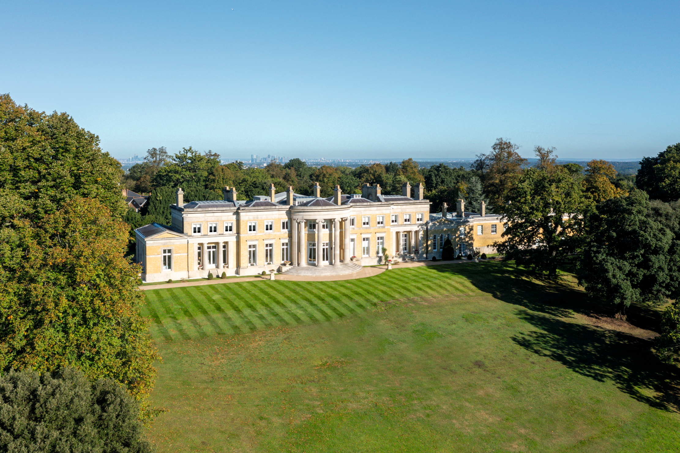 A Grecian masterpiece that might be one of the nation's finest homes comes up for sale in Kent
Grade I-listed Holwood House sits in 40 acres of private parkland just 15 miles from central London. It is spectacular.
By Penny Churchill