Farrow & Ball's top tips for how to create the right colour scheme for a Georgian home
Joa Studholme tells Emma J. Page how she used a distinctive palette of colours to give a fresh look to a Grade II-listed Georgian country mansion in London.
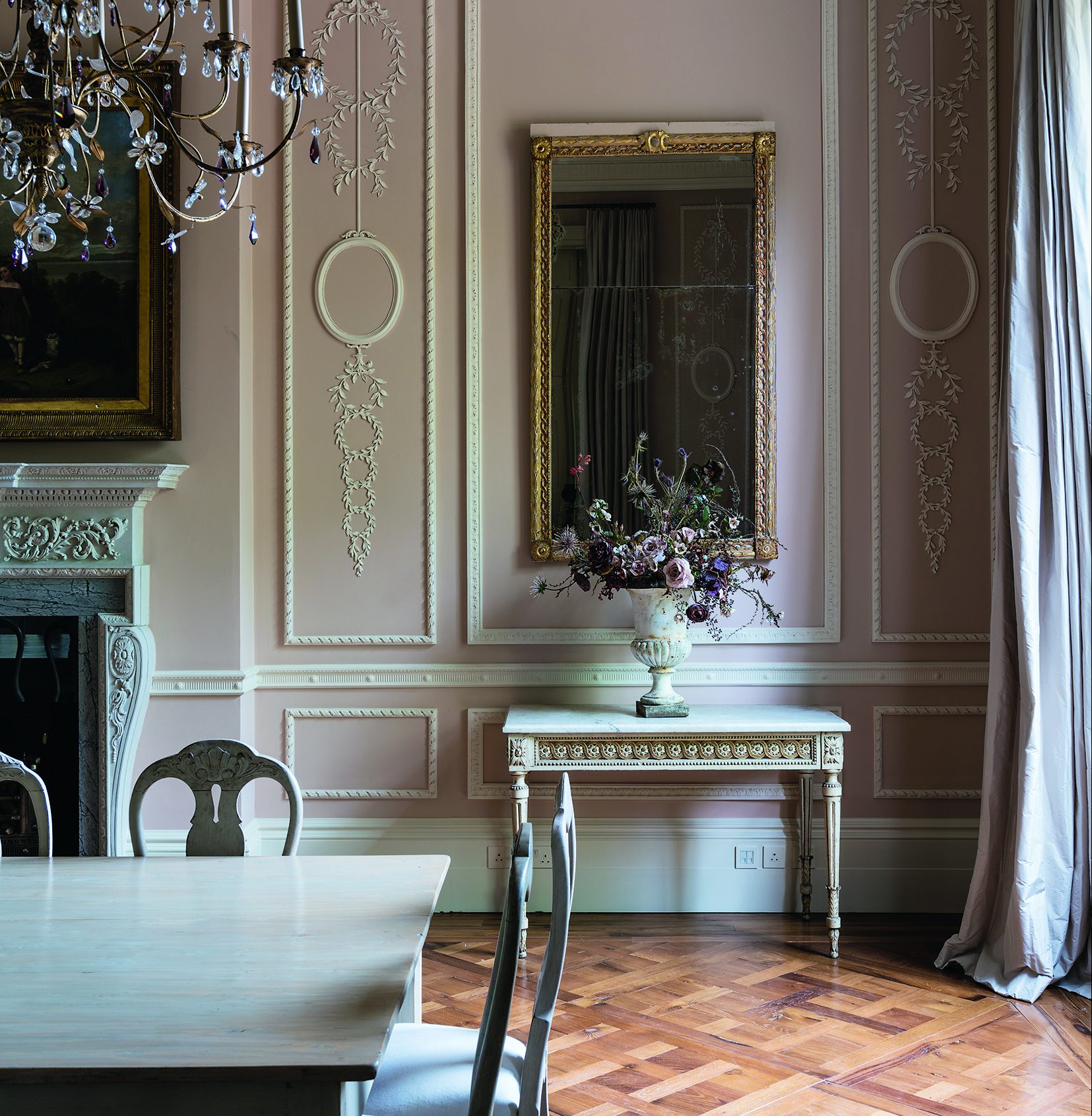

It’s not often that a successful decorating scheme is compared to a delicious dish, but according to Joa Studhome, colour curator at Farrow & Ball, both cooking and decorating require a similar alchemy. ‘It’s a matter of creativity rather than science,’ she says. ‘If we can shake off the shackles of what’s “wrong” or “right” and instead think about visual unity, seasoned with a few gentle contrasts, the results are much more interesting.’
More than two decades spent working in the interiors industry has taught her that colour confidence comes from appraising the details. ‘I’ve lost count of the number of times that people have asked my opinion about painting a room in a certain colour. ‘I always respond by asking “which part of the room?”. After all, a room comprises a lot more than walls; it’s about considering the ceiling, the skirting, the mouldings, the window frames.
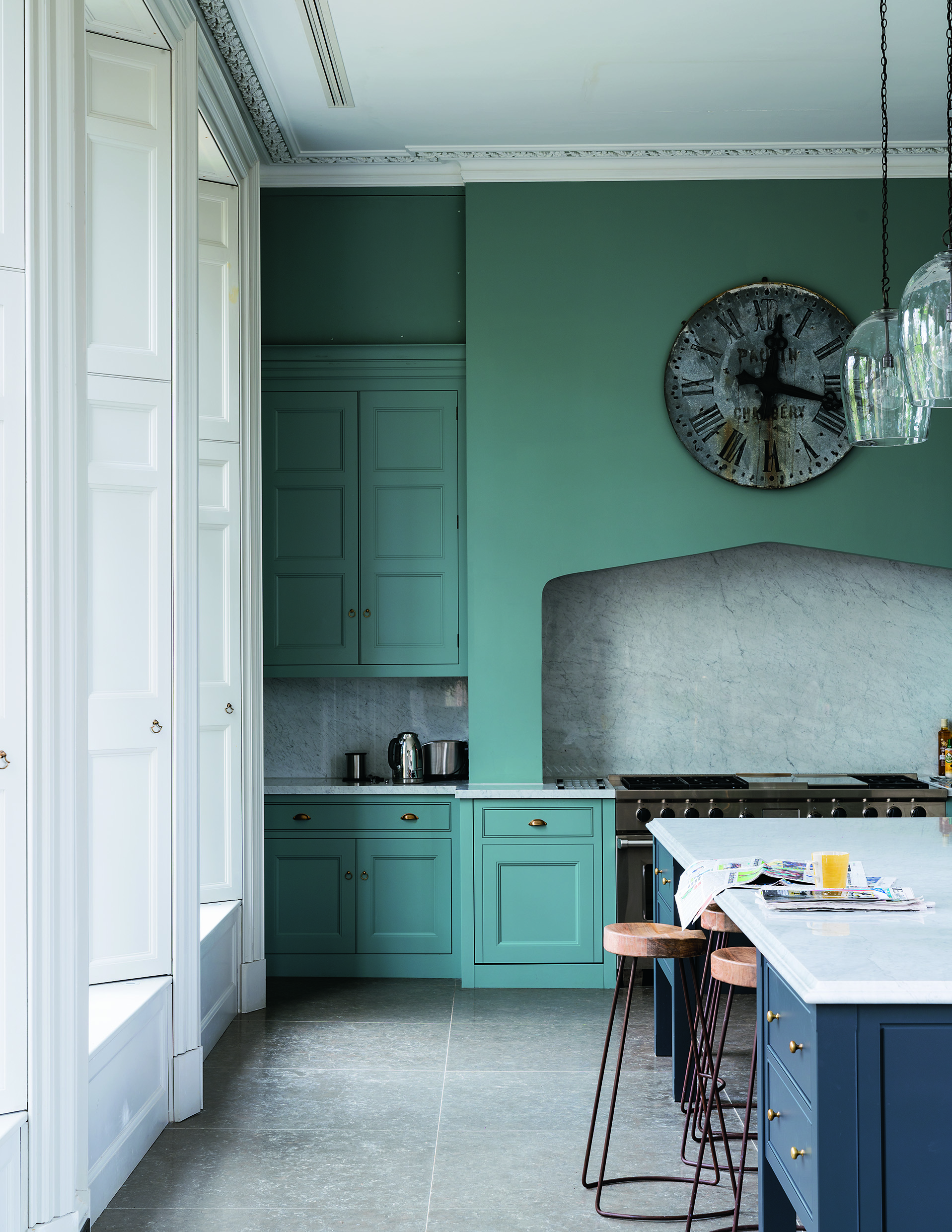
‘In cooking terms, fish may be the crucial element of a fish pie, but it’s the other ingredients – the butter, potatoes and mustard, for example – that pull the dish together.’
This eye for tonal nuance is key to the schemes that Joa has worked on over the years, ranging from grand country houses to contemporary lofts in the city. She doesn’t consider her treatment of any of them as radical and particularly dislikes the idea of adding any faddish colours to Farrow & Ball’s existing palette.
Instead, she believes that creating a fresh look is all in the application. That might mean painting walls and architectural detail in the same colour, as the Georgians often did, or applying colour in full gloss throughout a room for unexpected punch.
It’s a treatment she’s used successfully in one of her latest projects, Templeton House, a Grade II-listed Georgian country mansion in London. Joa concocted a palette for its 66 rooms that nods to the building’s historic roots yet suits a modern family. As in a well-seasoned dish, she balanced restraint and opulence, in the form of light halls and corridors and cosseting surprises such as a dramatic games room and cinema.
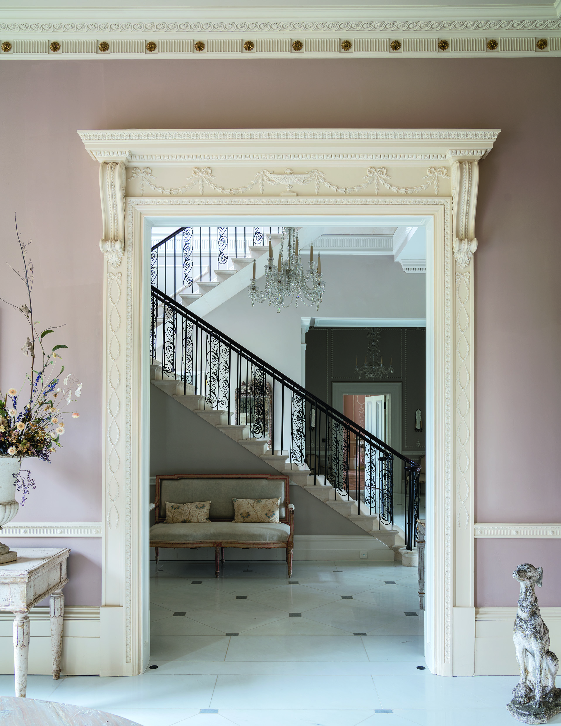
Although she has few rules, Joa employed a handful of techniques that enhanced the ‘dignified simplicity’ of this historic house, yet added a gentle ‘of the moment’feel. ‘First, I tried to listen to the architecture. That meant banishing all notions of using a pure white, which can have an unsophisticated, cheapening effect.
Sign up for the Country Life Newsletter
Exquisite houses, the beauty of Nature, and how to get the most from your life, straight to your inbox.
‘Second, we wanted the walls and the plasterwork to sit together in unity, which meant painting all the moulding in distemper to create a chalky feel with the details beautifully picked out. We opted for certain contemporising treatments, such as having the walls and kitchen units in the same colour, Oval Room Blue, or painting virtually every surface of the games room in exuberant Full Gloss Radicchio.’
Upstairs, the bedrooms feature a variety of hues, from Mizzle to Peignoir, each with a similar colour saturation, which lends them equal billing. ‘The house needed to feel like a whole, so although there is some ying and yang, in the form of the jewel-like basement rooms, there’s an easy flow,’ explains Joa.
‘It starts in the hallway, which is painted in Elephant’s Breath and Strong White, and leads on to the rear entrance hall, finished in slightly lighter Skimming Stone, creating the impression that the house opens out and becomes brighter.’
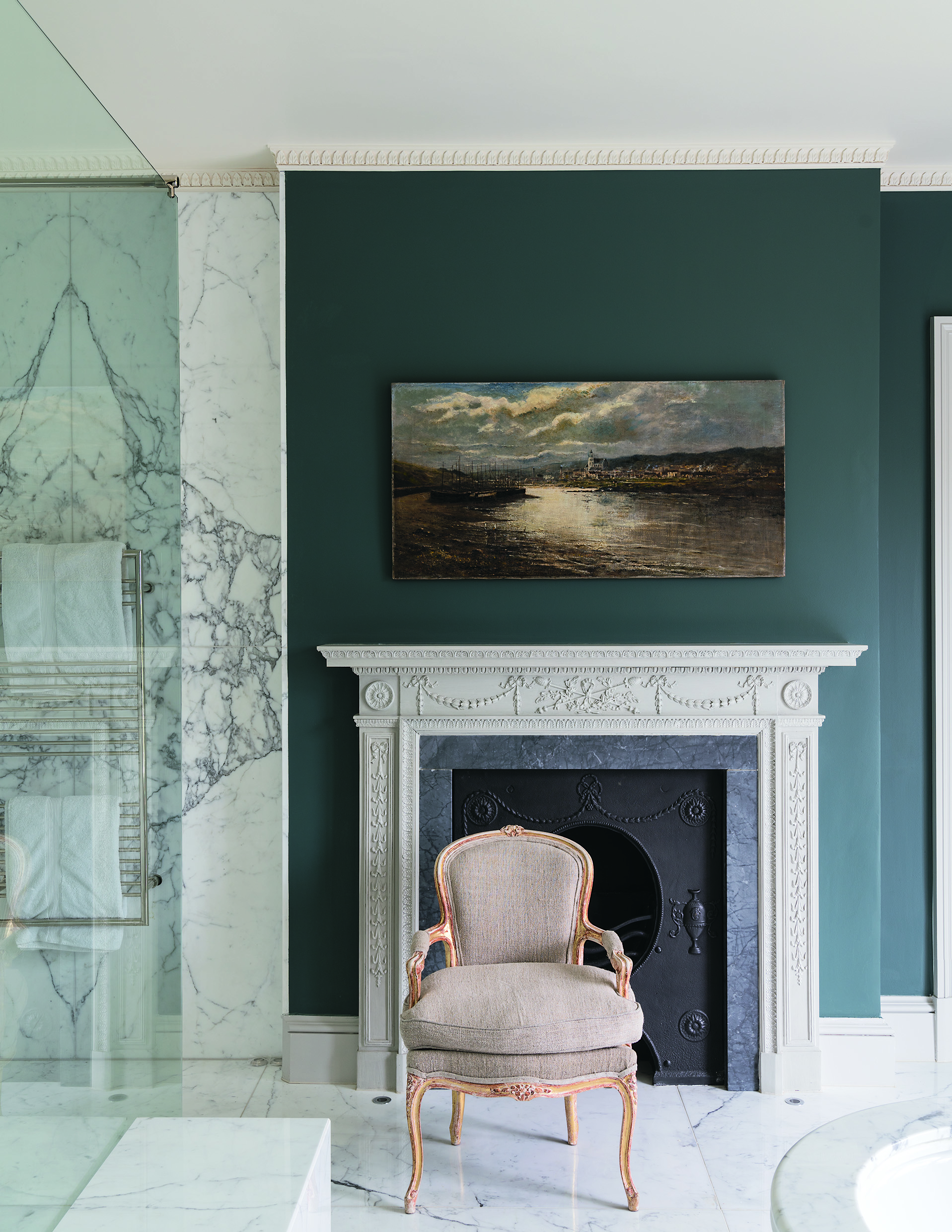
Thinking laterally is key. Joa advises against assuming that certain colours are strictly suited only to country or to city schemes. A case in point is De Nimes, a gentle blue. ‘When I created it, I felt it perfectly suited an East End loft space, but, in fact, the colour also translates beautifully to a Regency drawing room,’ suggests Joa.
‘Conversely, Preference Red was inspired by the Baroque trimmings of a Venetian palace and yet it looks amazing paired with walnut cabinetry in a contemporary kitchen. I would counsel only that colder greys don’t sit well in a country home – lilac-toned greys are more flattering. And avoid white gloss at all costs.’
The recipe for her own home, a converted schoolhouse in Somerset, benefits from much the same treatment, with bigger, brighter spaces painted in a new off-white, fittingly christened School House White, and smaller spaces have been treated to jewel-like hues.
‘I believe that we’re returning to the comfort of nostalgia,’ elaborates Joa, who welcomes the re-emergence of bolder colours. ‘We want our homes to cosset and uplift us. The idea that a well-considered palette can alter the way we feel is what keeps me revisiting the recipe book – and writing a few pages of my own.’
‘Farrow & Ball: Recipes for Decorating’ by Joa Studholme is published by Mitchell Beazley (£30)
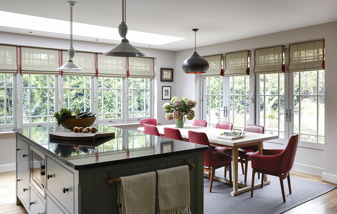
Credit: Jake Fitzjones
How to transform a dark Victorian kitchen into a charming social space with bespoke joinery
Charlotte Crosland redesign project turned into an entire refurbishment when it came to this Victorian house in London, including this

The beautifully-lit interior which gives a Surrey spa the undeniable feeling of being in church
Artist Brian Clarke was hired to make the spa at the Beaverbrook Hotel something a little special – here's what he
Credit: Alamy
Expert tips for caring for antique Oriental rugs
Roger Rose of James Barclay, the rug cleaning and repair service, offers advice on caring for antique Oriental rugs.
Country Life is unlike any other magazine: the only glossy weekly on the newsstand and the only magazine that has been guest-edited by HRH The King not once, but twice. It is a celebration of modern rural life and all its diverse joys and pleasures — that was first published in Queen Victoria's Diamond Jubilee year. Our eclectic mixture of witty and informative content — from the most up-to-date property news and commentary and a coveted glimpse inside some of the UK's best houses and gardens, to gardening, the arts and interior design, written by experts in their field — still cannot be found in print or online, anywhere else.
-
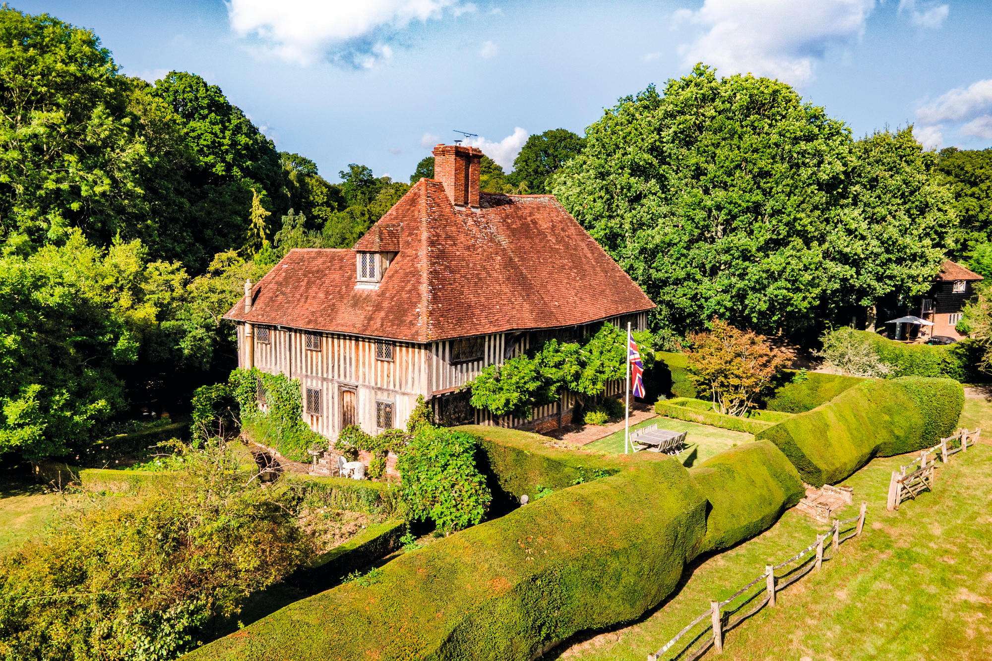 A mini estate in Kent that's so lovely it once featured in Simon Schama's 'History of Britain'
The Paper Mill estate is a picture-postcard in the Garden of England.
By Penny Churchill
-
 Splash! A Century of Swimming and Style: A whistle-stop history, from the Roman Baths to Hampstead Heath
Emma Hughes dives into swimming's hidden depths at the Design Museum's exhibit in London.
By Emma Hughes