How to decorate your entrance hall: Choosing colours, right lighting and what to do about furniture and pictures
Architectural historian, interior designer and natural-paint specialist Edward Bulmer reveals the secrets of successful hallway decorating.

What’s your approach to decorating an entrance hall?
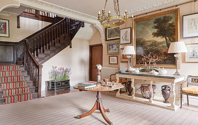
I prefer the paint colours to be neutral. Although a hall can be informative about the interests of the owners, I don’t dress it as a room to dwell in, but as a space to walk through, keeping richness for decorating other rooms in the house. This is a traditional approach, but it’s one that still works.
It also doesn’t lock you into a single historical period; it can still allow you to combine furniture and pictures from different periods, as I’ve done in my own home. Here, the walls are painted in Lilac Pink, which is a slightly sideways step from the traditional stone colour used in entrance halls. It has a pink hue that’s warm and a little more modern, and it makes a good background for our prints and paintings.
Can you suggest three other favourite colours for a hallway?
For the white lover, I would choose our Stone White, because it has some warmth and will look good with a stone floor, for instance. For the grey lover, I’d pick Dove, which has some earthy tones. Quaker is also a lovely hall colour, with more ‘stone’ than the other two I’ve mentioned. None of these are heavy—I’ve deliberately chosen quite lightweight colours.
What’s your advice on flooring?
First, value what you’ve got, unless you absolutely can’t! Once upon a time, there was probably a stone floor in our hall, but it’s since been replaced with boards, which are now rough and liable to splinter, so we had a rug and stair runner made by Roger Oates.
The use of stripes for utilitarian or inter-connecting spaces was quite common in houses, particularly in the 19th century, and they still work well.
In a new-build, I would put down a stone floor with underfloor heating. You could play with pattern, such as ordinary square flags laid diagonally or in a brick pattern. I’d always recommend choosing as big a flag as you think you can get away with, because small flags tend to look too small.
And lighting?
The light in our hall comes only from table lamps (the candleholder isn’t electrified and only used for festivities). That seems to be enough. Traditionally, a hall would have been quite underlit, because lighting was expensive and chandeliers were reserved for rooms where you were really showing off.
Sign up for the Country Life Newsletter
Exquisite houses, the beauty of Nature, and how to get the most from your life, straight to your inbox.
If you have a narrow hall without room for a table, wall sconces or glass-sided wall or ceiling lanterns may be the best option.
What are your thoughts on furniture and paintings?
I like rooms, including halls, to look inviting and comfortable. I often work on the interiors of historic houses, but life in them doesn’t have to be formal.
I try to accommodate informality as much as possible, yet still retain the aura that makes historic buildings special and different to modern ones.

Our hall has become our picture gallery, with a mix of paintings, engravings and drawings that we’ve bought, painted our-selves or inherited. A big picture adds visual weight and looks better with a large piece of furniture below it, so we made our console with a marble top specifically for the space.
I like balance in my designs and symmetry is a very useful contributor to balance. Here, it’s reflected in the position of the lamps, the chairs and the urns and the way in which we’ve hung the pictures.
And your best advice?
The important thing is not to overdo it. A hall should be a palate cleanser, some-where that looks as if you’ve reserved a little more for the principal rooms.
Edward Bulmer Interior Design – www.edwardbulmerinteriordesign.co.uk
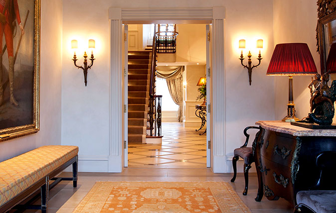
How to make a hallway that’s more than just a dumping ground
The best hallways create a bold statement. Amelia Thorpe explains.
Credit: Andrew Grant
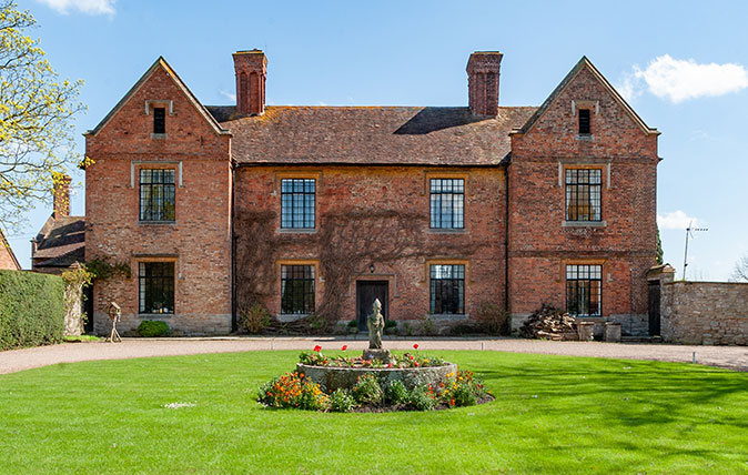
A Gloucestershire home with character, land and enormous potential
Priors Court includes everything from an original tiled hallway to a two-storey granary – but this quirky Gloucestershire home needs a

Open fires v wood-burning stoves: The grate debate
Wood-burning stove or open fire? Arabella Youens examines the pros and cons of both options.
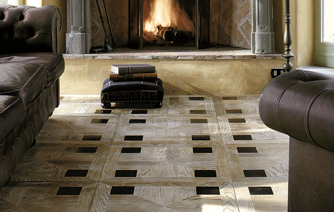
Flooring it: 10 ideas for beautiful carpet, wood, stone or ceramic floors
Country Life's interiors editor Giles Kime makes his selection of fine flooring for all types of different room.
Country Life is unlike any other magazine: the only glossy weekly on the newsstand and the only magazine that has been guest-edited by HRH The King not once, but twice. It is a celebration of modern rural life and all its diverse joys and pleasures — that was first published in Queen Victoria's Diamond Jubilee year. Our eclectic mixture of witty and informative content — from the most up-to-date property news and commentary and a coveted glimpse inside some of the UK's best houses and gardens, to gardening, the arts and interior design, written by experts in their field — still cannot be found in print or online, anywhere else.
-
 A Grade II*-listed country manor with one of the most beautiful drawing rooms in England
If Old Manor Farm in Somerset is good enough for Pevsner, it's good enough for you.
By Penny Churchill Published
-
 School dinner puddings, Scrabble tiles and Antonio Banderas: Country Life Quiz of the Day, April 11, 2025
Friday's quiz asks you to name one of Britain's most beautiful places, and ponders the distance of a marathon.
By Toby Keel Published
-
 Injecting colour, pattern and character into a once-plain sitting room
Books, art and textiles transformed a once-characterless space into a warm, inviting sitting room.
By Arabella Youens Published
-
 Say no to boring walls: Six choices of paint and paper which will get people talking
Amelia Thorpe picks out some glorious alternatives to just painting everything white.
By Amelia Thorpe Published
-
 'Not cheap... but cheaper than a divorce lawyer': Why it pays to hire a consultant to choose the perfect paint colour
Driven to distraction by paint charts? A colour consultant could be the answer for anyone befuddled by choosing the right hue, says Giles Kime.
By Giles Kime Published
-
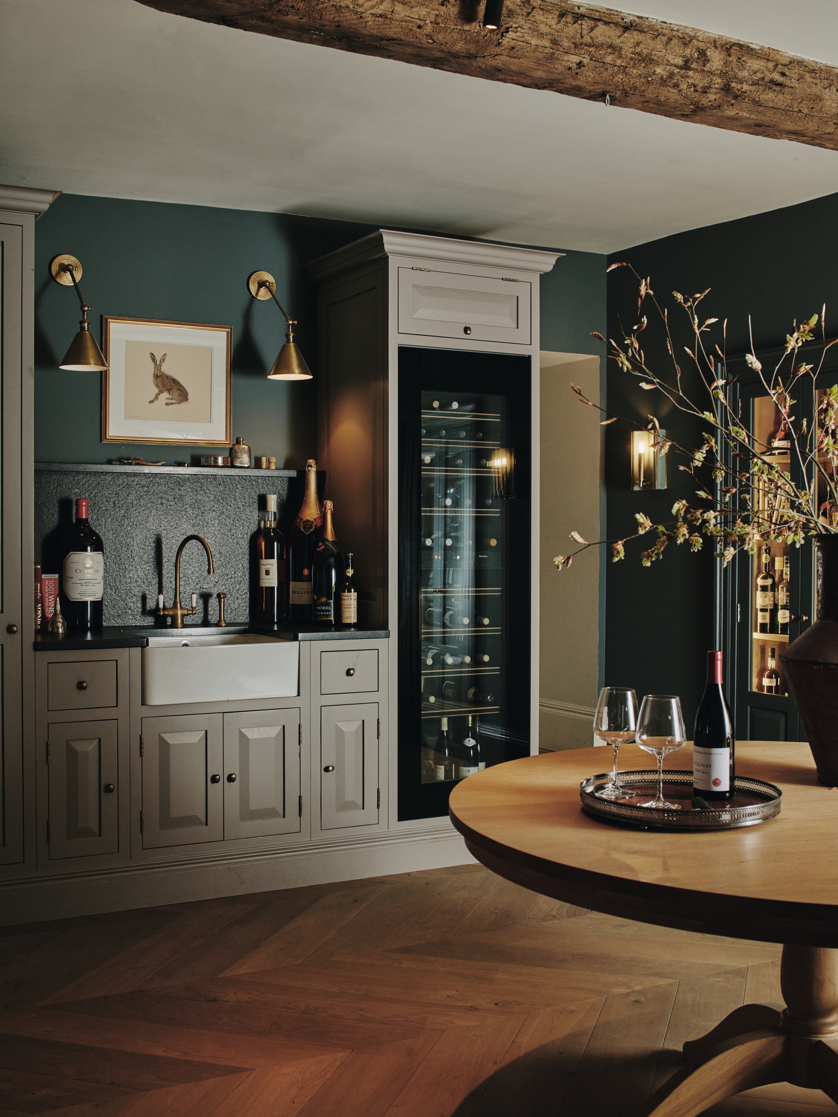 Room with a cru — how an 'enduring legacy of lockdown' is the latest must have in interior design
Long gone are the dusty cellars of the past. Now is the time to make the place you store your wine as pleasurable as drinking it.
By Amelia Thorpe Published
-
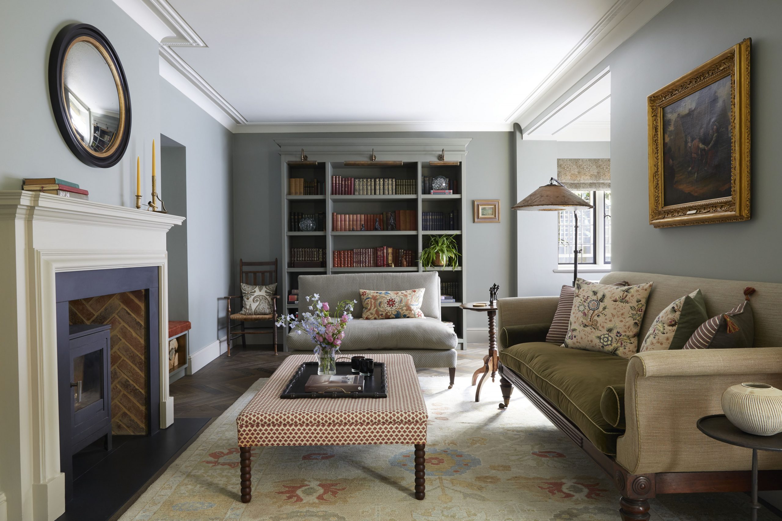 The secret to transforming an awkwardly shaped room
Cave Interiors turned the awkwardly shaped sitting room of an Edwardian house into a warm and welcoming space.
By Arabella Youens Published
-
 A gloomy kitchen entirely re-created as a cosy living space
When Nicole Salvesen and Mary Graham were asked to redecorate a country house in Berkshire, the first task was to turn a dark space into a colourful sitting room.
By Arabella Youens Published
-
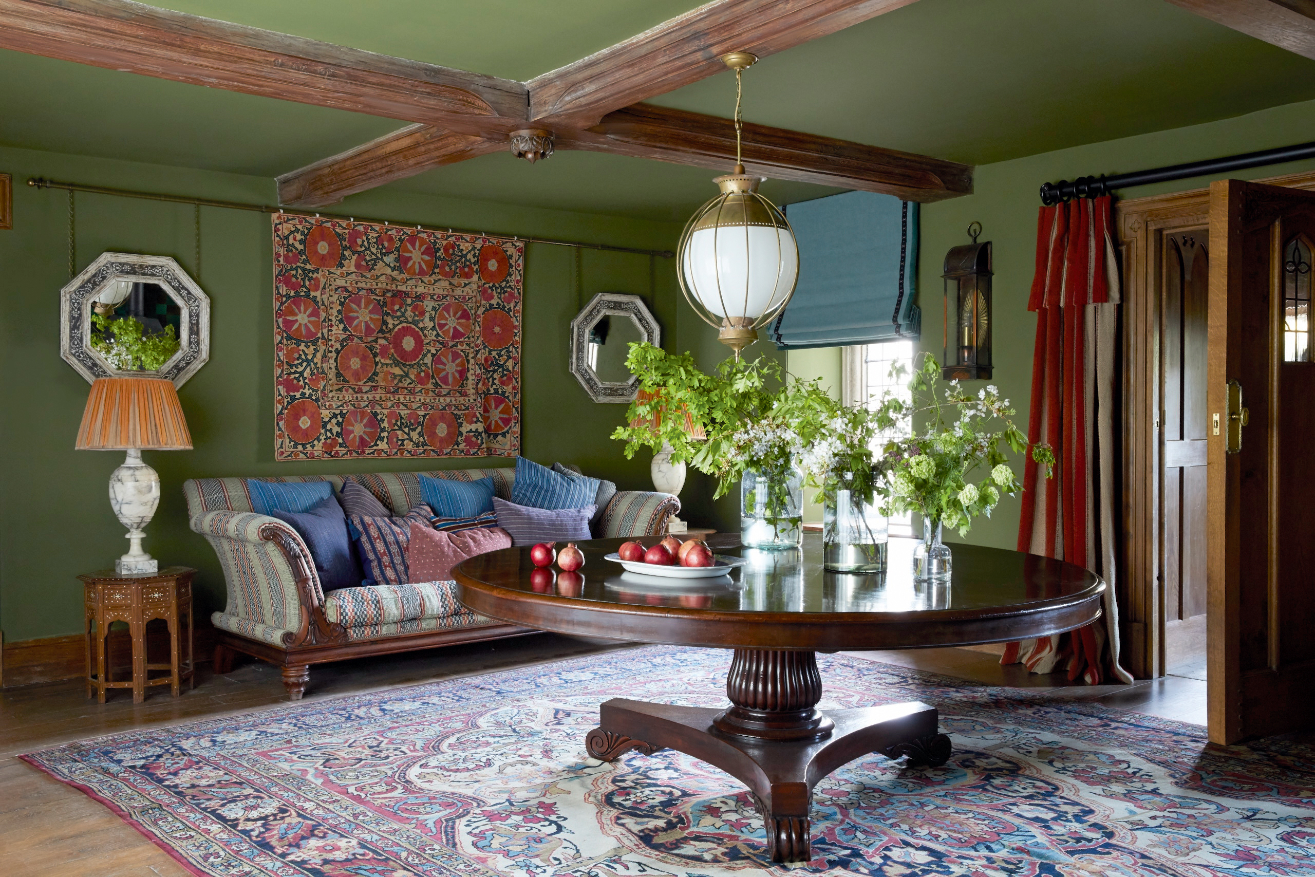 A living room that's a lesson in how to restore lost character in a historic space
Nicola Harding used rich colours and textures to enhance the historic character of a Jacobean house in Berkshire.
By Arabella Youens Published
-
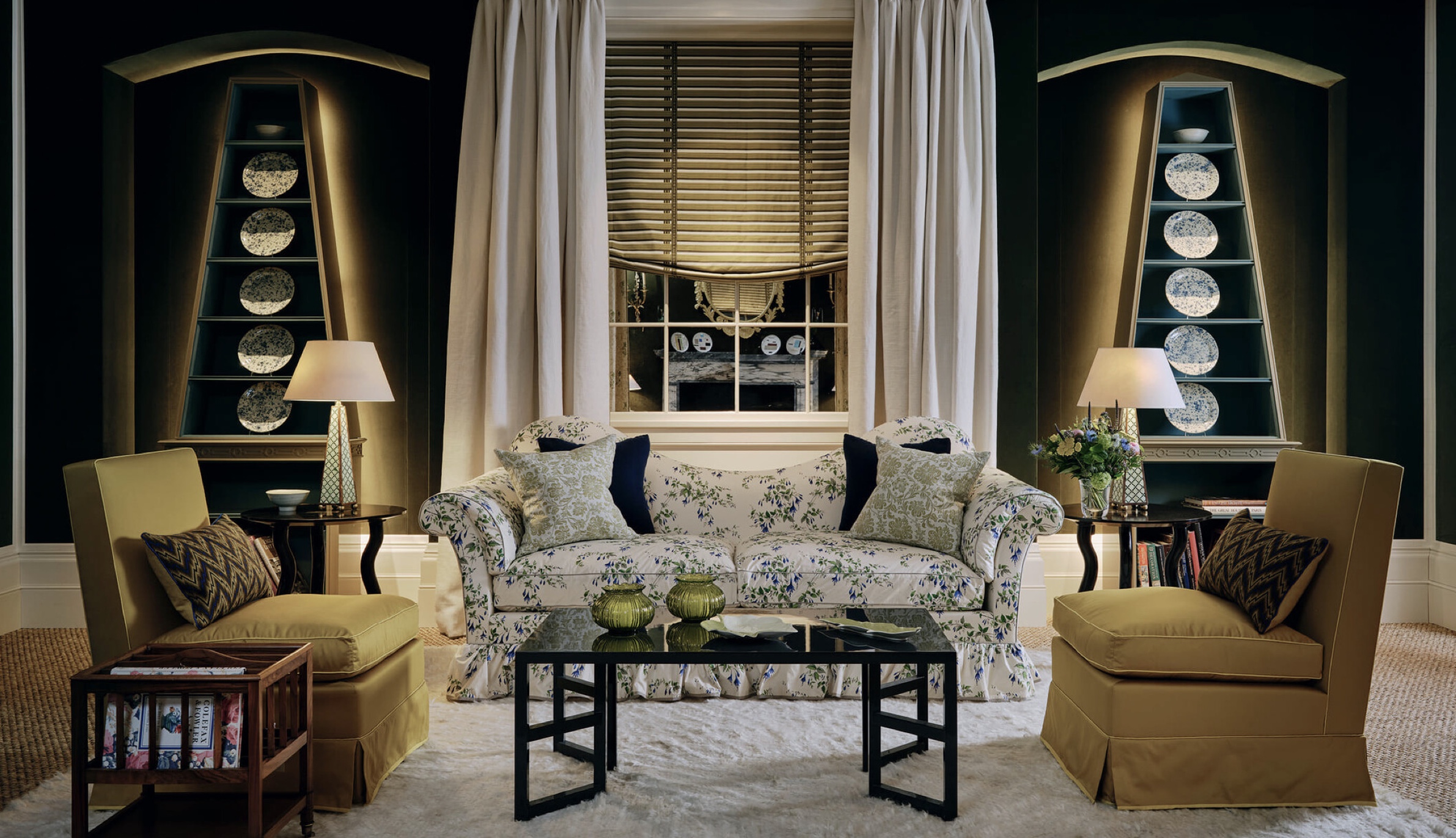 The slipper chair: How one of America's great designers produced a classic of armless fun
The slipper chair might have its roots in the 18th century, but it owes its compact, convivial appeal to Billy Baldwin, a giant of 20th-century American interior design.
By Giles Kime Published