How to combine colour, pattern and texture without making a complete mess of things
Tricia Guild, designer, founder and creative director of Designers Guild, offers advice on boldly combining coloured fabric, wallpaper and paint.
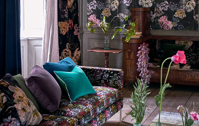

Which is the best way to combine a variety of patterns?
Decorating your home should reflect your personal taste, so, if you love mixing patterns and scale, then go for it. It’s often easier to start by limiting your colour palette to just three colours, one of which should be a neutral. A mix of patterns can be sensational, particularly if they impact on one another – for example, a very formal tailored stripe can make a blowsy floral feel more graphic. A check used with a floral adds a note of homely cosiness.
It’s always a good idea to experiment on a mood board first. We offer this service in our store and online and it’s a great way to work out the looks you love.
When planning a colour scheme, where do you start?
The process of collating a mood board is, to me, such a natural and instinctive way of editing; I always use them at the beginning of planning any scheme. When making your board, the trick is to use each colour or pattern at the same scale as it will be used in the room. If it works on paper, it’ll work in a room.
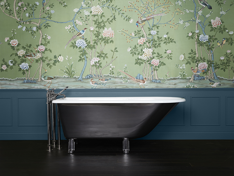
What’s the best way to combine colour?
Consider a few points when creating a colour scheme: identify the main colours that you love and establish whether they’re cool or warm. Your main colours will dictate the type of white or neutral you’ll need.
Neutrals are important: they’re the colours that underpin your scheme, providing a constant, harmonious note. White is very often the default option, but why not consider something more interesting? It could be grey, ecru, chocolate, a shade of blue or green or even pale plaster pink.
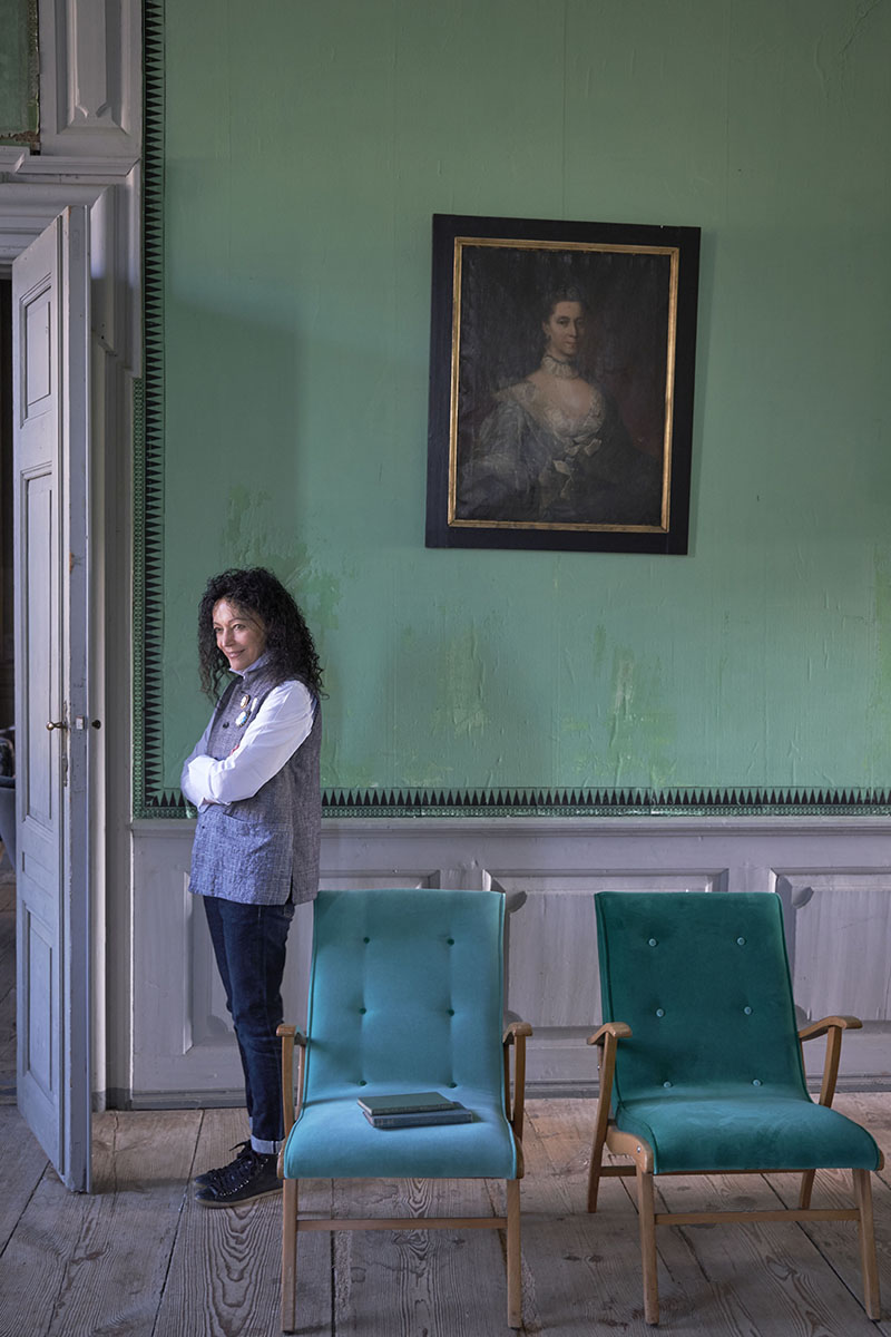
What are your current favourite patterns and colours?
Each collection is important to me, but I adore the Delft Flower design in Graphite [pictured at the top of the page]. It’s printed on a lightweight and softly tumbled linen and works well on curtains, blinds or cushions.
Another is the Casablanca Berry, which is a jacquard woven velvet that has a striking geometric design and makes a strong statement for upholstery in contemporary interiors. At the moment my favourite colour is our paint called Leaden Pink. It’s a very gentle soft rose with a touch of grey, so it’s neither too sweet nor too girly – it works everywhere and is also incredibly flattering.
Sign up for the Country Life Newsletter
Exquisite houses, the beauty of Nature, and how to get the most from your life, straight to your inbox.
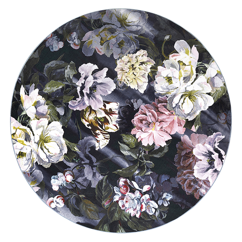
What about rugs?
My current favourite is the Delft Flower Noir rug. It’s a beautifully drawn floral. Thanks to its round shape and large scale it feels contemporary, but is equally at home in a more traditional room. It’s really quite beautiful.
What’s your top tip for using pattern on upholstery?
Why not try mixing a couple of patterns on a piece, such as a floral on the front and a stripe or plain on the back? It always looks great and your furniture will have more personality and style.
How about decorative accessories?
I’m a big fan of using cushions, throws and rugs to ring the changes in an interior. I always change my cushions around in the winter, introducing richer colours and warmer textures, and I add rugs and soft woollen throws to sofas. These simple changes needn’t be costly, but can make all the difference to how your space feels.
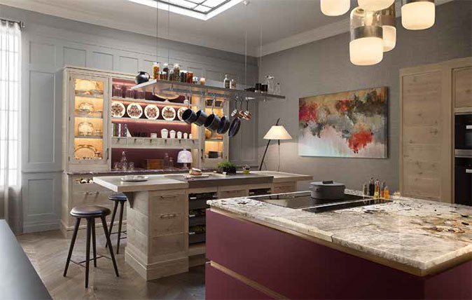
The new kitchen design mantra: Don’t be afraid of the dark
Dark colours and rich materials are creating moody new looks in kitchens, says Amelia Thorpe.
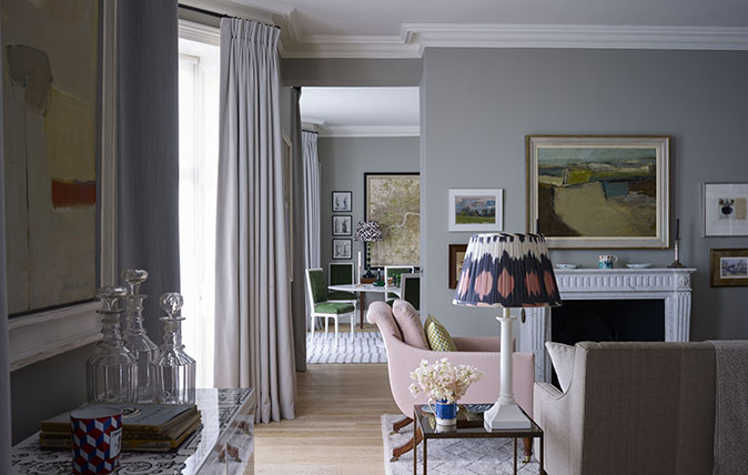
A living room that’s a calm sanctuary in the midst of the city
Ben Petreath's brief was to create a characterful city sanctuary. Here's how he went about it.
Country Life is unlike any other magazine: the only glossy weekly on the newsstand and the only magazine that has been guest-edited by HRH The King not once, but twice. It is a celebration of modern rural life and all its diverse joys and pleasures — that was first published in Queen Victoria's Diamond Jubilee year. Our eclectic mixture of witty and informative content — from the most up-to-date property news and commentary and a coveted glimpse inside some of the UK's best houses and gardens, to gardening, the arts and interior design, written by experts in their field — still cannot be found in print or online, anywhere else.
-
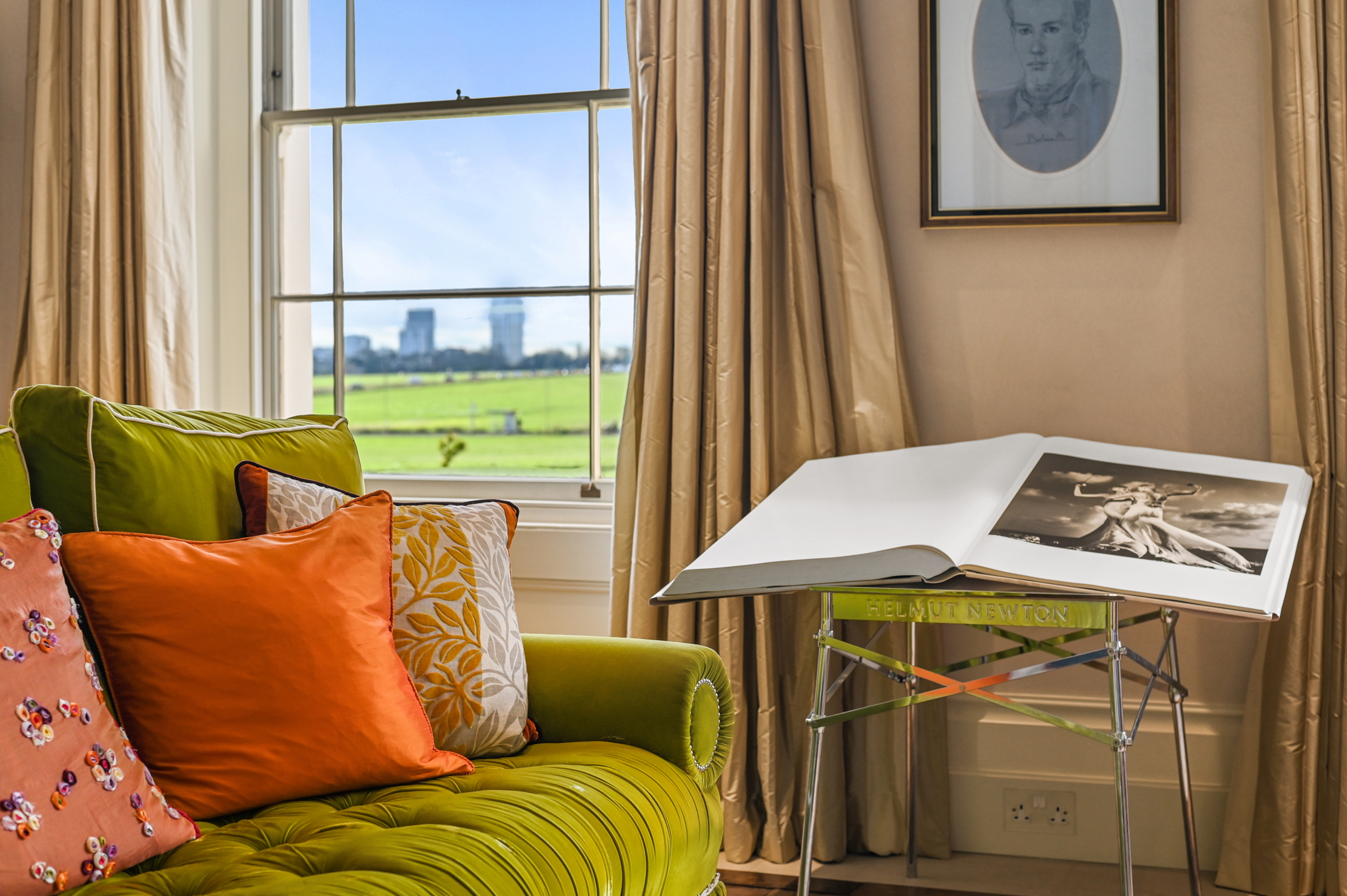 A rare opportunity to own one a family home on Vanbrugh Terrace, one of London's finest streets
This six-bedroom Victorian home sits right on the start line of the London Marathon, with easy access to Blackheath and Greenwich Park
By James Fisher
-
 Materials, textures, construction, expression: A Brutalist watch on your wrist
Luxury watchmakers are seeking to bridge the gap between two contrasting styles, with exciting results.
By Chris Hall
-
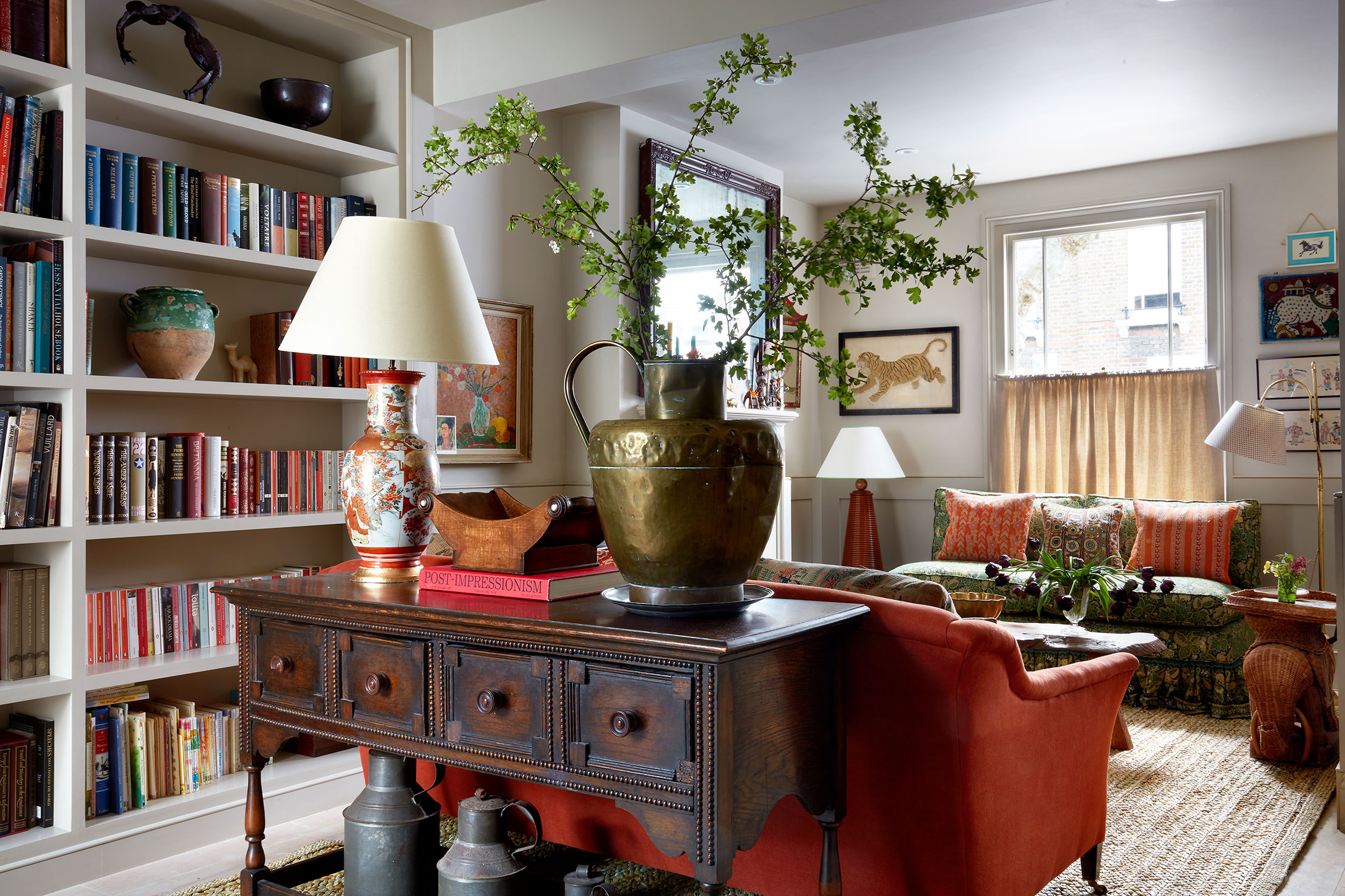 Injecting colour, pattern and character into a once-plain sitting room
Books, art and textiles transformed a once-characterless space into a warm, inviting sitting room.
By Arabella Youens
-
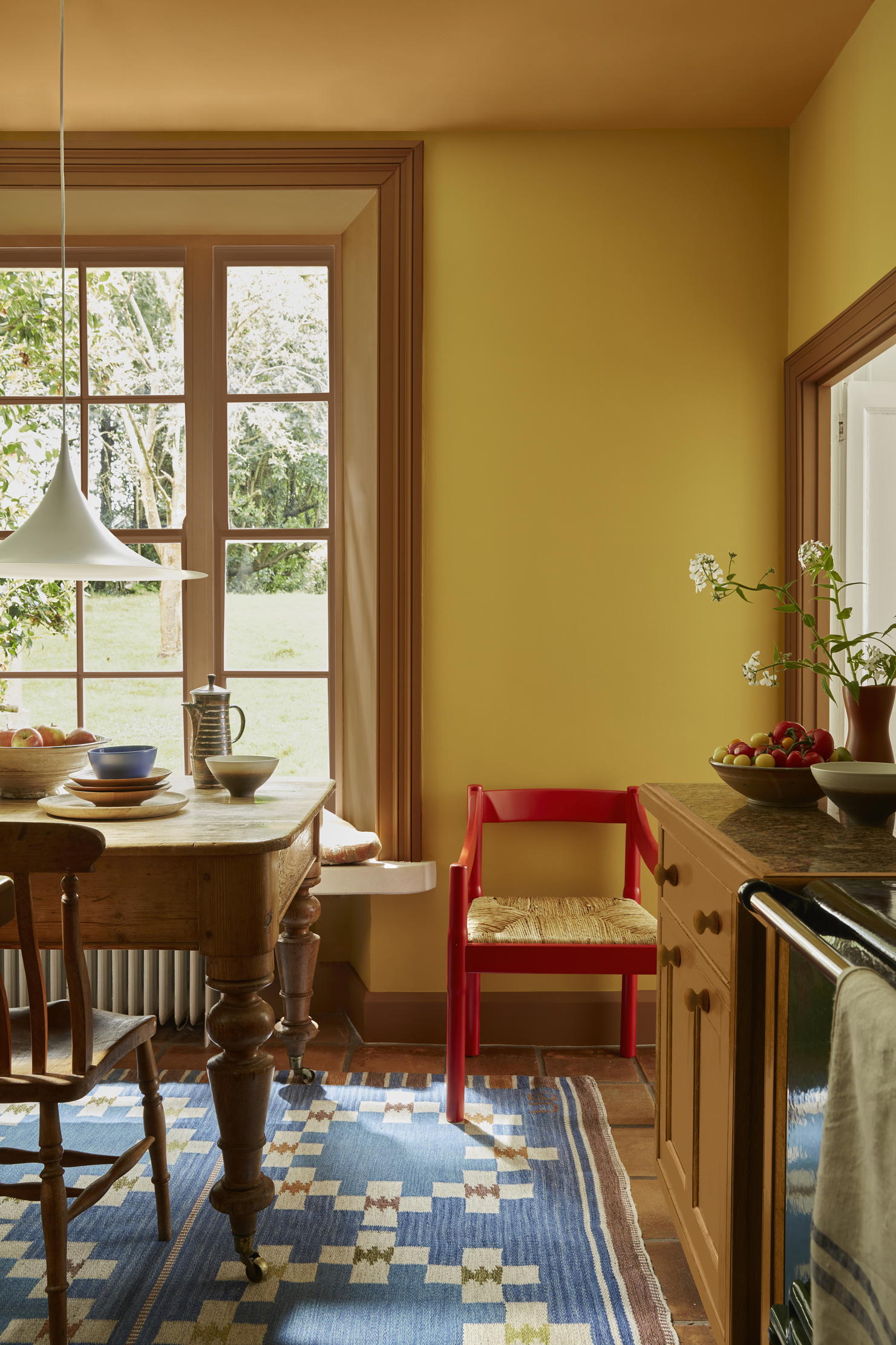 Say no to boring walls: Six choices of paint and paper which will get people talking
Amelia Thorpe picks out some glorious alternatives to just painting everything white.
By Amelia Thorpe
-
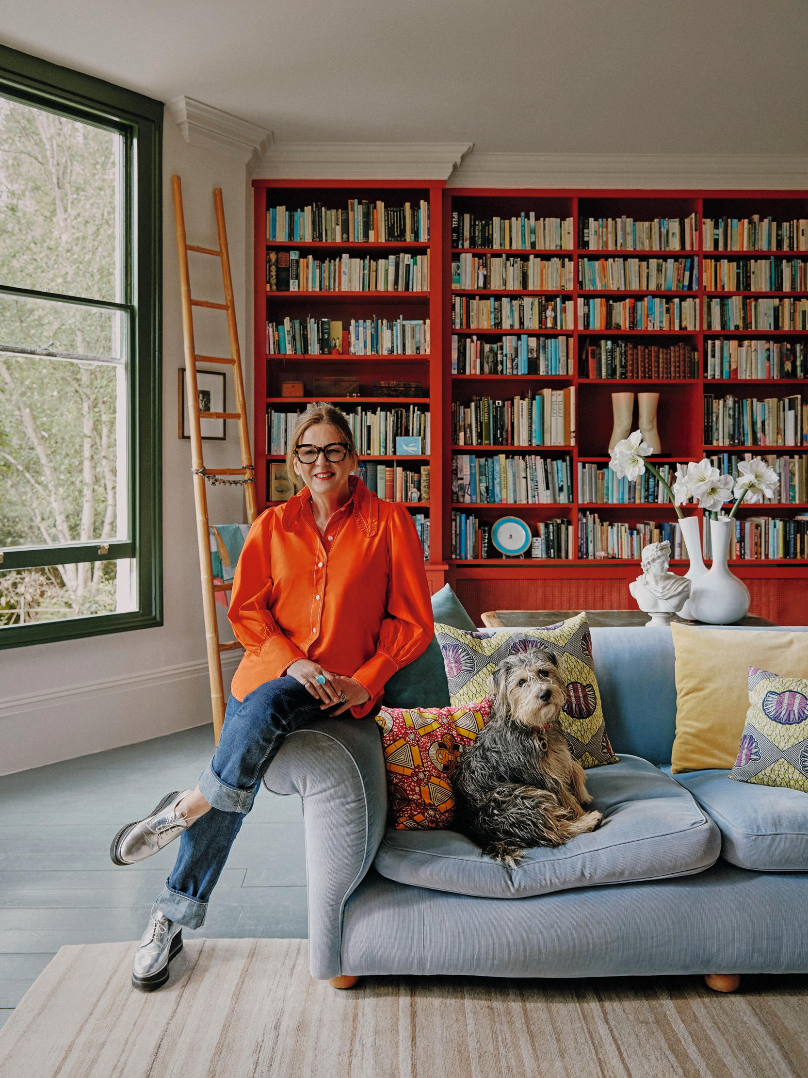 'Not cheap... but cheaper than a divorce lawyer': Why it pays to hire a consultant to choose the perfect paint colour
Driven to distraction by paint charts? A colour consultant could be the answer for anyone befuddled by choosing the right hue, says Giles Kime.
By Giles Kime
-
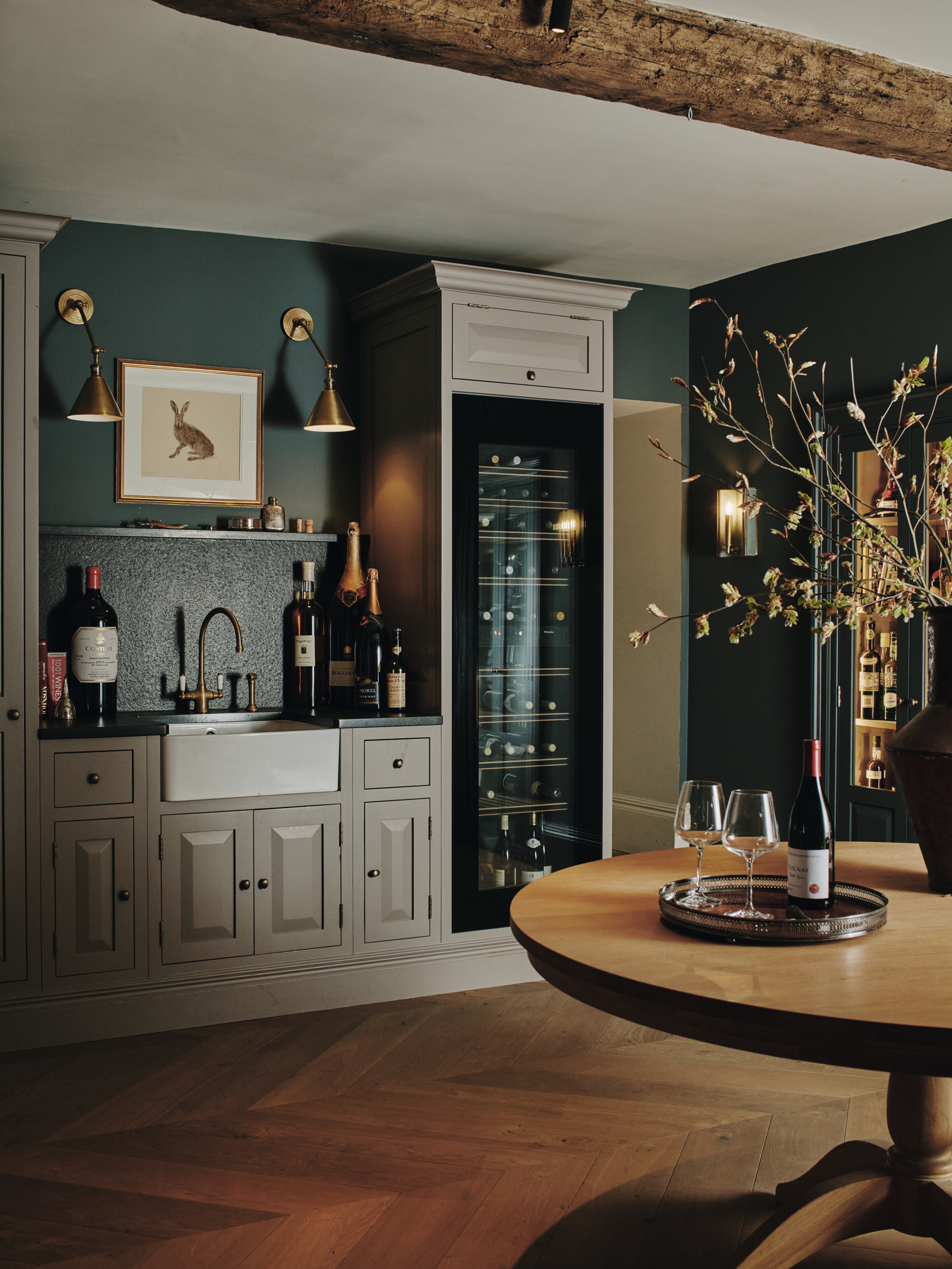 Room with a cru — how an 'enduring legacy of lockdown' is the latest must have in interior design
Long gone are the dusty cellars of the past. Now is the time to make the place you store your wine as pleasurable as drinking it.
By Amelia Thorpe
-
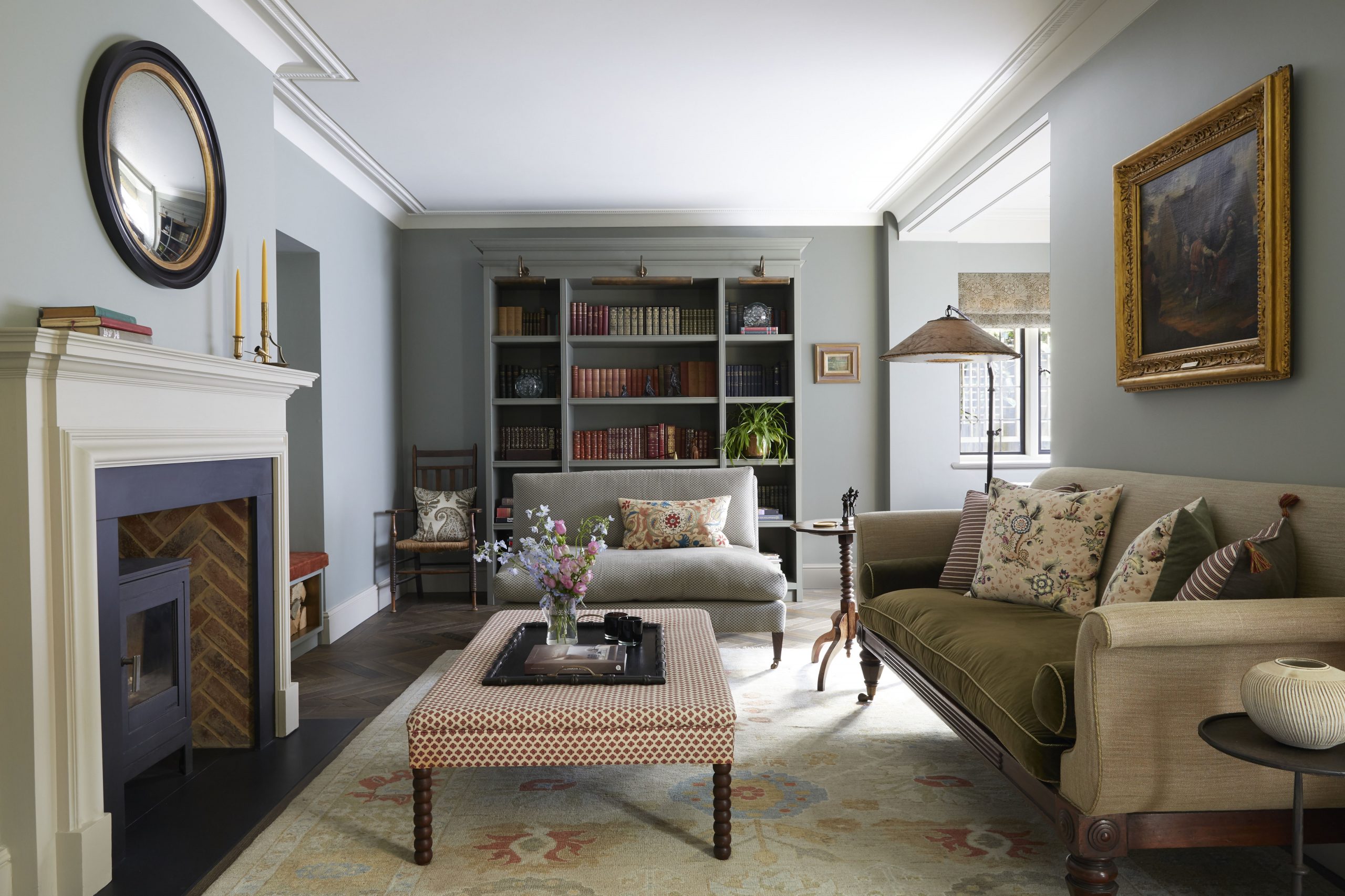 The secret to transforming an awkwardly shaped room
Cave Interiors turned the awkwardly shaped sitting room of an Edwardian house into a warm and welcoming space.
By Arabella Youens
-
 A gloomy kitchen entirely re-created as a cosy living space
When Nicole Salvesen and Mary Graham were asked to redecorate a country house in Berkshire, the first task was to turn a dark space into a colourful sitting room.
By Arabella Youens
-
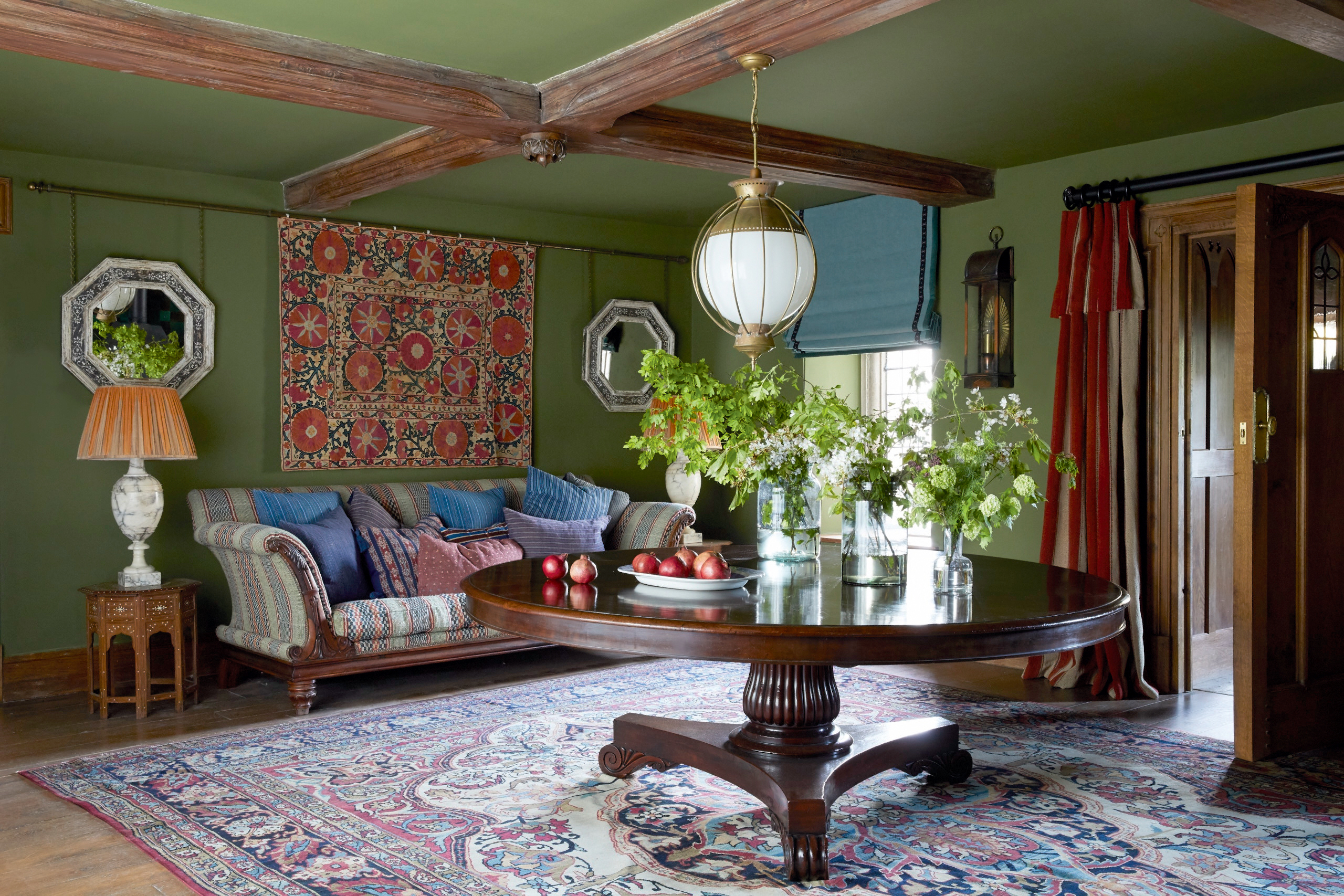 A living room that's a lesson in how to restore lost character in a historic space
Nicola Harding used rich colours and textures to enhance the historic character of a Jacobean house in Berkshire.
By Arabella Youens
-
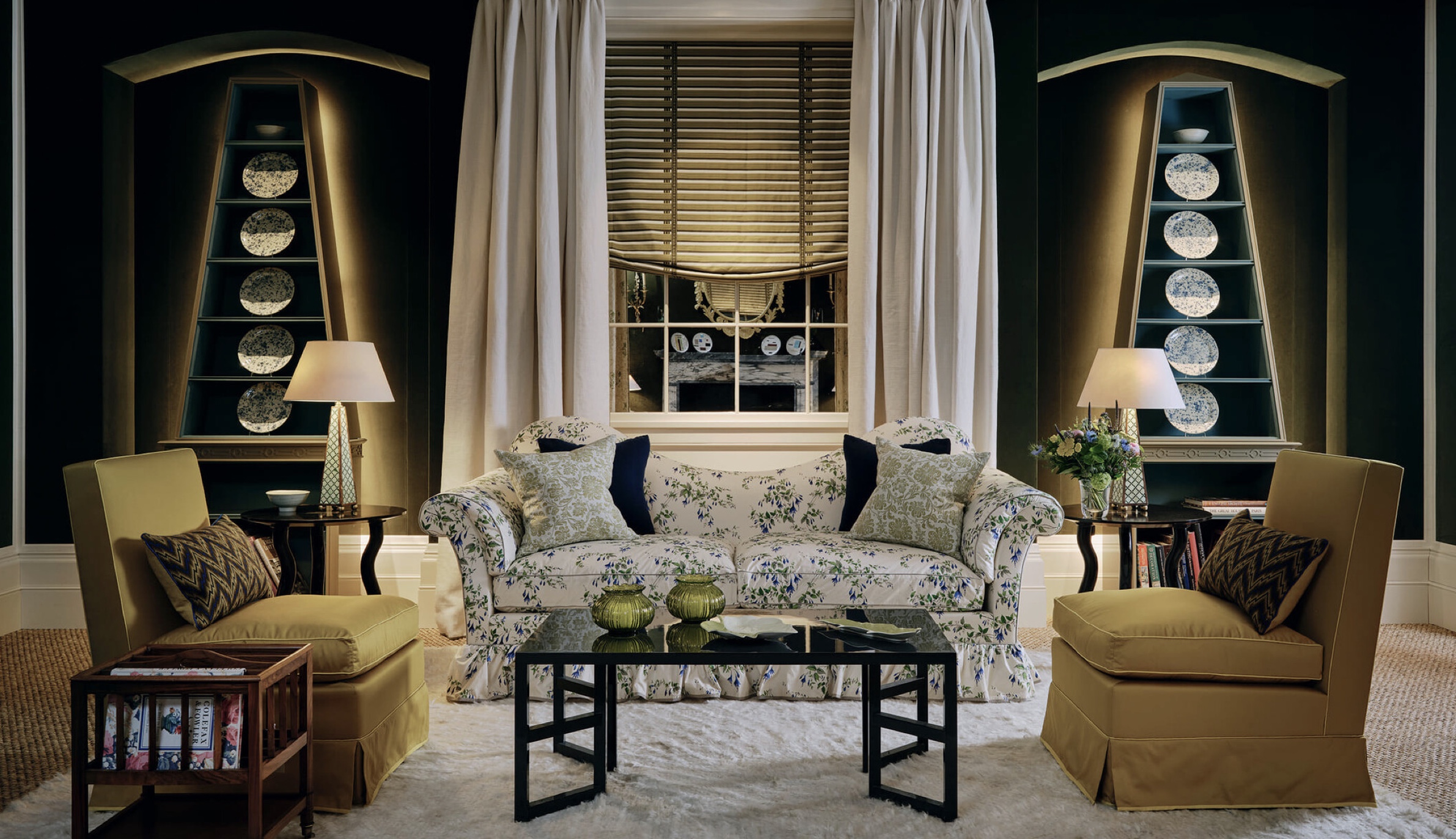 The slipper chair: How one of America's great designers produced a classic of armless fun
The slipper chair might have its roots in the 18th century, but it owes its compact, convivial appeal to Billy Baldwin, a giant of 20th-century American interior design.
By Giles Kime