
Recently I attended a screening of John Betjeman's Passion for Churches, introduced with a talk by Eddie Mirzeoff, who had been the director of the tour round Norfolk churches.
The tour was much supported by Billa Harrod who I interviewed for Country Life a year or two before she died. Eddie recalled a wonderful remark by Betjeman, how he wanted the documentary to be "natural, lifelike and full of humour, like Chaucer", and that Anthony Powell had described Betjeman as having a "whim of iron".
I wonder what he would have made of the pitiful crawling logo designed for the Olympics, it really is the bottom, like a bishop dressed in punk to attract a younger audience. I would have thought we would have done better to get together some of our great architects, admired around the world to generate a logo, they might not even have charged for it! The best the athletes at the launch could say was that it was funky, eeugh.

The London 2012 logo
For more comment from Country Life about the 2012 logo, look out for Carla Carlisle's Spectator column next week (June 21)

-
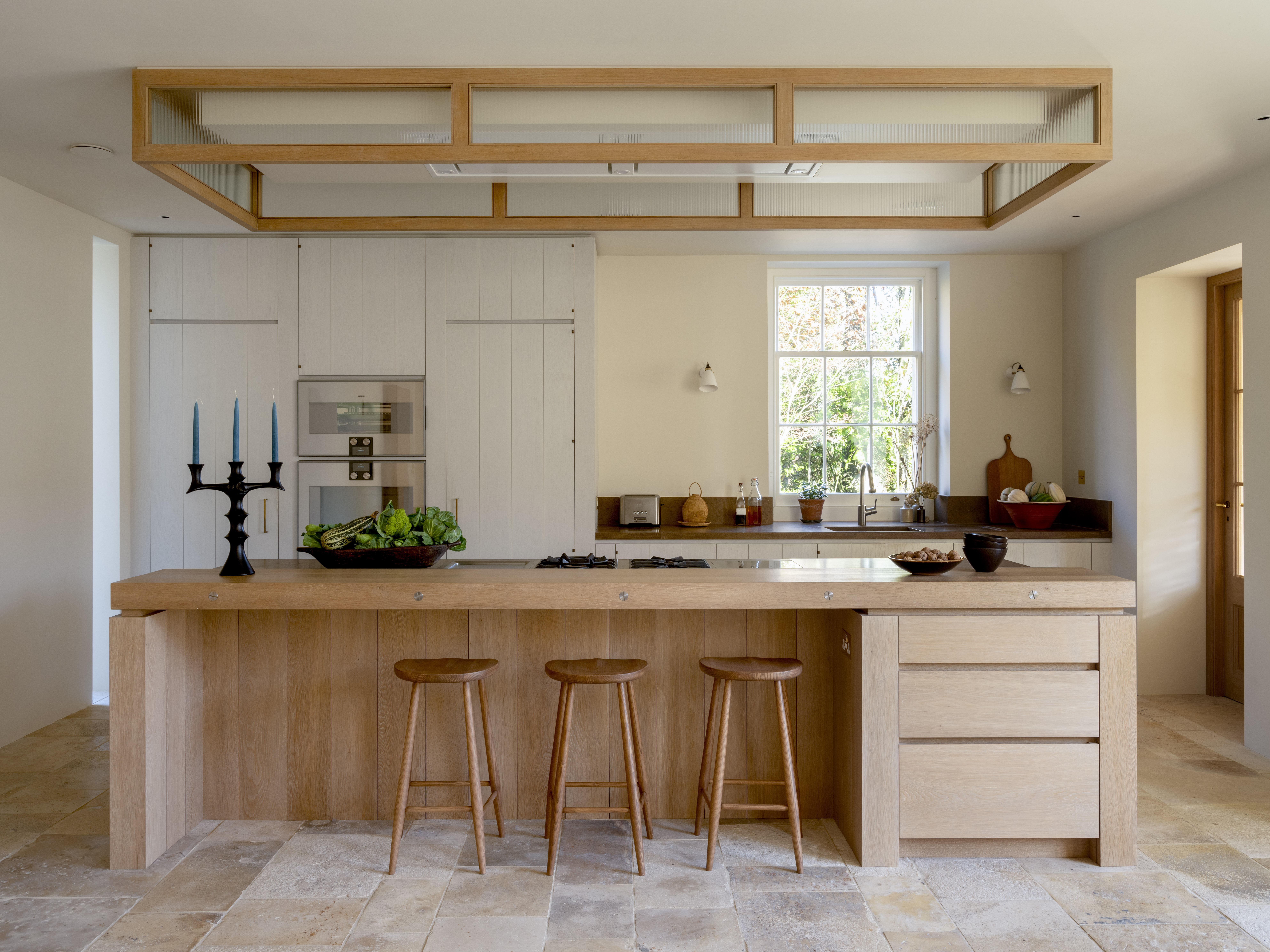 Designer's Room: A solid oak French kitchen that's been cleverly engineered to last
Kitchen and joinery specialist Artichoke had several clever tricks to deal with the fact that natural wood expands and contracts.
-
 Chocolate eggs, bunnies and the Resurrection: Country Life Quiz of the Day, April 18, 2025
Friday's quiz is an Easter special.

