Bighton Grange, Hampshire: A Regency revival
A new house in Regency style creates the perfect setting for modern family living. Clive Aslet is impressed by this light, family-friendly and informal design.
Exquisite houses, the beauty of Nature, and how to get the most from your life, straight to your inbox.
You are now subscribed
Your newsletter sign-up was successful
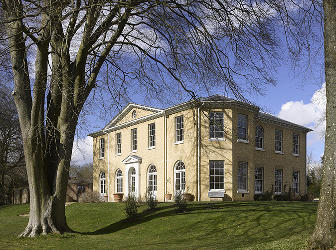
You approach Bighton Grange through a gentle Hampshire landscape of hedges and horses. Round a bend in the lane and it is there: pale brick and tall sash windows, with a three-sided bay to one side. John Claudius Loudon, the early-19th-century encyclopaedist of villas, would have felt completely at ease with it; he would have recognised the genre, and even the stylistic detail. His older contemporary, Humphry Repton, would have approved of the choice of material – he regarded new red brick as looking too hot. Yet Bighton Grange is clearly not an old house. Designed by George Saumarez Smith of ADAM Architecture, it is a precisely observed essay in the way a family with young children lives now, showing that elegance can be combined with informality. This makes it one of the most interesting houses of recent years.
Mr Saumarez Smith will be known to readers of Country Life as one of the principal architects now working at the Duchy of Cornwall’s Poundbury. In London, he designed the brilliant new art gallery for Richard Green that stands at 32, New Bond Street; its ingeniously controlled façade, which manages to make light of the tall attic storeys, is in the rationalist style of Sir John Soane, with vestigial orders decorated only with incised decoration. The eye is immediately drawn to a central frieze of bas reliefs illustrating scenes from the Odyssey, chosen as an allegory of the development of art since 1900, by the sculptor Alexander Stoddart. Mr Saumarez Smith has also designed a Classical villa in New Delhi. This, however, is the first time that Country Life has given an article to one of his English country houses.
The clients, who had been unable to find an old house that suited their needs, discovered him through an exhibition at the Royal Institute of British Architects (RIBA). This was ‘Three Classicists’, which took place in 2010. Recently, he returned to the RIBA with a show called ‘Measure, Draw, Build’, extracted from his meticulous measured drawings and sketchbooks.
At Bighton Grange, the colour of the brick was the starting point. This was a preference of the clients who dislike the harshness of much new brickwork. While Hampshire is pre-eminently a county of red brick and tile, it also produced Beaulieu Whites, made from clay dug from the Beaulieu river near Southampton – the chalk in the clay produced bricks of a light straw colour. To Mr Saumarez Smith, pale brick immediately suggested a Regency rather than Palladian idiom – and it may have been particularly happy as a memory of his native Suffolk. As a grandson of Raymond Erith, he has always known Great House, Dedham, which Erith built for his father-in-law. It’s a rational, if not austere house, built to a budget, which also chimes with the contemporary Regency Revival of the 1930s – Erith would surely have liked Bighton Grange.
This is Regency architecture of the pared-down variety. The entrance front is strictly symmetrical. To either side are slightly projecting bays, containing a tall sash window on the ground and first floors; in the centre are more sashes, more closely spaced and with arched tops on the ground floor. This creates a dynamic composition. The centrepiece is a Tuscan-stone porch, but of the sparest kind; the pilasters are decorated only with incised lines in the manner of Soane and his pupils. Decoration is otherwise minimal. Even the chimney-pots have a rectangular profile, with a slab of stone on the top. The shape protects the chimney from anything that may otherwise go down them (Letters, March 21 & April 4, 2018) – including (a modern menace) hailstones, which rattle down the chimney liners that are invariably fitted these days; in the past, they would have simply been absorbed by the width of the stack.
If the pale brick seems unusual in modern Hampshire, that is not just because the county has ceased making them; they are so difficult to obtain from British brickyards that those used in Bighton Grange came from Denmark.
To one side of the entrance is what appears to be a simple, weatherboarded barn – as well as garages, it contains some of the heating plant. Then comes a walled kitchen garden: here, red brick does make an appearance, along with a horseshoe arch that provides the necessary ventilation. It is of a soft rosy hue, laid with wide mortar joints. The bricks were some of the last made at Bovingdon before production ceased for lack of clay. On the outside face, the wall is set with panels of flint, as the chalk of this landscape is rich in them (the thinness of the soil explains the success of the wildflower meadow).
Exquisite houses, the beauty of Nature, and how to get the most from your life, straight to your inbox.
The garden front is five bays wide, with a pediment over the middle three. Flanked by pairs of arch-headed French windows, the doorcase has a pediment, but the spandrels below it, as well as the pilasters to either side of the door, are enlivened only with incised lines, breaking into stylised palmettes at the corners. This façade looks south, over a wildflower meadow, some mature beeches and a new plantation of trees – the French windows are a constant incitement to go outside.
Inside the house, the plan is as clear and rational as the façades. It reflects a great deal of thinking on the part of both the clients and the architect, who have both analysed their priorities in depth. While beautifully proportioned, the home had to be informal, family-friendly and light. There was no room to waste, which has produced a plan of interlocking spaces, some of which open into each other. This suited Mr Saumarez Smith’s temperament. He says that he loves ‘tight plans that fit together like a knot’.
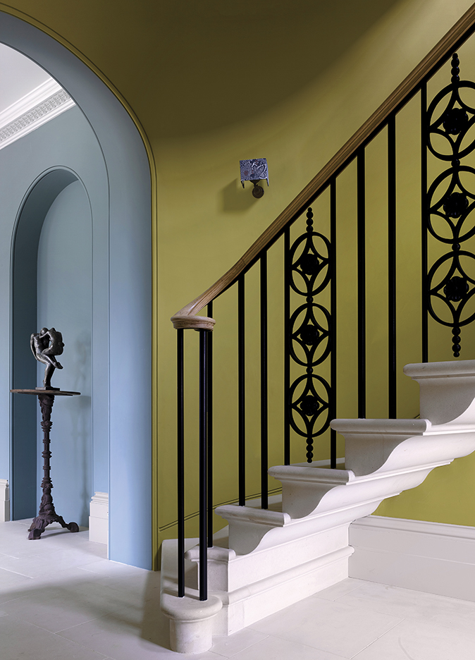
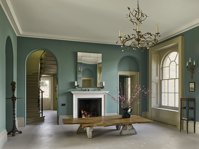
The ground floor is based around three big rooms, 18ft by 24ft, all of which are the same size, with tall (11ft 6in) ceilings. The first of these spaces is the entrance hall. Immediately, the personality of the house declares itself—there is no fussiness, only symmetry. The mouldings around the arched openings to the staircase and doors are minimal. Walls are painted a single tone of dark duck-egg blue – a foretaste of all other walls in the house: none is wallpapered. The fireplace, shutters and deep window reveals are those of a traditional house and yet the chandelier is made of bronze leaves and almost the only piece of furniture in the room, the table, is made from a single, broad plank of oak, waney edges and all. This is positioned at child height: perfect for them to draw at if they are sitting on the floor. They can stand on it, too, if they like. The wide, limed-oak floorboards are another good surface for playing on – or riding scooters on.
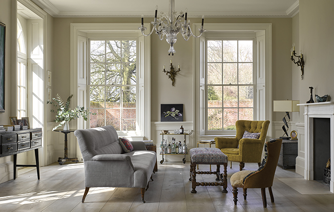
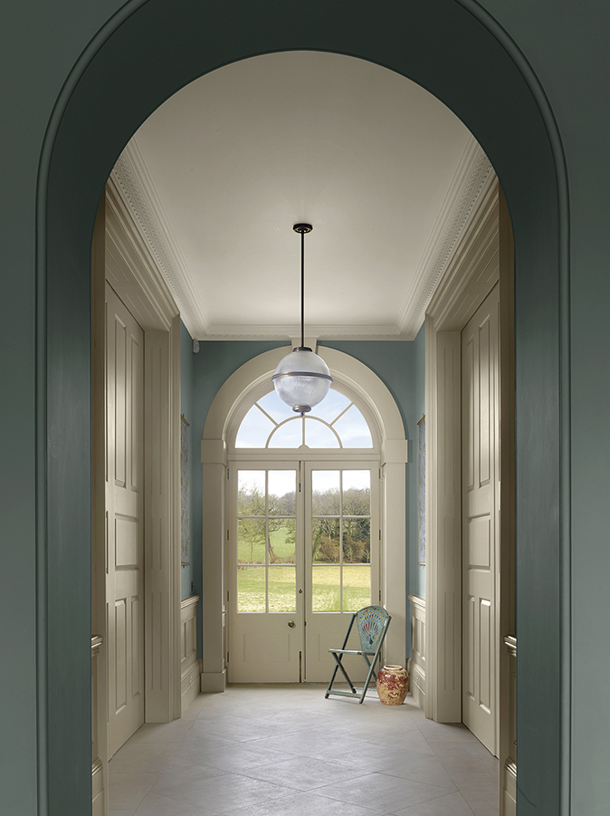
So much for informal and child-friendly. The third desideratum, light, hardly needs comment, because of the number and size of the windows. This is particularly evident on the garden front where the windows come down almost to the ground, as they would have done in the Regency. You glimpse the garden on entering the house, because the garden door stands on an axis with the front door. It is as though the house is beckoning you through, another aspect much enjoyed by the children. The lobby in front of the garden door is paved with stone flags and to either side of it are the kitchen and the drawing room. They have pocket doors that slide back into the wall and so the spaces can function as one.
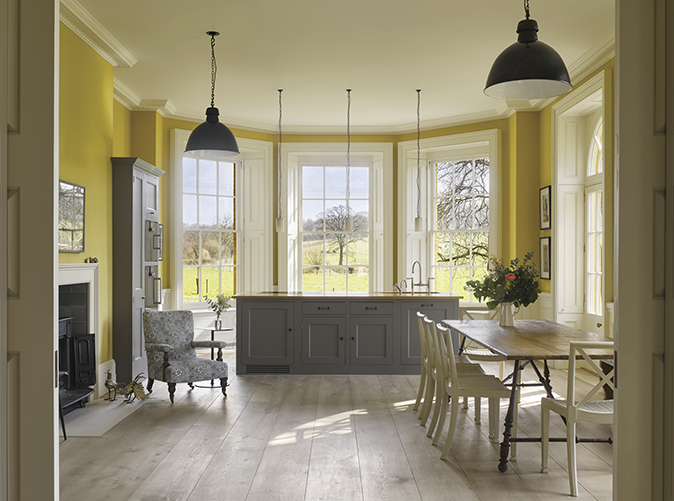
An early decision was to dispense with a dining room. The clients knew that they might sometimes entertain on a big scale, but this did not warrant a dining room that would be unused for most of the year. The hall could serve that purpose as need arose. Otherwise, as the plan evolved, they realised that everyday life would principally take place in the kitchen, with the drawing room as a retreat.
The kitchen has the canted bay, noticed on the outside, which lights a large central work station. One of the charms of the kitchen is that it feels like a room in an old house that's been converted to family use and the proportions are just as fine as those of the other rooms. Next door is a pantry: essential as a supply depot, in which the clutter of cooking ingredients can be banished. As well as a big fridge, it has old-fashioned slate shelves, as any pantry should.
The kitchen has a wood-burner, but the drawing room is dignified with a fireplace. The plasterwork of the cornice was adapted from a rosette pattern made by Stevensons of Norwich. The profile of the dado was inspired by William Fuller Pocock, a Methodist surveyor who published, among other pattern books, Modern Finishings for Rooms: a Series of Designs for Vestibules, Staircases, Libraries, etc., in 1811. Pocock’s work exemplifies the quirkiness of the Regency, which Mr Saumarez Smith finds appealing. ‘The era of John Nash may be more suitable to modern life than that of the Palladians; it is freer, and the house is at one with its landscape. Nature is so important.’
Provision was made for one ground floor room that, in the clients’ words, is ‘not on the way to anywhere.’ That occupies a corner of the entrance front. Conceived as a study, or sitting room for watching films, it has been pressed into (temporary) use as a playroom. No doubt its function will evolve. Balancing it, on the other side of the house, is the boot room.
The curving staircase is cantilevered, each tread carved from Portland stone. Downstairs – on York-stone treads – lies a basement containing gym, wine cellar and a spare bedroom apartment. Upstairs is the bedroom floor – and a surprise.
The surprise is a gallery that runs from one end of the house to the other, on an axis at right angles to that of the ground floor. At either end is an arch-headed window.
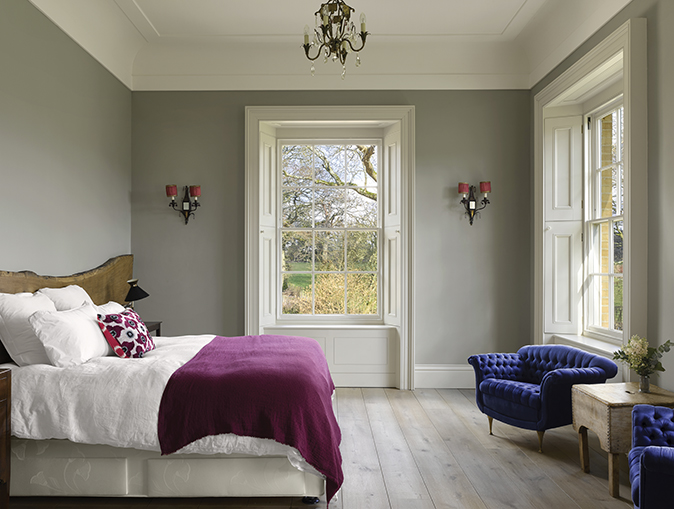
‘I always like the upstairs of a house to have something unexpected,’ says Mr Saumarez Smith. Although the clients had initially wanted five bedrooms on the first floor, they came to realise that four suited them better; each can enjoy a double aspect and is flooded with light. Ceiling heights on this floor are the same as on the ground floor – although the cornice is replaced with coving to soften the effect. The theme of the natural-oak board reappears as the headboard in the guest bedroom. Old lighting fixtures, wall and floor tiles and furniture are mixed with new.
This is an intelligent and exciting house, as well as a place that, when I was there, a young family was enjoying to the full. We look forward to seeing what the architect will do next.
How to create a new build country house
Here are nine examples of recently completed new builds to delight and inspire.
10 new builds you need to see right now
New-builds and developments with a fresh outlook.
The best country house builders, craftspeople and specialists in Britain
Whether you're embarking on a new-build or painstakingly restoring a listed building, here are the craftsmen with excellent foundations.